
Typography, Readability and Legibility
July 30, 2018When it comes to typography, we look at two factors affecting the design. Readability and Legibility are both important for communicating with type. These two terms seem very similar, but they refer to different functions of the type each with its own strength and weakness within the communication or the design and layout itself.
.
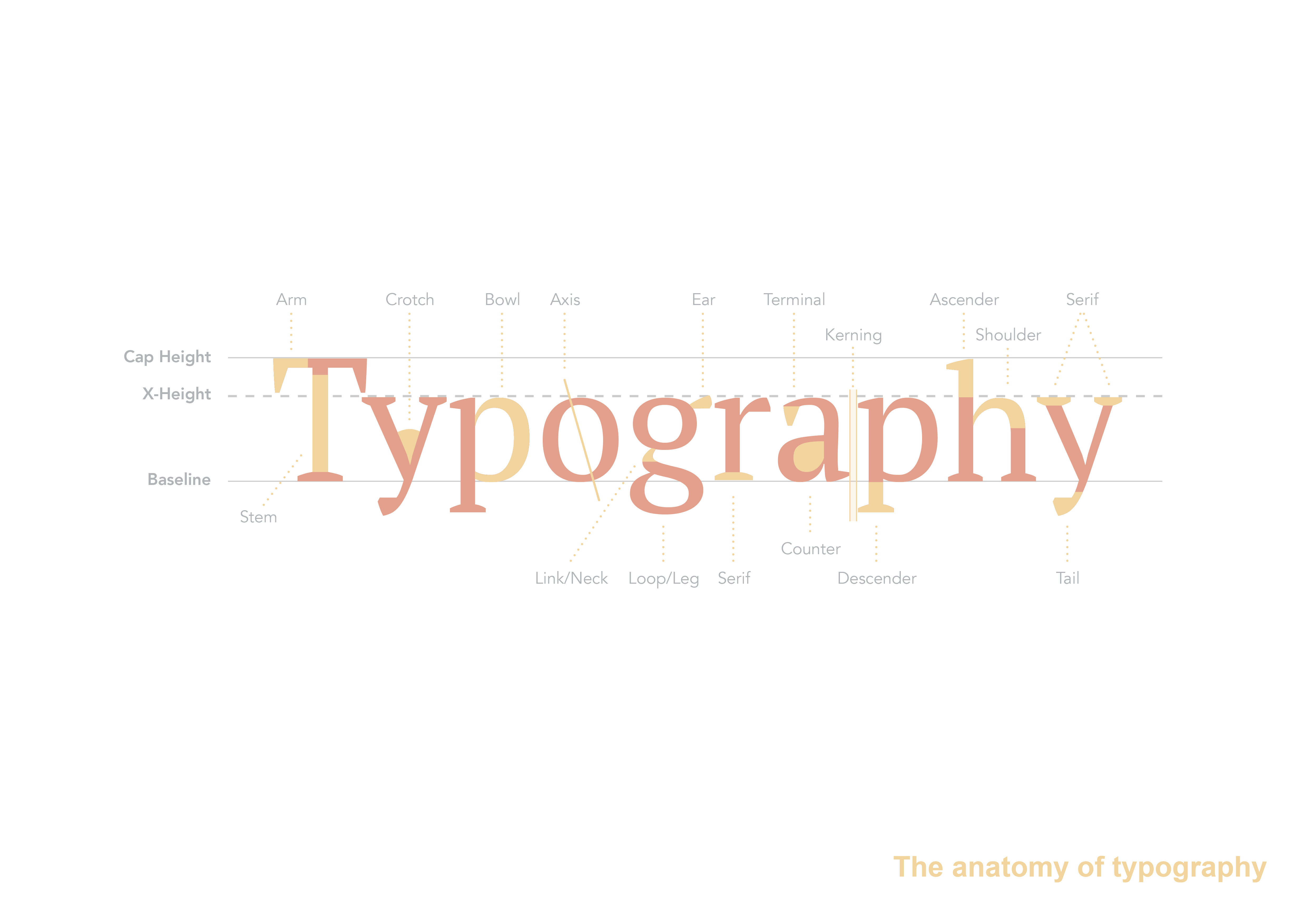
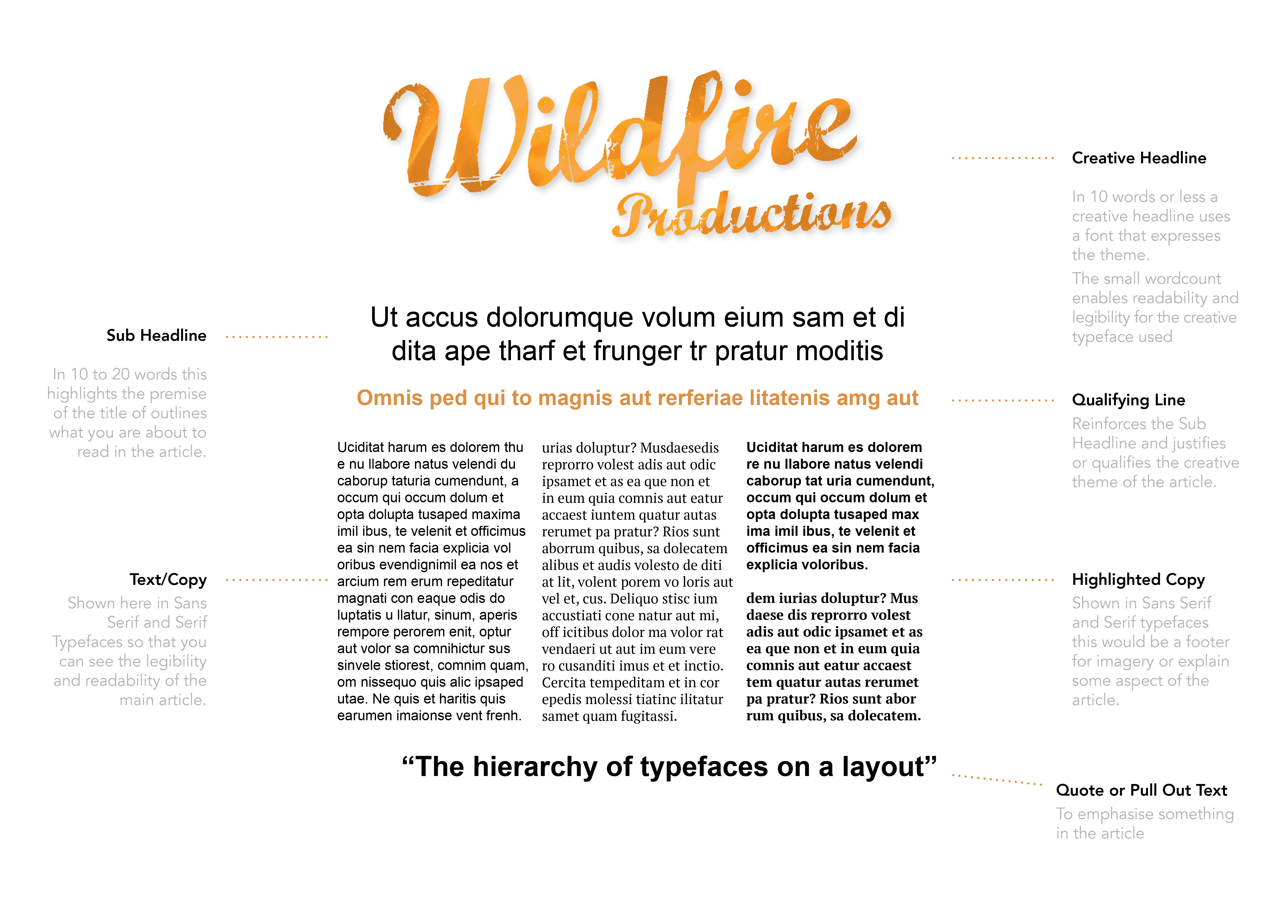
At Wildfire Productions we often look at hierarchy of Headline, Sub-headline, copy or text and use of creative highlighted text like Quotes and Pull outs as you see in magazine page layouts. And Yes! “Kerning” (the space between the characters or letters and words) and “leading” (the space between the lines and paragraphs) play a very key role in typography to gain higher levels of “Readability” and “Legibility” but the choice of fonts is also very important in Typography.
The other factor is columns and layouts. The grids you use relate history and reading consumption habits. Novels and books have a single column grid, Newspapers narrow columns ranging from 5-9 columns across a broadsheet and Magazines 3-5 columns or often 1-2 columns depending on the style of the magazine. All these conventions have been broken by designers. But on the same token remain unbroken. Whatever way you wish to design, the way we read is in our DNA. Our behaviour is set due to our consumption of books over time. Narrow columns are easier to read, for faster consumption as their short line length is less taxing on our eyes (e.g. newspapers). Single columns are for more descriptive storytelling and when you want a reader to sit back and focus on a report or story.
A final note we’d like to add is about use of justification. “Justified”, “Forced Justified”, “Flush Left” or “Flush Right” and “Centred Typography” within the design. Often this comes down to copywriting and content. Sometimes the way text is written doesn’t work justified and becomes “Gapy” (full of ugly gaps). But “Justification” or “Forced Justification” is widely adhered to in formal scientific texts and reports. Where as “Flush Left” or “Flush Right ” and “Centred Typography” is used more in magazines and editorial. Different fonts also play a dynamic role and within the visual interplay of layout design either adding or detracting from your overall Readability and Legibility.
This is why it is so important to choose fonts well when developing your business’ “Styleguide” or creating website font cache vs. brochure fonts for a clients branding. This is also why clients or young designers with no formal training in typography should not try to typeset type or choose fonts without thoroughly experimenting with different typefaces needed to create a brand communication and your typography. The result is that the final design looks “desktop published” and can lack credibility. Be mindful, because Typography is more than just letting the computer do the work.
So here is some good tips on understanding and achieving better typography and designing better communications:
Lets Look at the Two Functions of Type
When choosing a font for a clients branding you have to establish their personality and consider the amount of type they will be using over marketing and advertising or even internal stationery. In developing your designs, your type needs to communicate, yet to do this it needs to do two things at different levels of the typographic hierarchy.
- Have impact or get a reader’s attention and interest
- Consider being kind to the reader or design things to be easily read
The first design approach is about “readability” and the second is about “legibility”. Legibility is mostly a function of typeface design. It’s a measure of how easy it is to recognize one letter or word from another and how easy blocks of text are to read in a sentence. Whereas, Readability is a function of how typefaces are used. It’s about how inviting your type is to read and about getting the viewer to want to read it. This important for a client that needs to inform people and educate, but in the case of a street-wise Skate brand the Readability and Legibility can often break from tradition and reinvent the rules.
Readability
Readability applies to the overall reading experience. It’s macro-typography and it’s about making type aesthetically pleasing in order to make it more inviting to the reader.
Imagine you open a brochure and the text that’s been formatted as one very long paragraph with no headings or subheadings. It’s just one long block of text. It’s not very inviting to read and you will have to invest your time to digesting it.
So the only way to know if you want to read that block of text is to begin reading it and unless the first sentence or two is extremely compelling you’ll probably move on to another page. If this is the case and you decide to skip reading it, it’s because the type “design” wasn’t “readable”.
Had the type been separated into several paragraphs, had there been a main page heading and subheadings giving clues about the content, had there been images, or some bulleted lists, the text would have been much more inviting to read and regardless of poor writing or the length you would be able to read it quite well and digest the communication presented quickly.
That’s readability. You design your type so it looks more interesting. You make certain parts of the type “stand out” or “attract attention” to their benefits or the crux of the communication. You make it palatable to the reader. You entice the reader providing a way into the full body of the text.
Being more noticeable and more interesting by way of design or the typography makes type more readable.
Understanding Creative Display or Headline Typography:
Normally only a sentence or between ten and twenty words, display type is about creating impact character and entices people to read. Readability is generally the job of this form of typography. Creative Display typography includes:
- Creative Headings
- Sub-headings
- Qualifying Sub-headings or Decks
(a line or two of text below and expanding on the main heading) - Captions/Quotes
- Breakouts/Pull quotes
Display headings often use creative or display fonts and typefaces. The biggest potential problem with using fonts that are too creative here is that they are often readable but less legible.
The typefaces that leap out and get your attention, might be difficult to read in large doses. It’s fine as display type in a short heading but for copy or text it’s near impossible to work with.
The other side-note when choosing a font is in the typefaces design. Does it have; fractions, is it All caps only, how does it look in upper and lowercase vs. All caps, how do the numbers look, does it have a good range of glyph sets and has the designer developed italics, bold typefaces, extended and condensed versions to make up a broader family that you can work with. How does it behave when kerned or the leading is changed. All these factors are important, if you don’t understand the dynamics it’s best you get professional advice or look atyou’re your other options before committing to print or choosing your branding style.
Its funny, how highly readable type can be less legible. You want to pick your moments in designing, for making type readable vs. legible. A little attention to the details and some experience goes a long way here.
In addition, to making Headline type aesthetically pleasing and attention getting, you can use it to make your main body of text inviting to the reader by employing a deeper more immersive thinking that relates back to your branding and positioning:
Understand your brands personality – Choose fonts that look classic and traditional or modern and progressive.
Understanding the reader’s self-interest – use display type to make the value of your main body of text clear and digestible to the reader.
Giving the type design a purpose – give display type distinct treatment that adds to or reveals the meaning of your main body of text. Give it a hook, a strategy, a benefit or a proposition. Don’t just give your headings titles or “nouns” put your words into action and employ “adjectives” and “verbs”. Be exciting.
Keeping small display type short and brief – don’t make captions, qualifying subheadlines and decks several paragraphs long. It’s difficult to read smaller sized text and that text will be skipped unless it’s relatively brief.
In conclusion, always remember the idea of Headline type is “readability” and it’s acceptable to sacrifice some “legibility” to meet that ideal. It’s here we can have; the creative hooks, the excitement, and the wow typeface. The personality to gain the readers trust and suggest that the copy is good enough to read on.
Legibility
Legibility applies to parts of the text like letters and words and paragraphs. It’s micro-typography. It’s about type’s ability to be easily read, particularly under normal reading conditions.
Assuming you find some text readable at some point you’ll actually be reading it. The type shouldn’t get in the way at this point. In fact the less you actually notice the type the easier it will be to read the words.
We can think of illegibility as a condition where your mind is ready for more information, but it has to wait on your eyes to make out the words trying to convey that information. Illegible type is where your mind is waiting on your eyes.
Legibility is the opposite. The letters and words are so clear that your eyes have to wait on your mind to be ready for more. Reading legible type is effortless.
Illegible type presents barriers to communication. Legible type fosters communication.
The Copy or Text Type:
Legibility is most important factor in communications when it comes to the copy or the text type. It’s important that designers make sure the copy or text type more legible than the more creative display type. Some of the more distinct things to be aware of are:
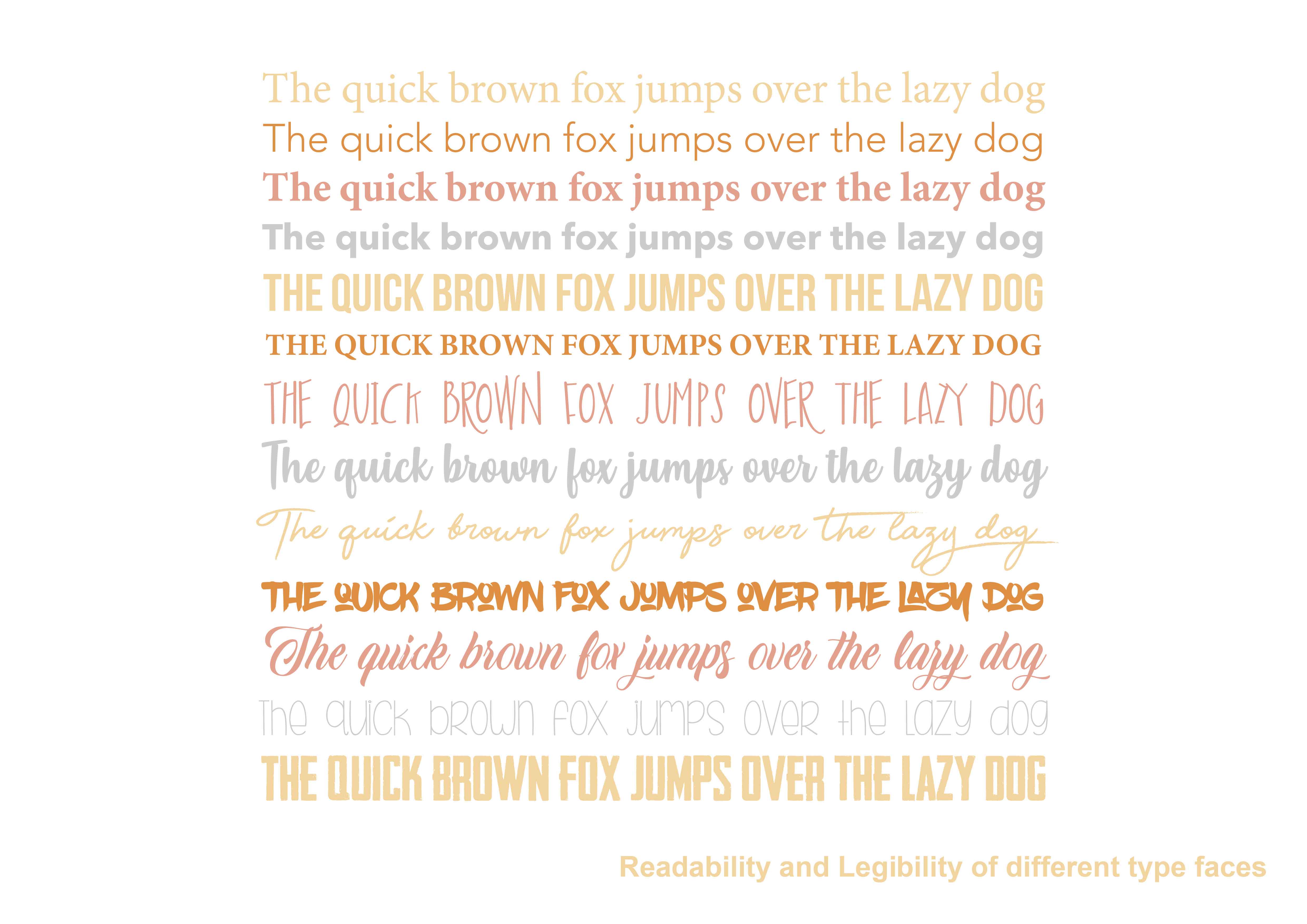
Choose a regular to medium weight font
Using regular or normal weight fonts have better legibility as they are the base level of the font design. Bold, Condensed, Extended and Light or Thin fonts will be harder to read as they are alternative styles.
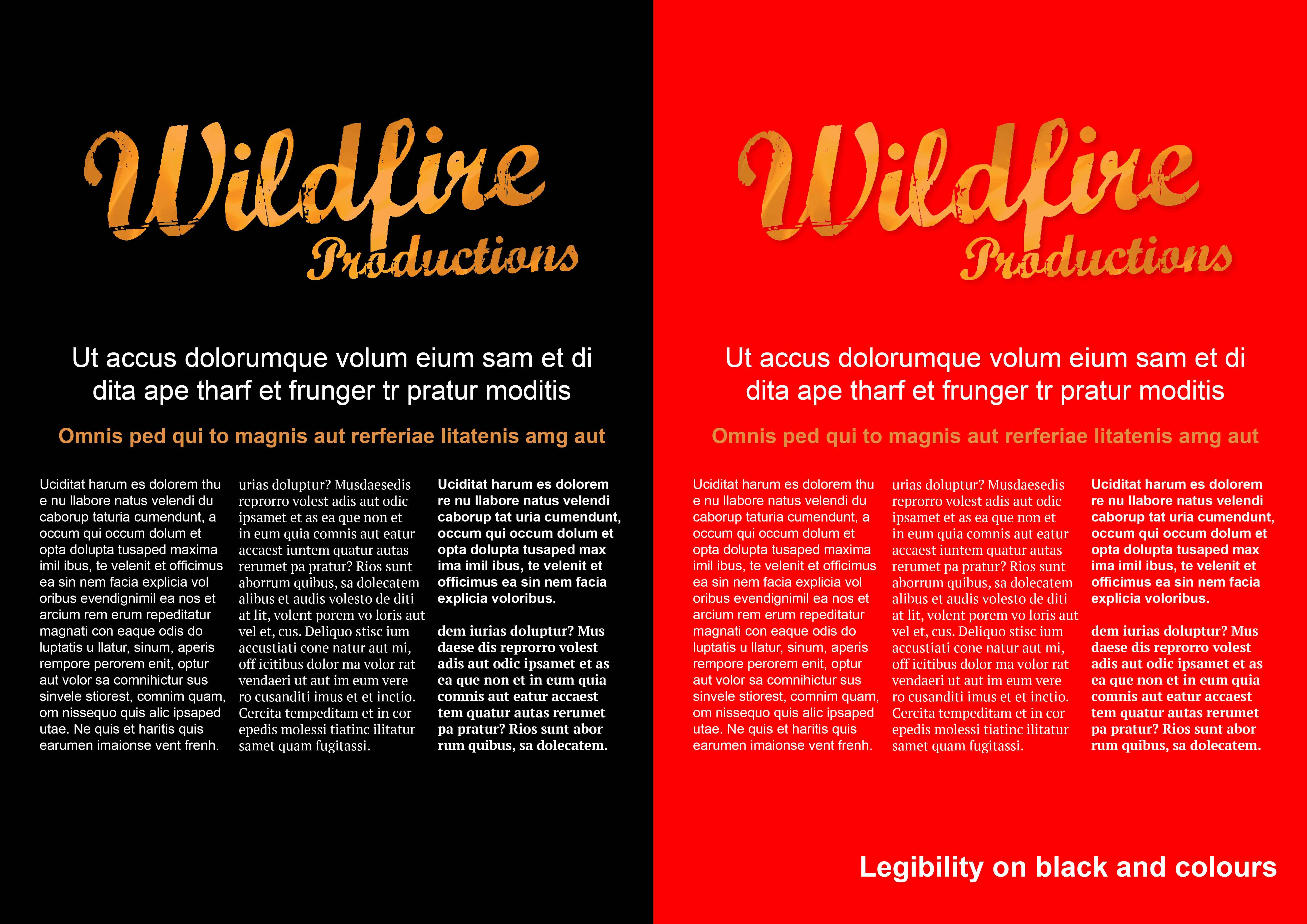
Be mindful of reverse type and coloured type
Especially on pictures or photographs. Even on different coloured backgrounds there is “a good rule of thumb.” Have at least 30% tonal difference between the background colour and the reverse type or you will lose both Readability and Legibility.
Give text a comfortable size and column width
Ideal size and measure is somewhere between 12px–14px font size and 45–70 characters per line. But it again can change when looking at Style guides brand conventions set up by a design team. All fonts have their day and there sense of character. I guess that’s why they are called characters. Designers understand this and employ fonts to bring personality to brochures layouts magazine pages etc. to tackle legibility and readability for the client.
Be seamless with your typography
Make all your type decisions invisible to the audience. Don’t try to draw attention to copy as the reader should be reading and not thinking about your poor type decisions.
Again by the time readers have made it to your copy they’ve made a commitment to reading. Your text type should be visually elegant and digestible and not get in their way. If there are too many gaps because of justification rewrite the copy and fill the spaces or toy with better kerning, turn-overs and hyphenation issues to get better spacing so they can read easily and enjoy the experience.
A Quick guide to Better Typography
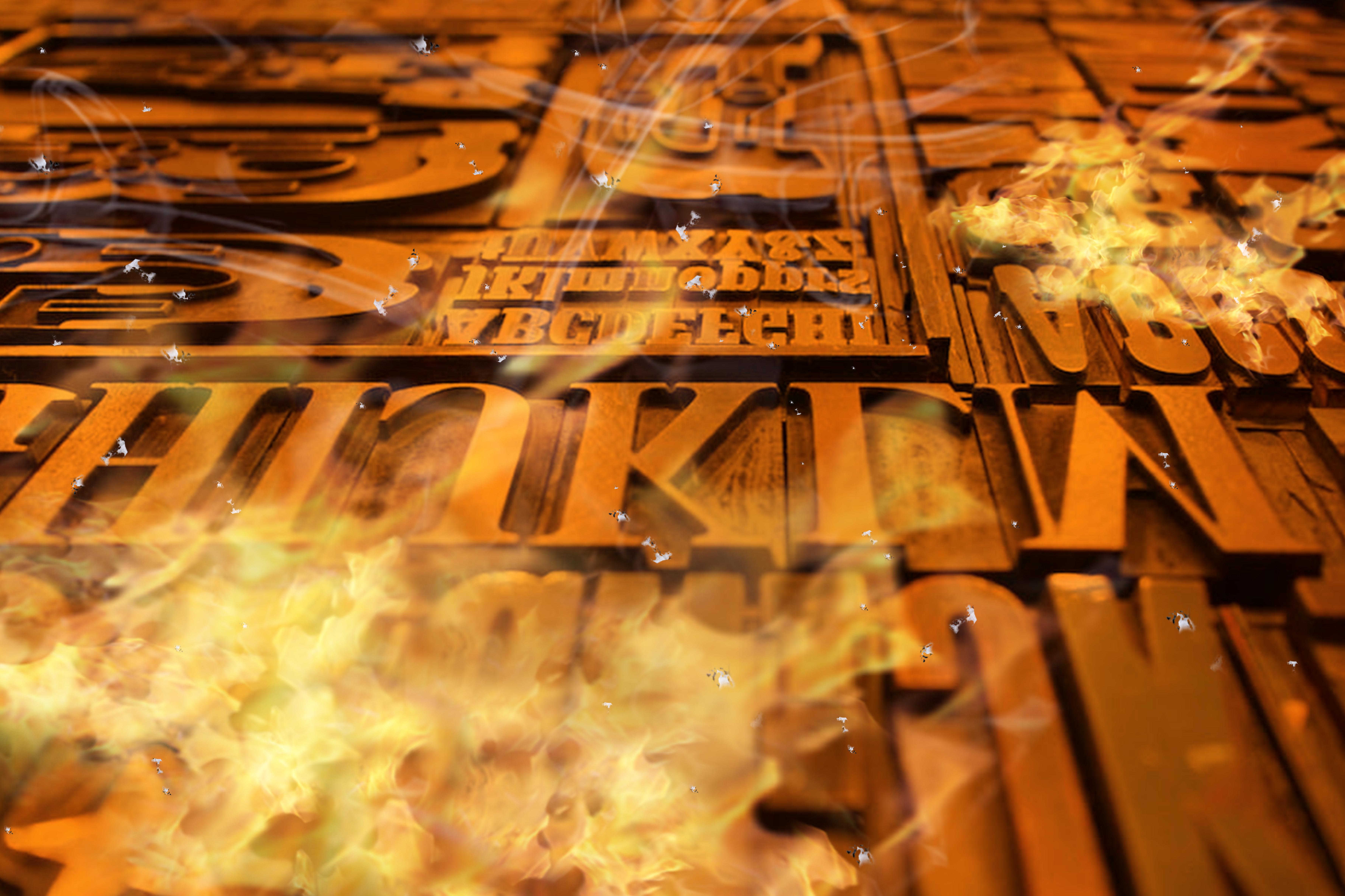
Understanding the dynamics and tolerances of Typefaces, Hierarchy, spacing and typographical design is important otherwise you get a very desktop published finish. Years ago copywriters, editors, publishers, writers used the Oxford Style Guide for publishing. Many new age web designers these days may not be aware of Kerning and leading, because computers have taken over from old school letterpress work where these names are derived. A time where lead lettering was hand-set backwards before printing on wooden blocks.
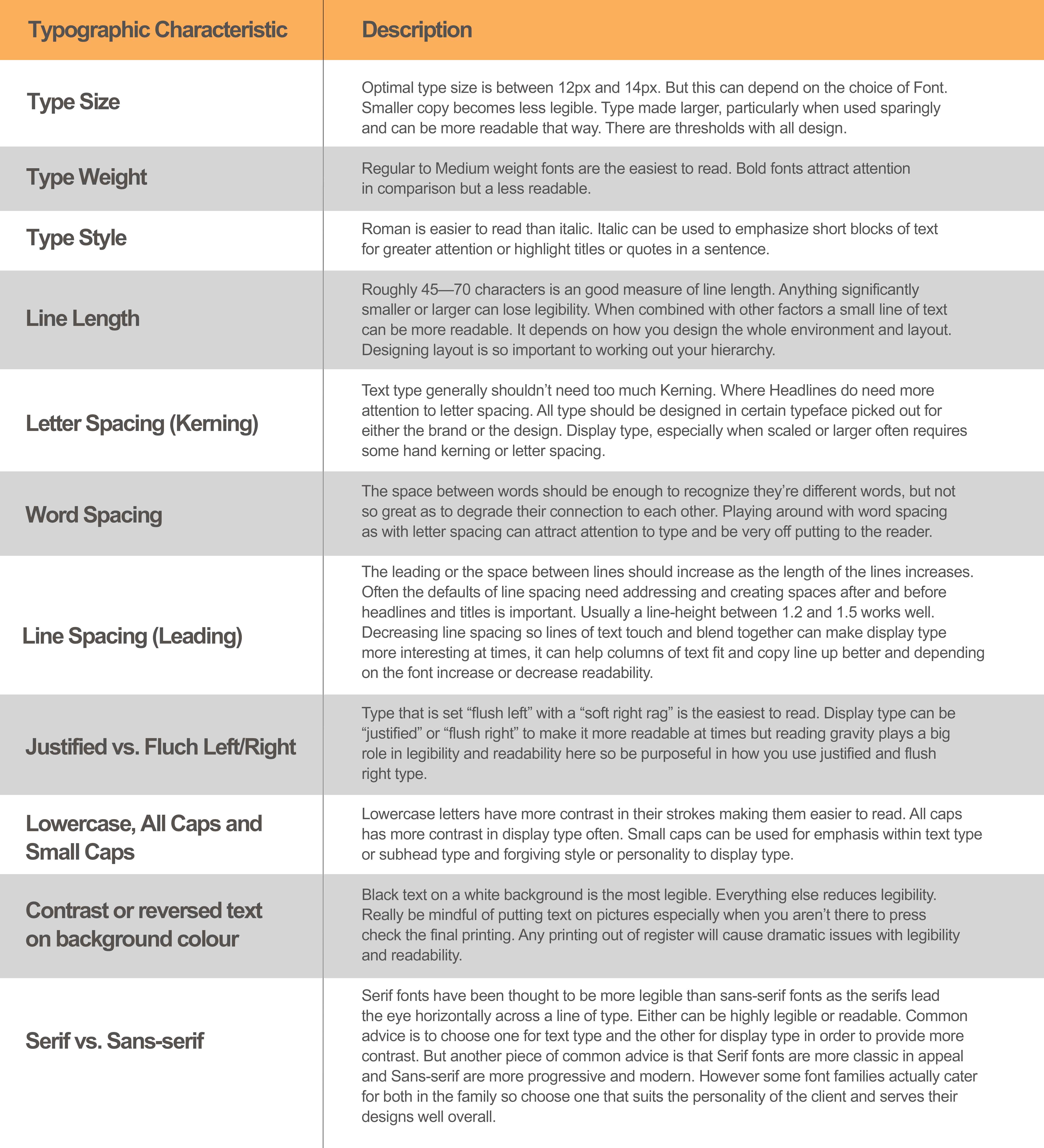
Below is a table which is our cheat notes or quick reference guide for clients we hope it helps you understand our passion into better understanding of design. Yet also why some days what might look like a simple correction, or changing one line of copy, ends up being a typesetting nightmare for us designers.
So Let’s Wrap This Up!
Readable type and legible type sound like they should be the same thing, but they are quite different and serve two different functions of type with regards to you communicating your message.
Readability is about attracting attention to type in order to create a desire to read on and investigate further. Creative display type is typically used to make boring blocks of long copy and informational type more readable and interesting.
Use Titles and Display type sparingly. This will also increase readability and be mindful of your design and font use to balance any reductions in legibility.
Be Legible in your copy text. There is no way people will attempt to read unreadable type. So make your copy text easy to read. The goal of text type is to be free flowing, turn over nicely, no widowed lines, nicely formed paragraphs with the perfect balance legibility and readability. The balance between both your headlines and copy comes down to the contrast of increased readability in Headlines and increase legibility in copy or text.
If you can do that well and find a design or layout hierarchy across the whole page or spread you have created a good design. Insert our applause here and we hope you enjoyed our insights. Thanks for reading.