.
.
‘Show and tell’ is a great way to express our story.
At Wildfire Branding is paramount. Positioning is key to your brands leverage and taking a human approach to infuse humour or personality where you can is important. We produce classic, well designed, advertising and design projects. We try to take risk with our ideas, language and graphics. We understand that to push our frontiers we can’t do this by sitting idle. Wildfire is about creating brand stories that create immersive experiences – “Storyscaping”.
In the design game images are everything. People judge you on your production. There’s always more story behind every picture and there is definitely more to production and process behind every great execution. At the end of the day we think our creative speaks for itself. From Graphic design, mainstream advertising posters, social media, to VLOGS and Television. If you can’t connect on a human level, you won’t reach your audience with any great effect. It may seem overwhelming. But this is a 26 year story. Once you have time to take it all in, we truly believe our creativity and thinking will strike a cord with clients!
.
“Wildfire really gave Hungry Bear Pizza a great Branding start. From training manuals to in-store training posters, advice with shop design, Menus, coffee mugs and Branding books. We took a Pizza shop and totally found it’s sense of adventure.”
.
.
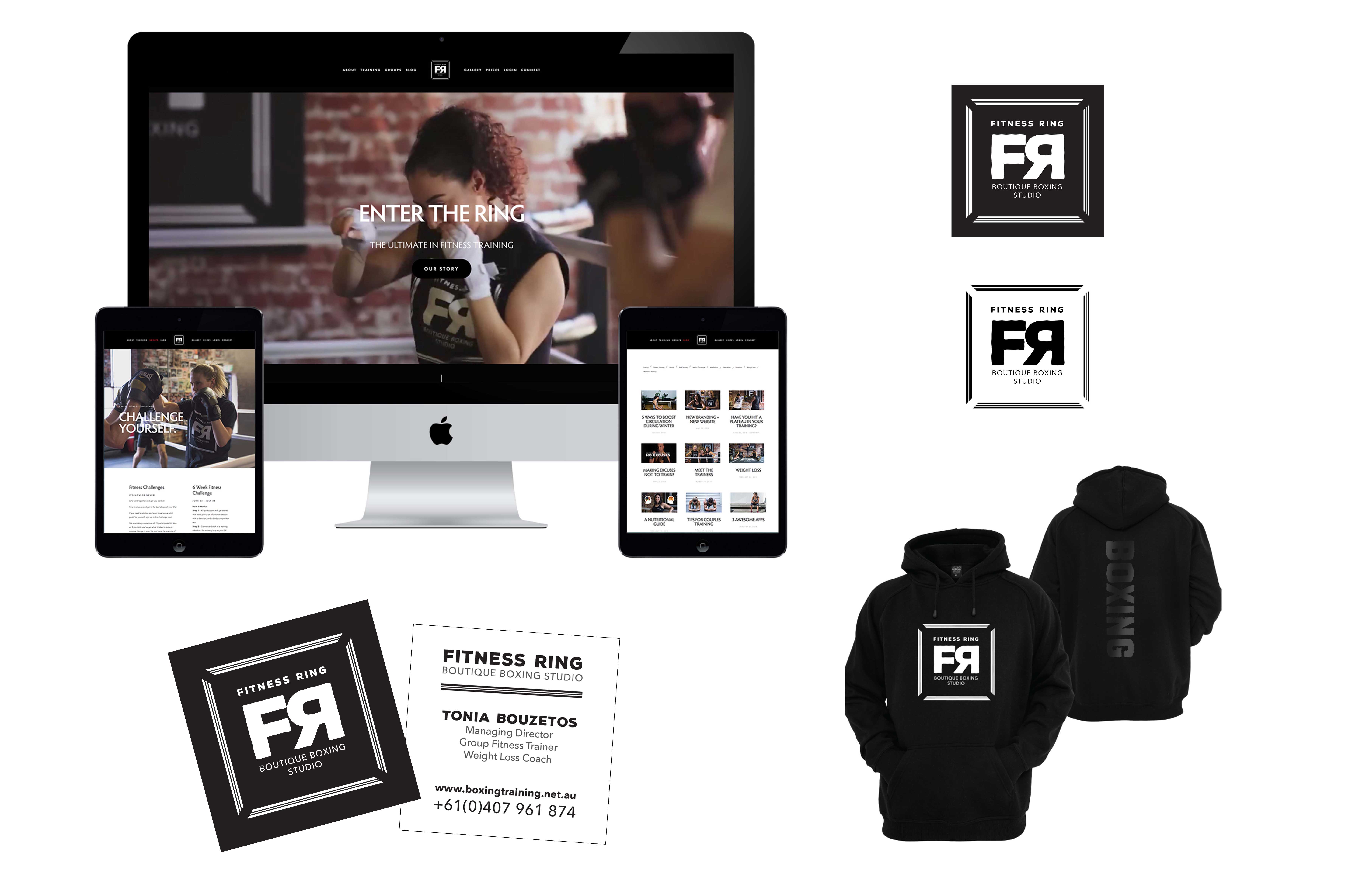
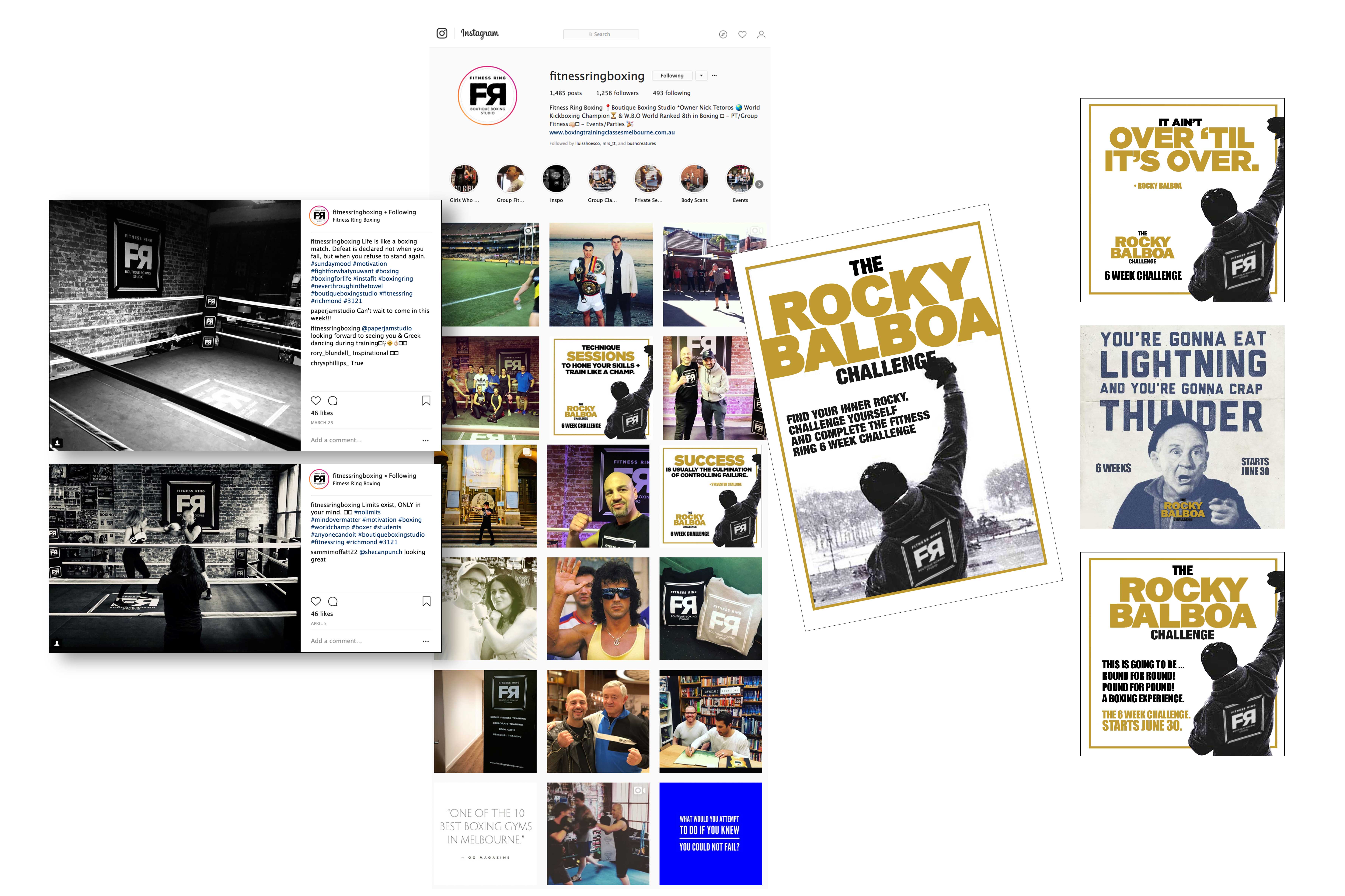
“Wildfire have worked with Fitness Ring to plan and develop their boxing story on social media and with their up and coming challenges. The Logo and corporate branding has gone on Hoodies, T-Shirts and even cushions and the buzz has been incredibly exciting.”
.
.
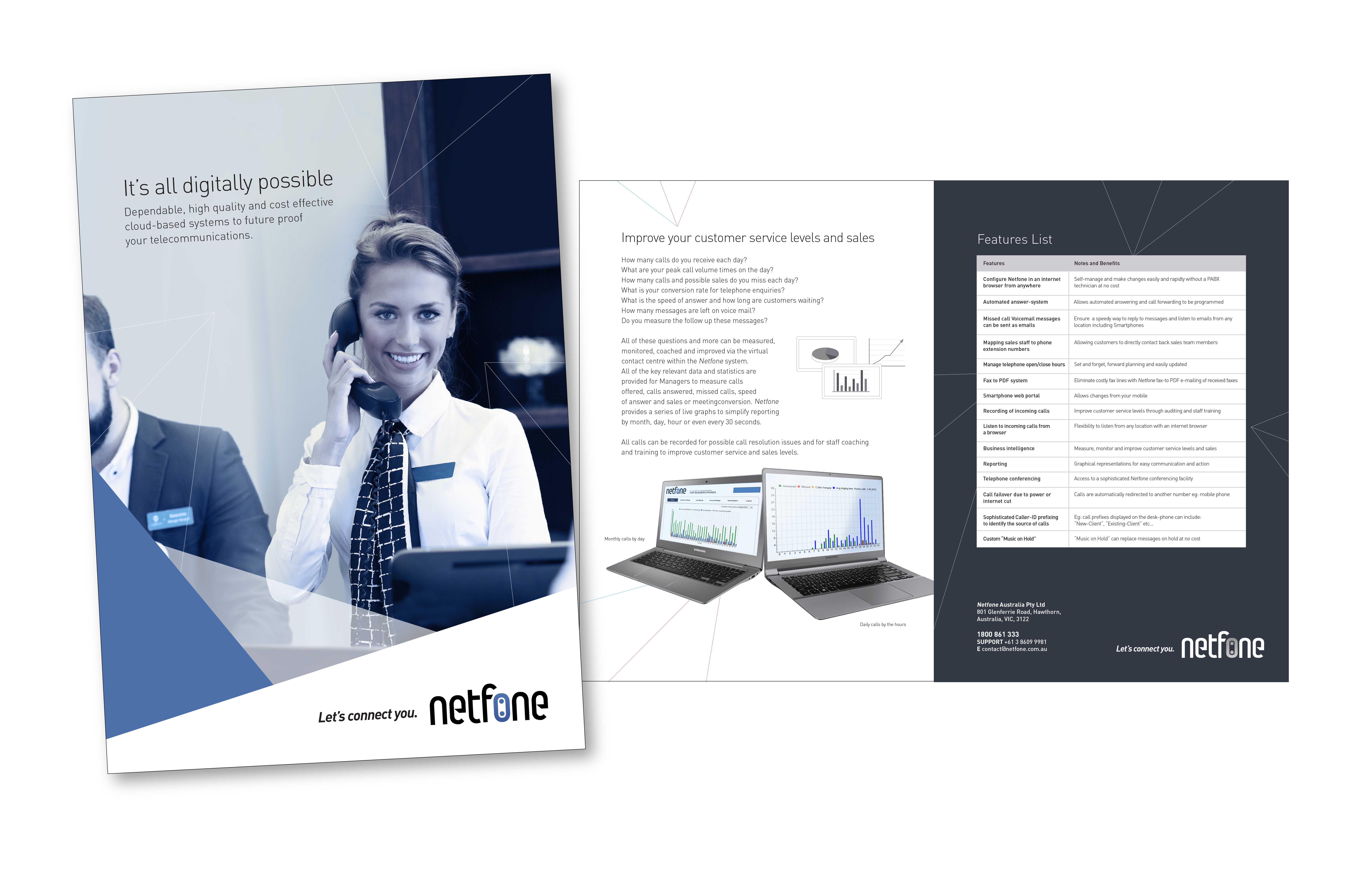
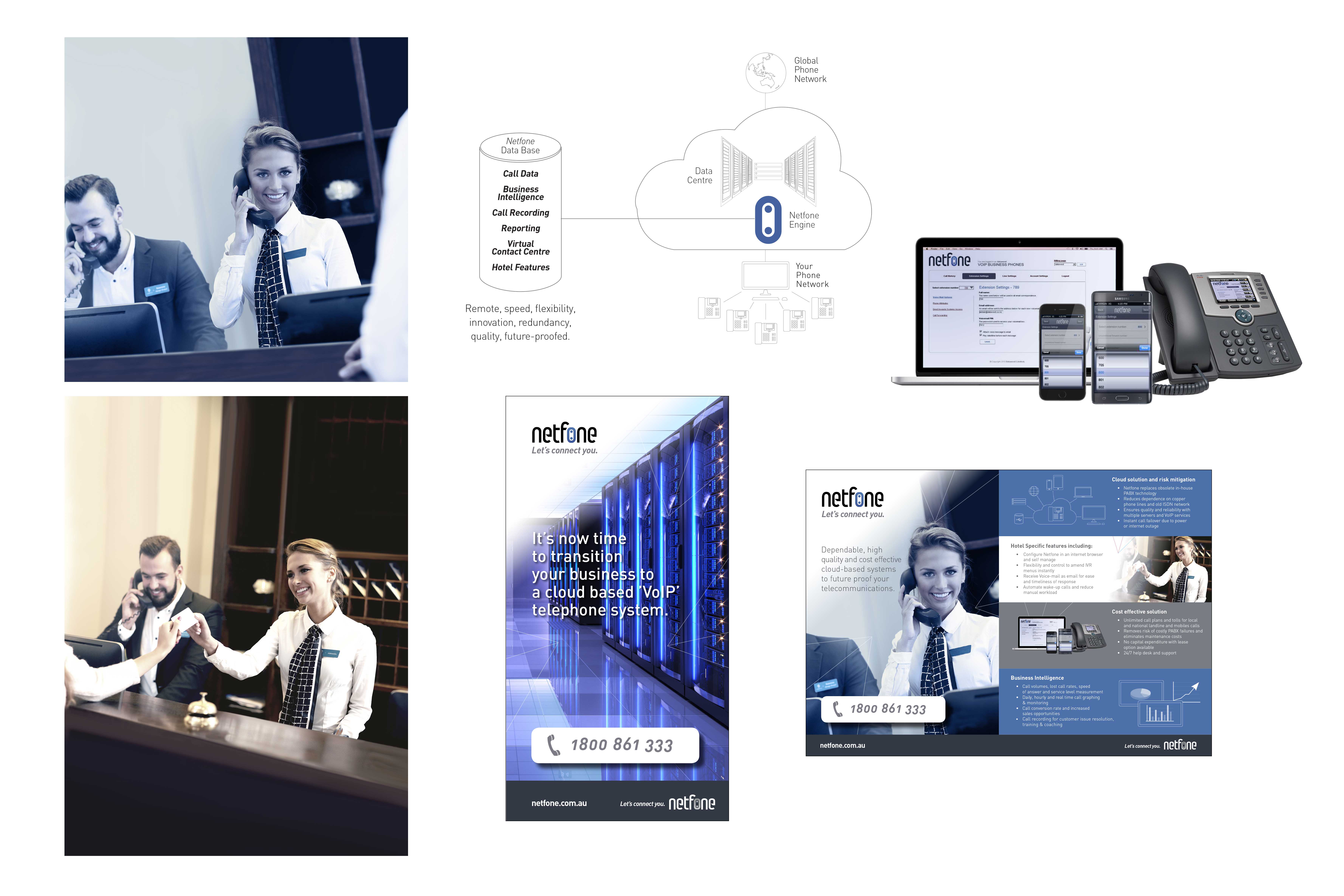
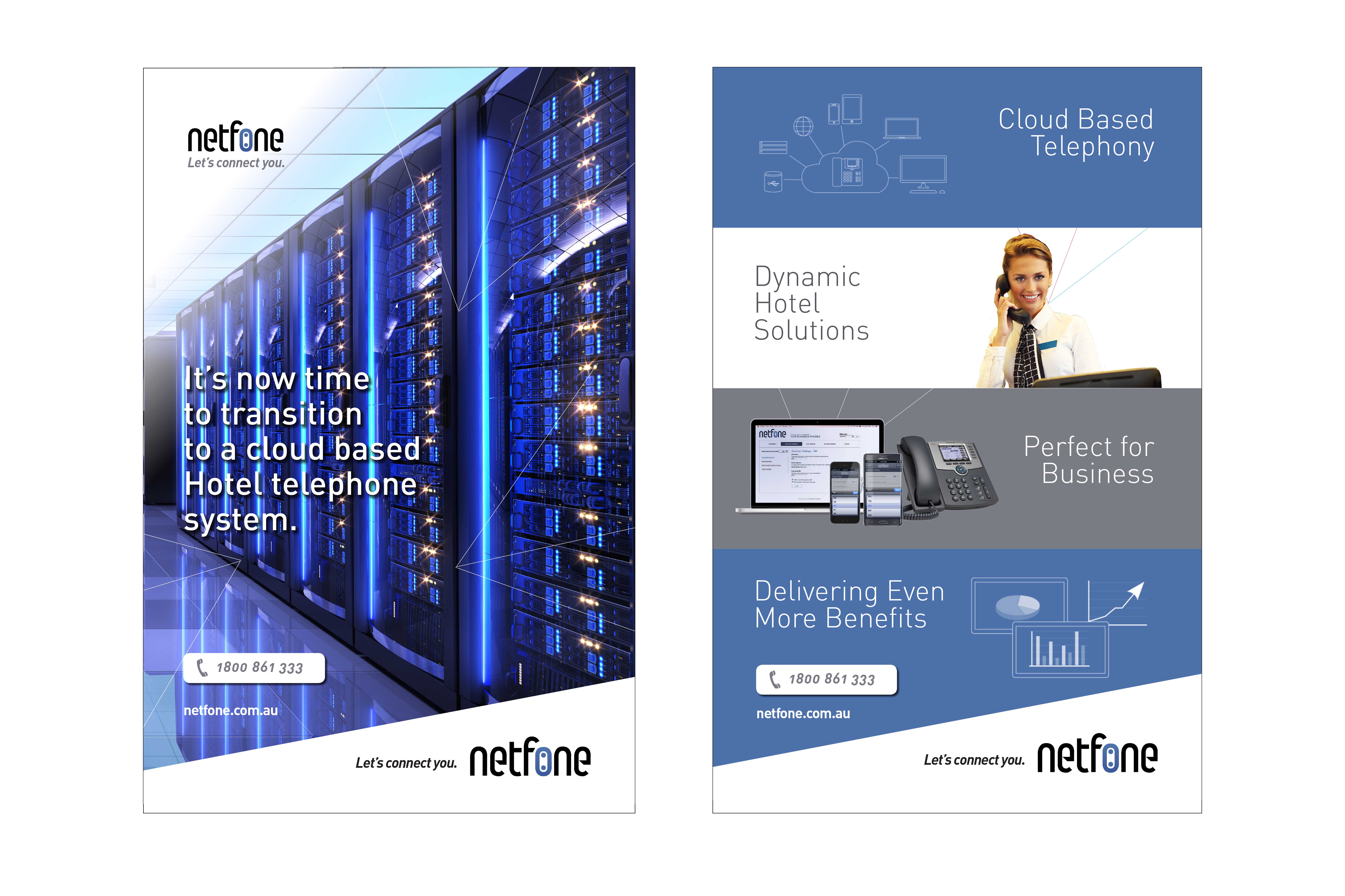
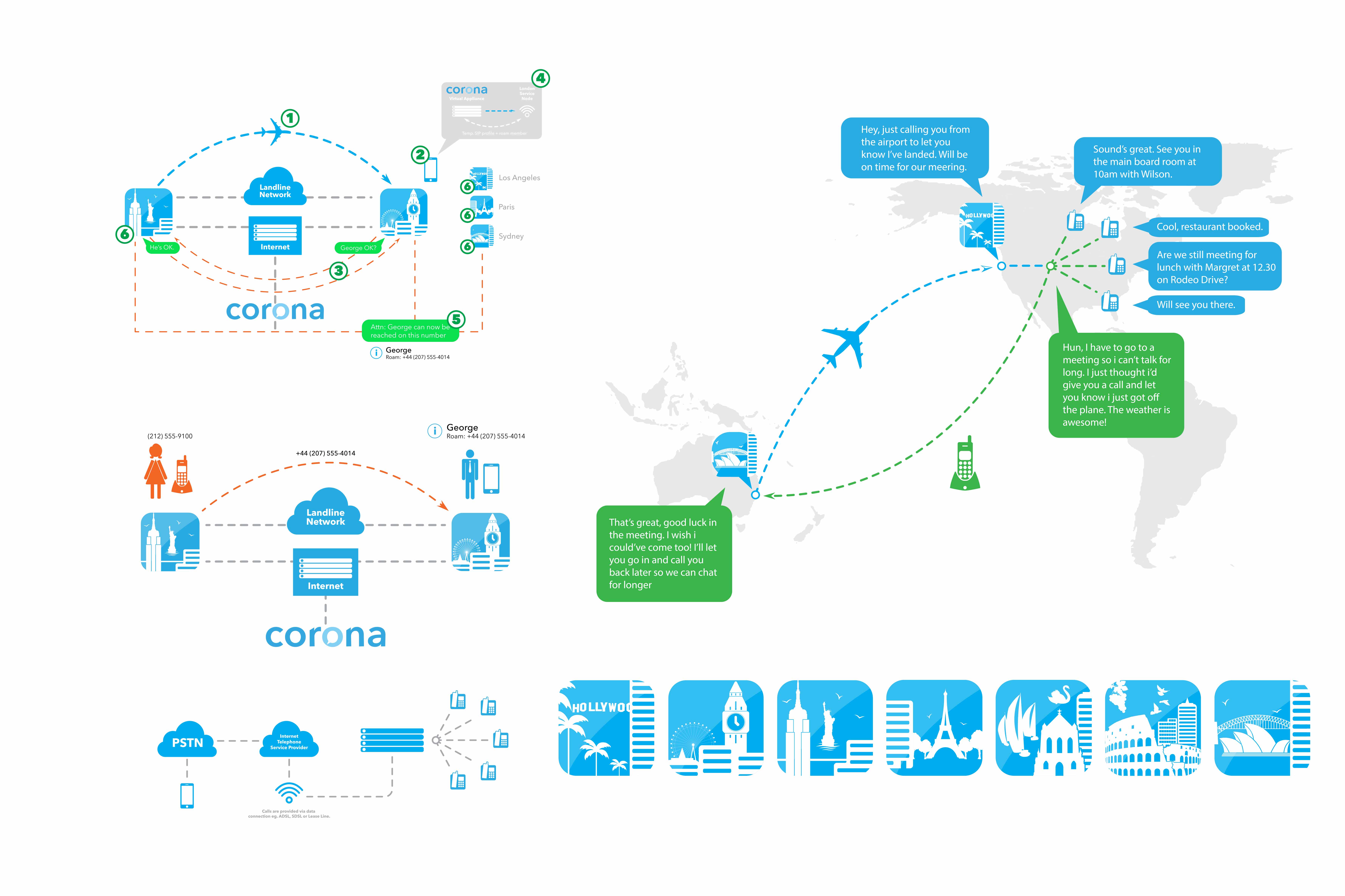
“Netfone were looking to extend into Australia but their website needed a whole new look and then the sales brochures and corporate branding needed to run with the new website to tell the story. Wildfire looked a Duotones and using stock shots was able to create a “Storyscape” for Netfone that far exceeded the brand to date.”
.
.
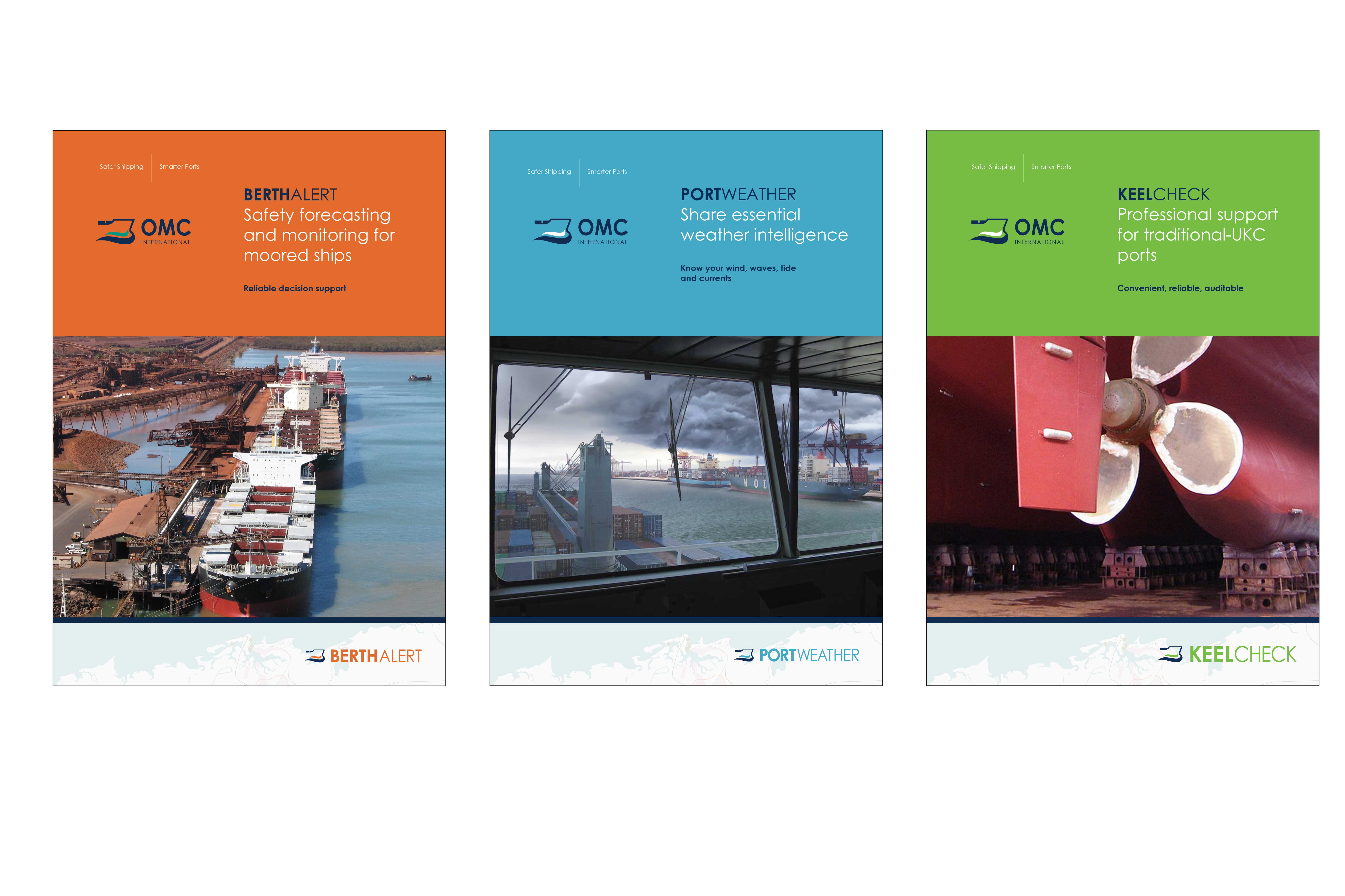
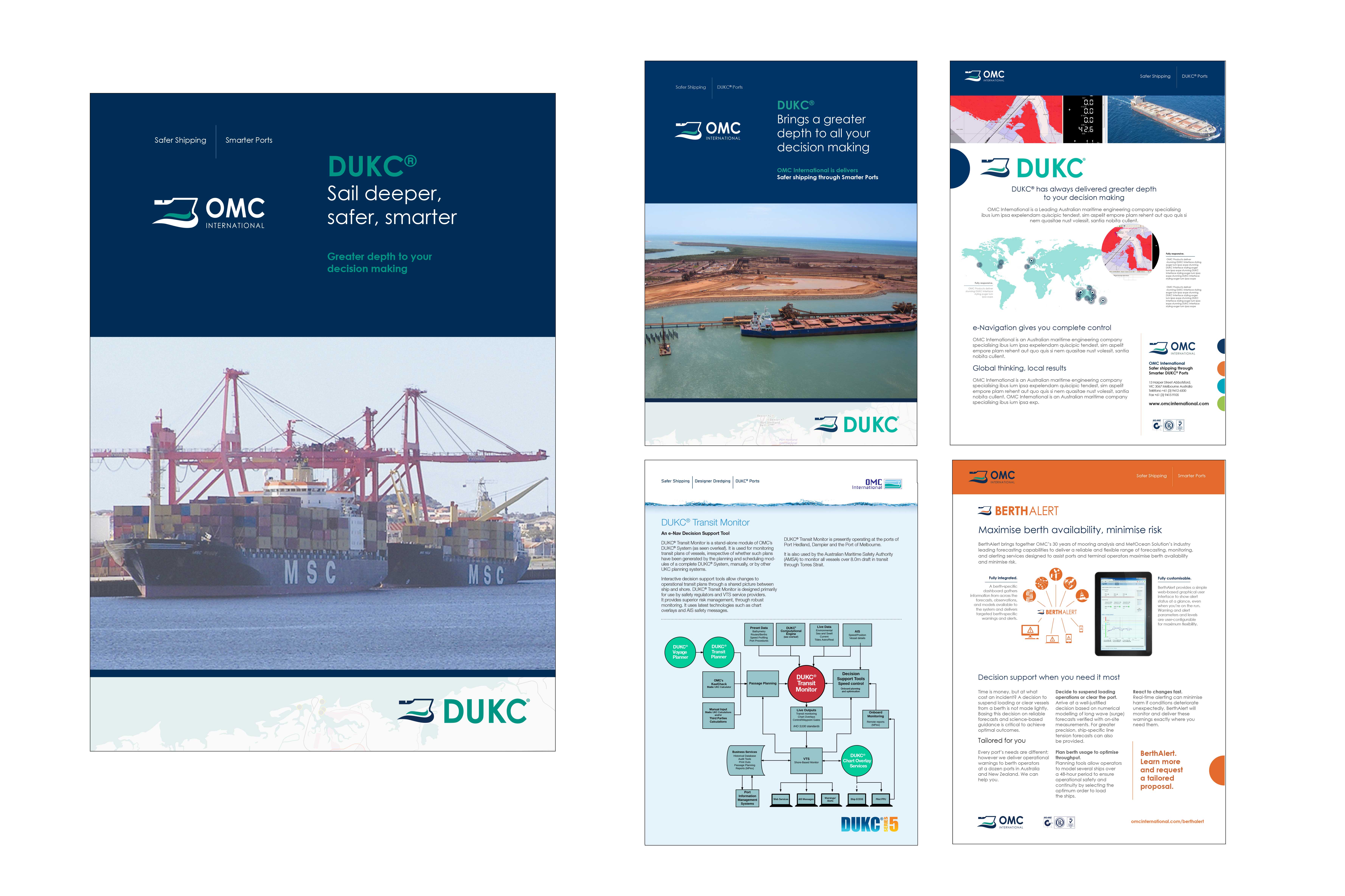
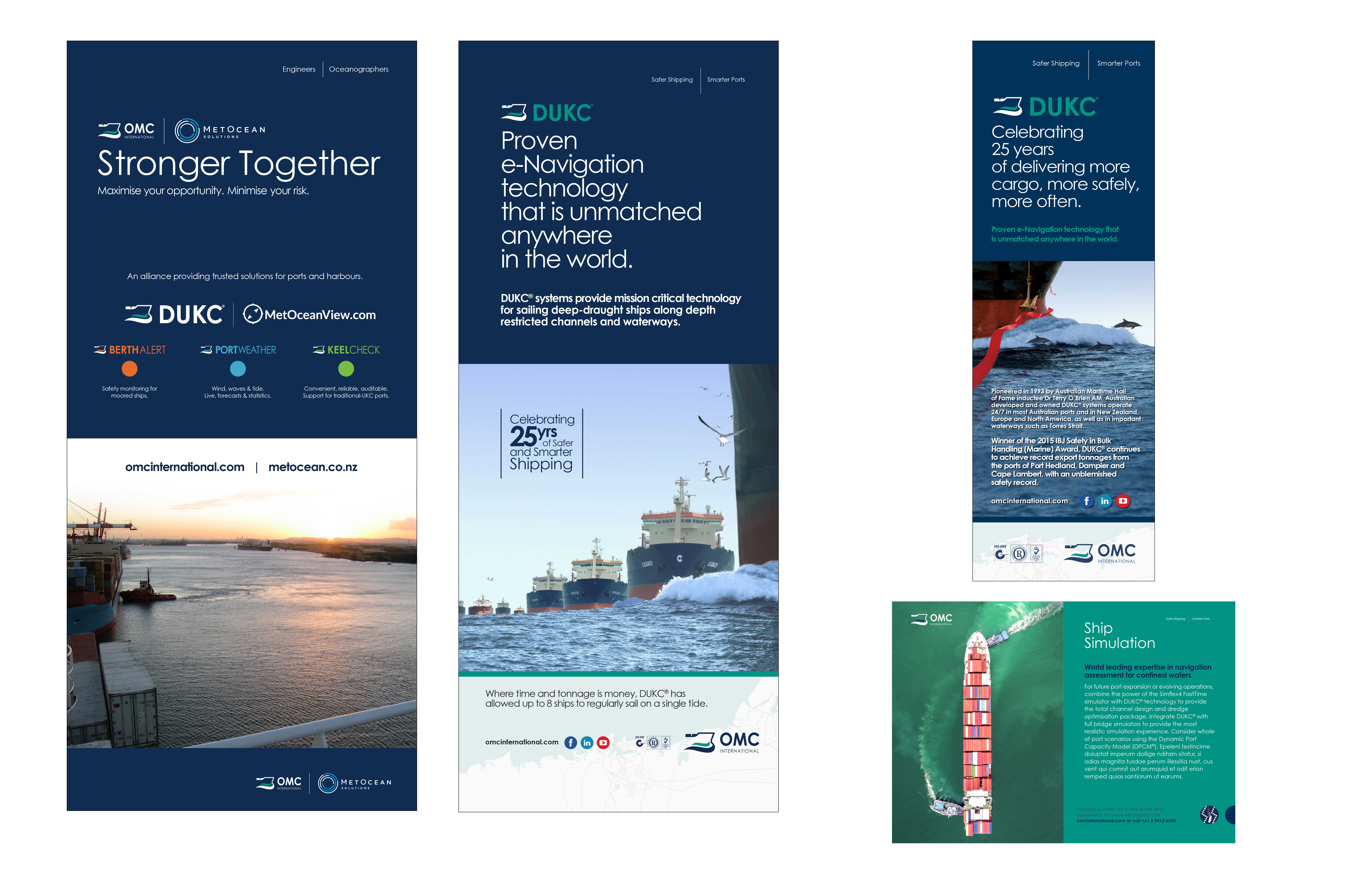
“OMC International is one of Wildfire’s oldest most steadfast Clients. They have worked with Myke Mollard for over 15 years and Wildfire has seen this company through a couple of corporate logo changes, three branding changes as the company has evolved and grown. This new style was in response to their latest direction to develop more lite-products and move into the world of Apps and more portable applications for their software.”
.
.
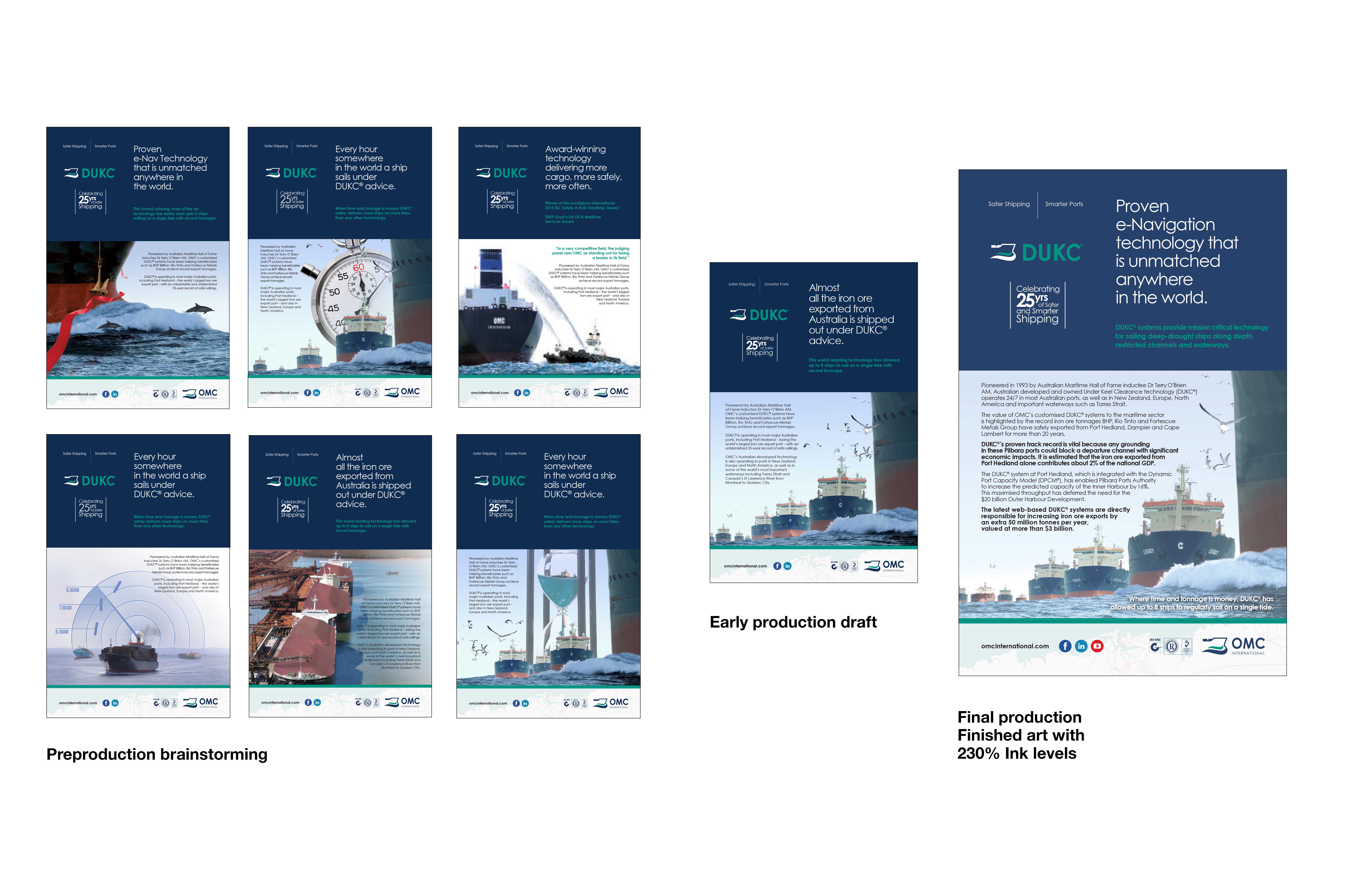
“Wildfire recently developed this Australian Newspaper Ad for OMC International and here you can see the evolution from Brainstorming to the final Ink Level adjusted news print ready advertising 1/4 page advert. Here you can also see the evolution of the copy-lines and even thought the advertising had a lot of copy it was strategic to have it there.”
.
.
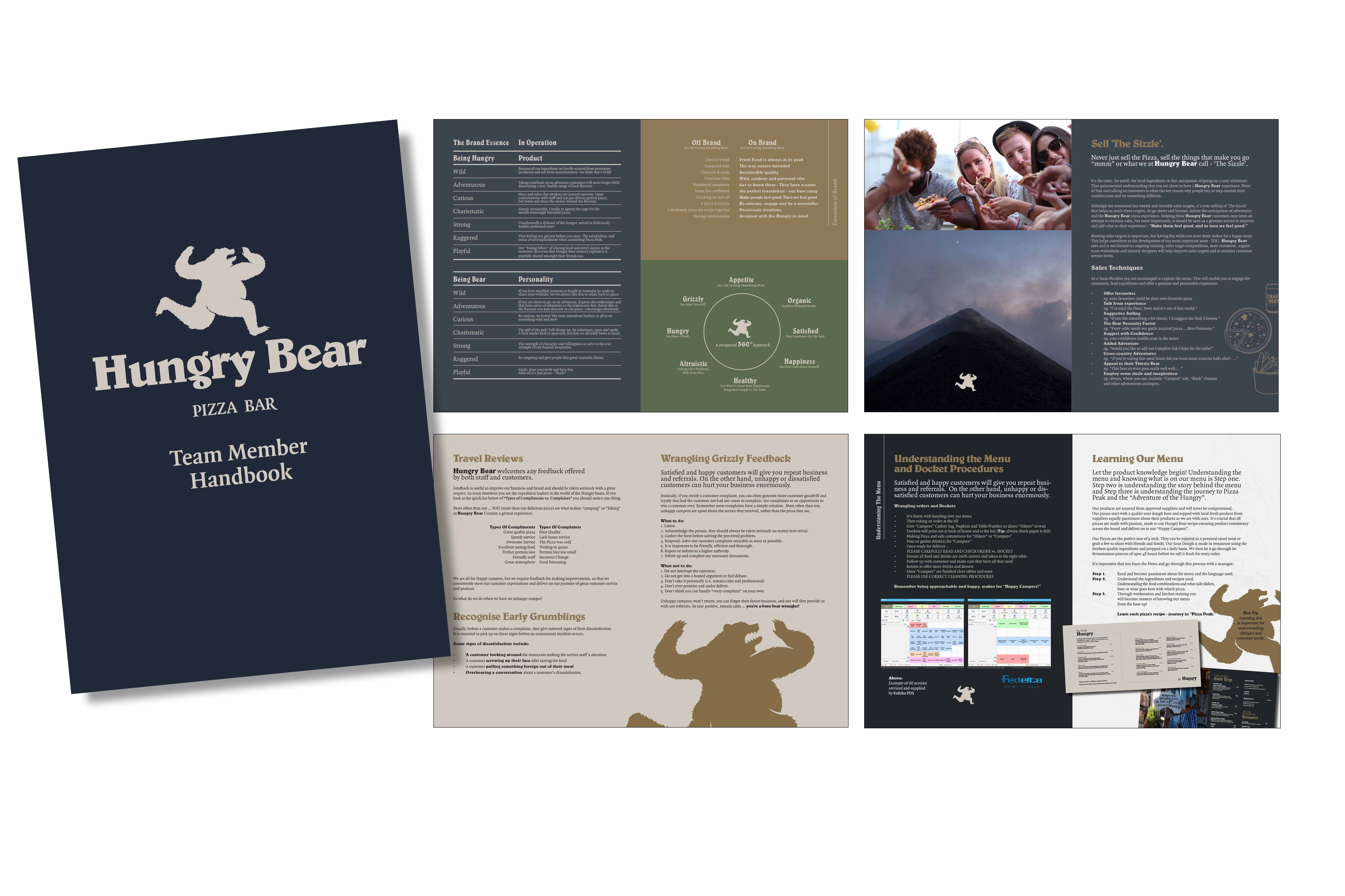
“Wildfire really gave Hungry Bear Pizza a great Branding start. From training manuals to in-store training posters, advice with shop design, Menus, coffee mugs and Branding books. We took a Pizza shop and totally found it’s sense of adventure.”
.
.
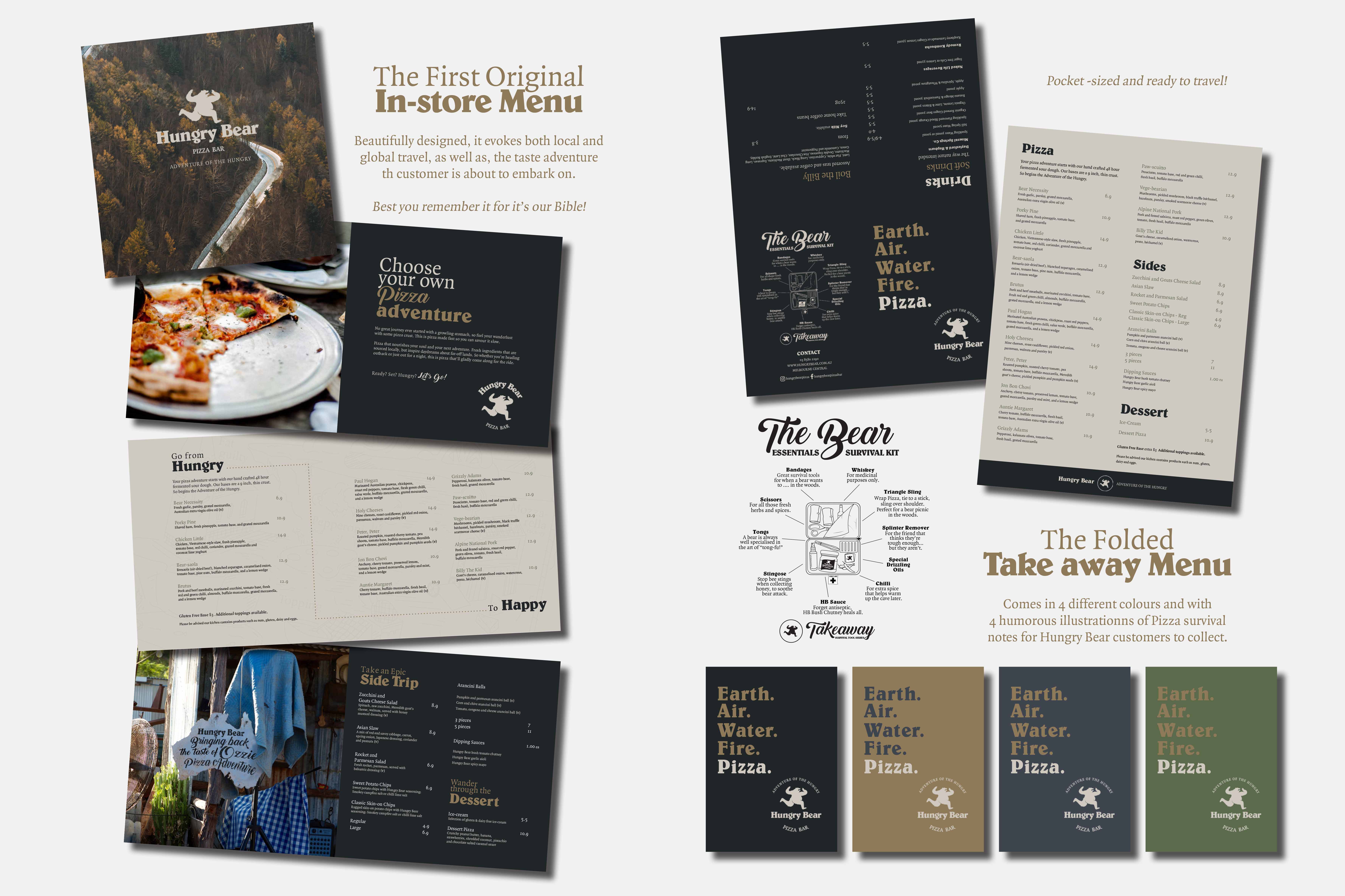
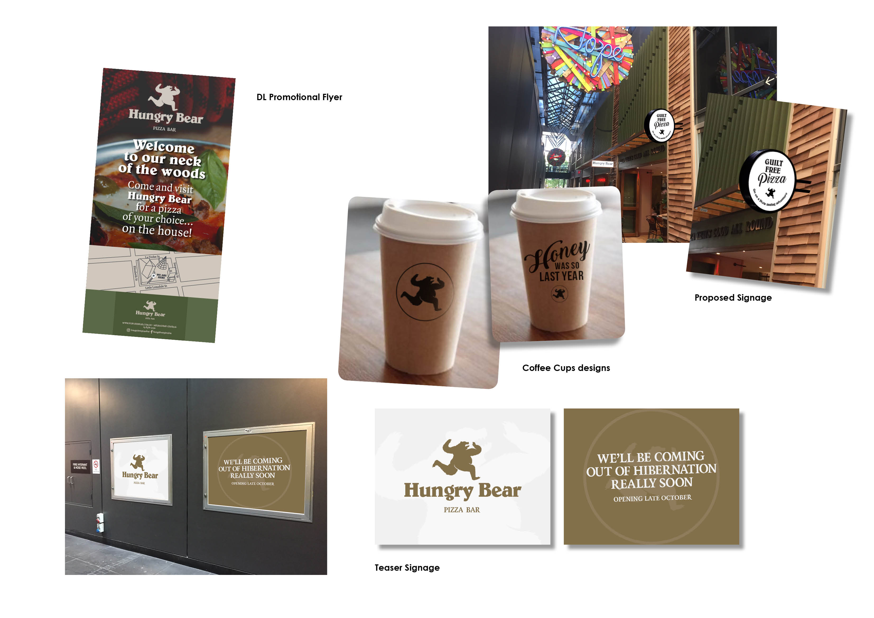
“Hungry Bear Pizza menus were very stylised. Clean elegant designs developed by a branding agency. But there was something missing and the owners wanted more from this. So Wildfire Productions quickly developed a branding experience that had a real sense of Adventure. Bold and grizzy like the bear on the logo, Wildfire developed brading to bring the outdoors indoors and the “Adventure of the Hungry” was born.”
.
.
“The Hungry Bear Theme was great to explore and Wildfire were totally at home writing fantastic lines to inspire customers and tap into their own sense of Pizza adventure.”
.
.
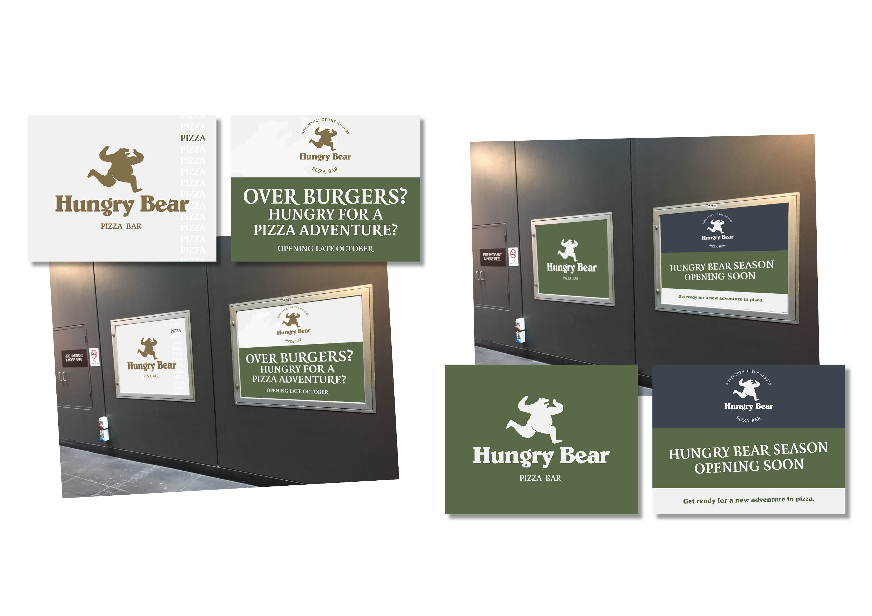
“It was quirky and out there as the name suggests and again the theme and branding helped in delivering concepts that were catchy and had some bite to them.”
.
.
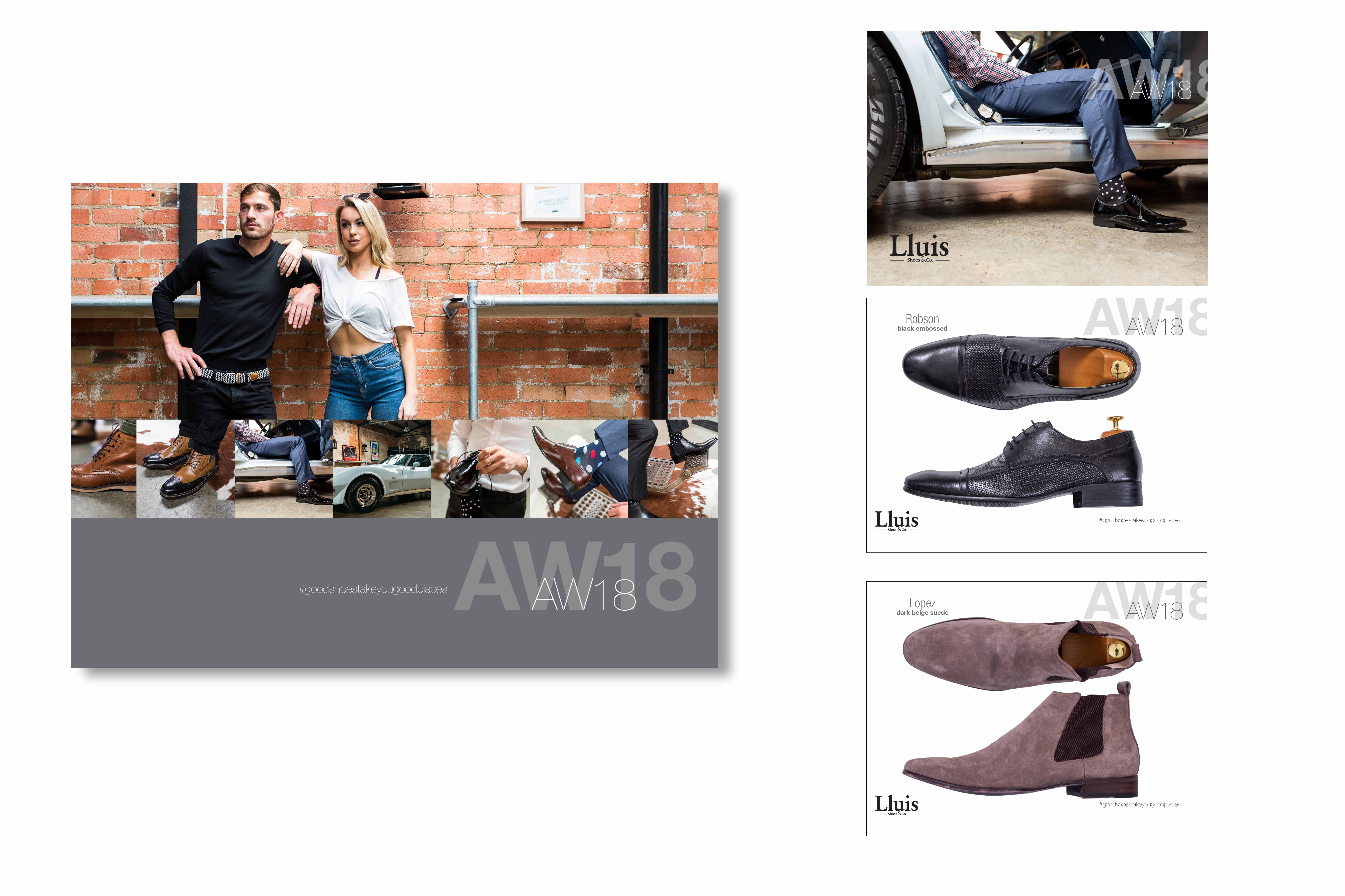
“Lluis Shoes & Co. was great to explore and Wildfire were totally at home writing fantastic lines to inspire customers and tap into their own sense of Pizza adventure.”
.
.
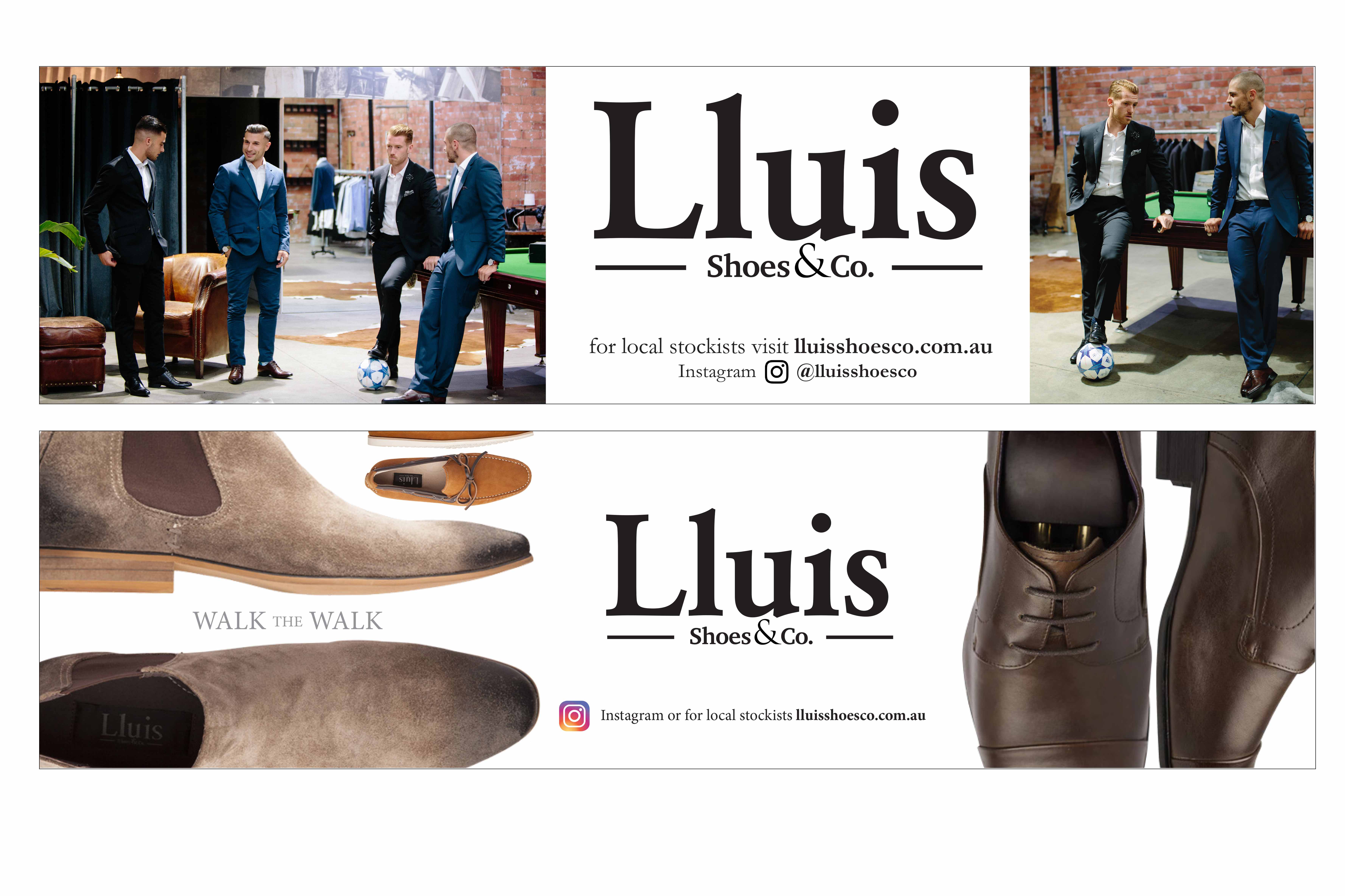
“Lluis Shoes & Co. had the opportunity to a create a super-site Billboard. Wildfire relished the challenge and jumped on this in days. The top one was the actual billboard used showing the Lluis Shoes & Co. Lifestyle, but we actually believe making a hero of the shoes, the fashion and the range was possibly a better way to go. Both work and get the client out there “Walking the Walk!” on the street.”
.
.
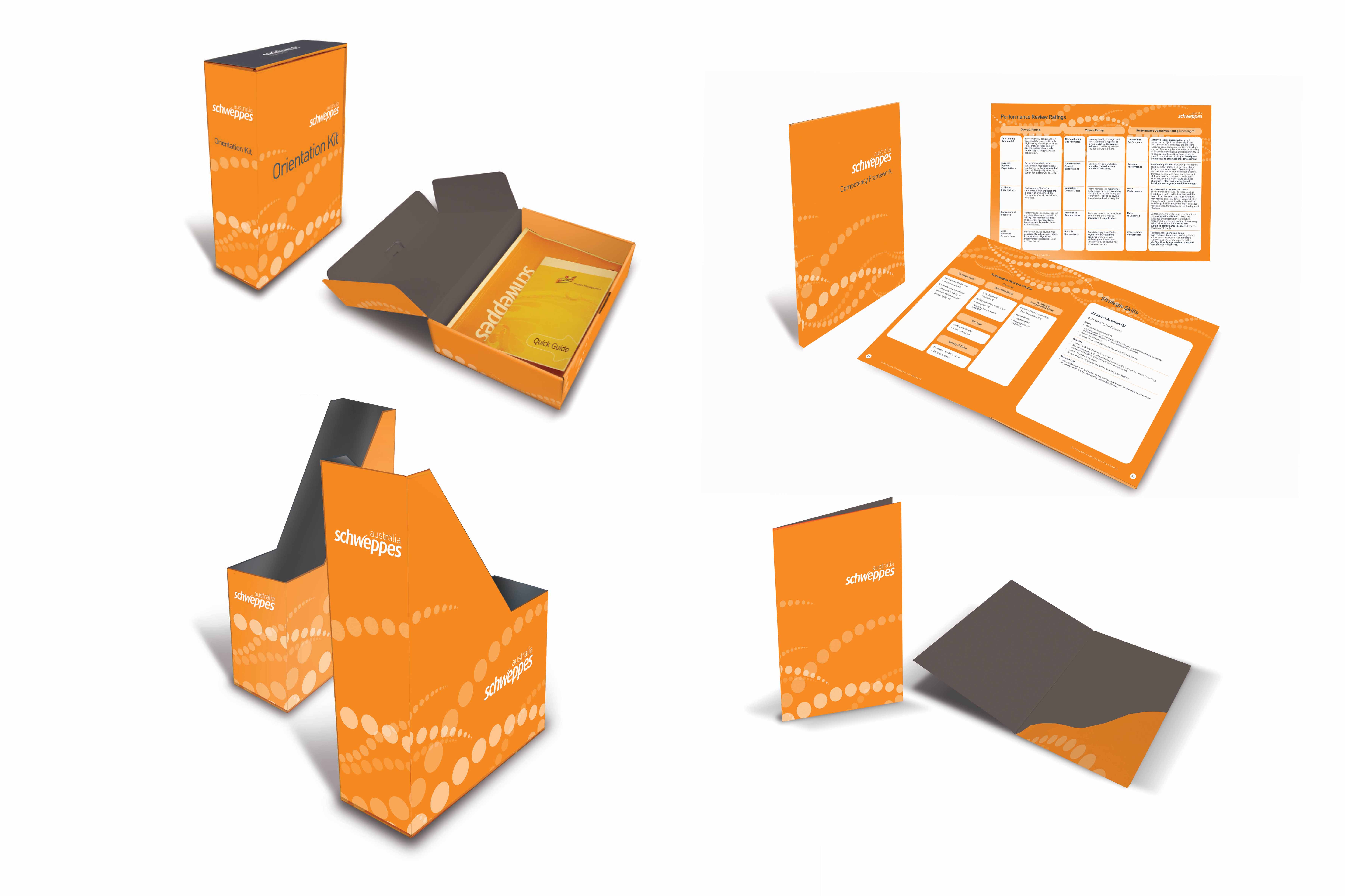
“Wildfire is one of a select few of Schweppes’ preferred suppliers. These sales tools and sales packs are a range of items created for Schweppes across 2012 – 2016.”
.
.
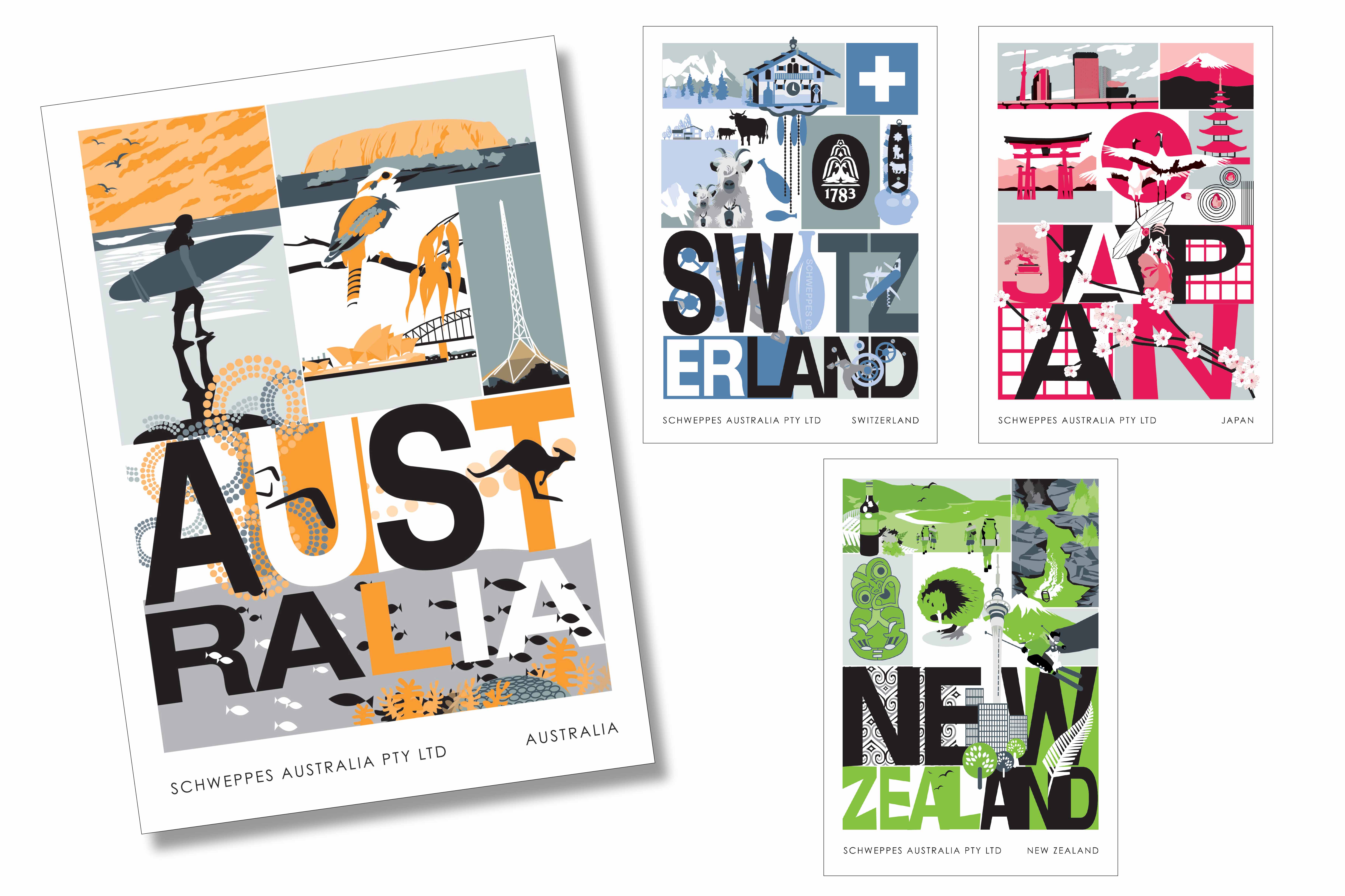
“This internally used staff postcards range was used by Schweppes HR department to highlight the international presence of Schweppes Worldwide. Myke Mollard illustrated these funky postcards developed from a style chosen by the Schweppes team and illustrated or made to order.”
.
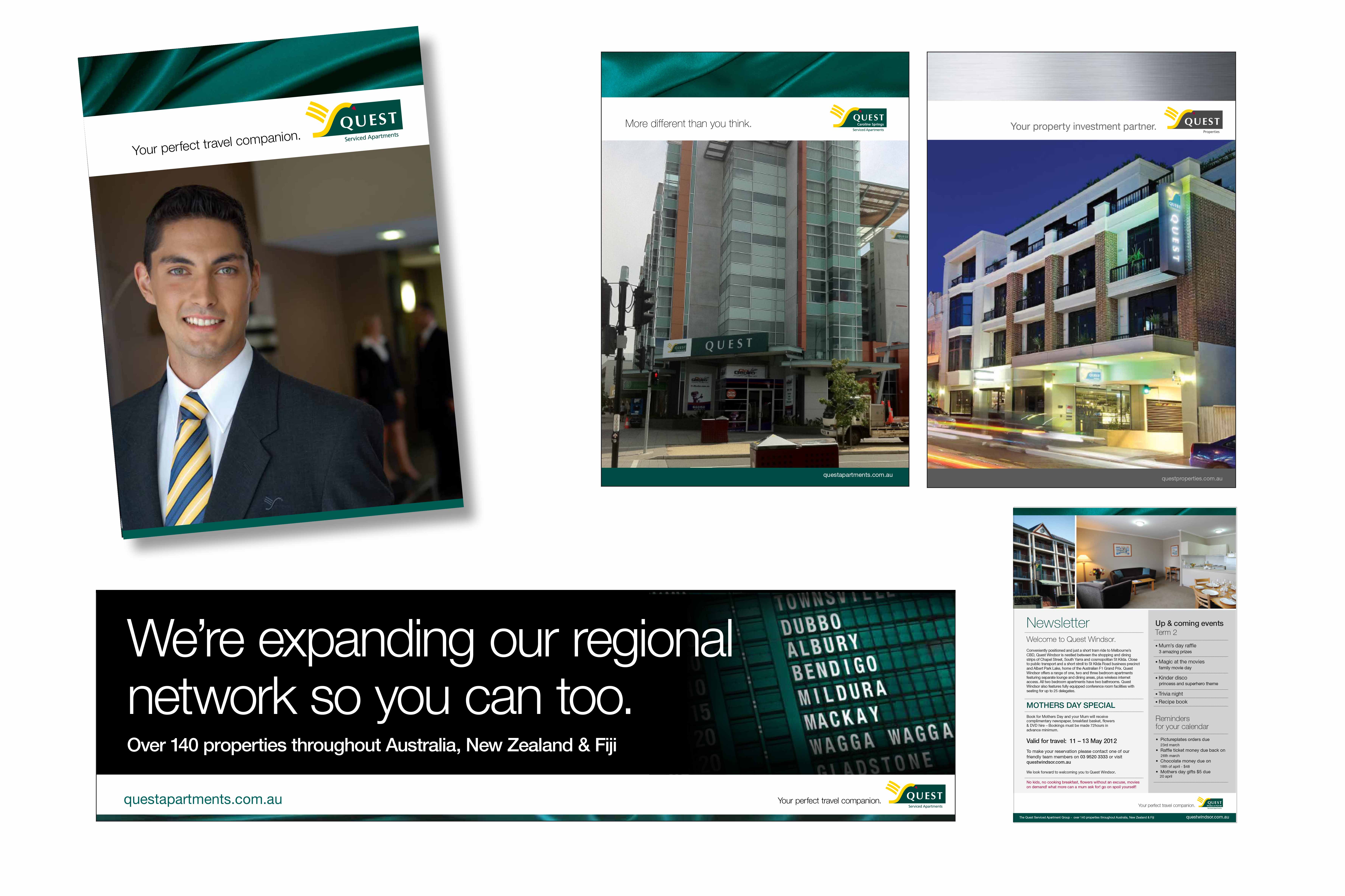
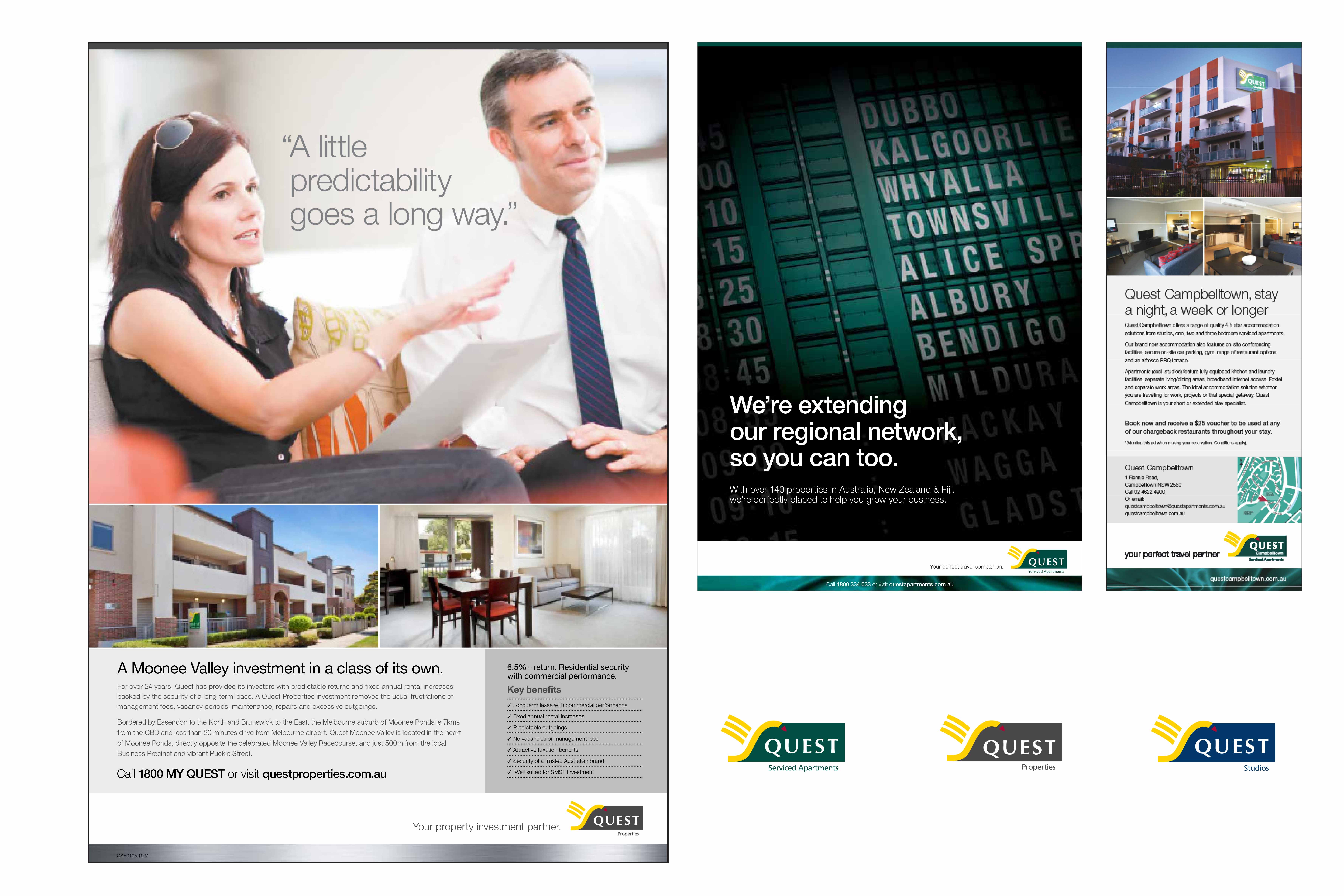
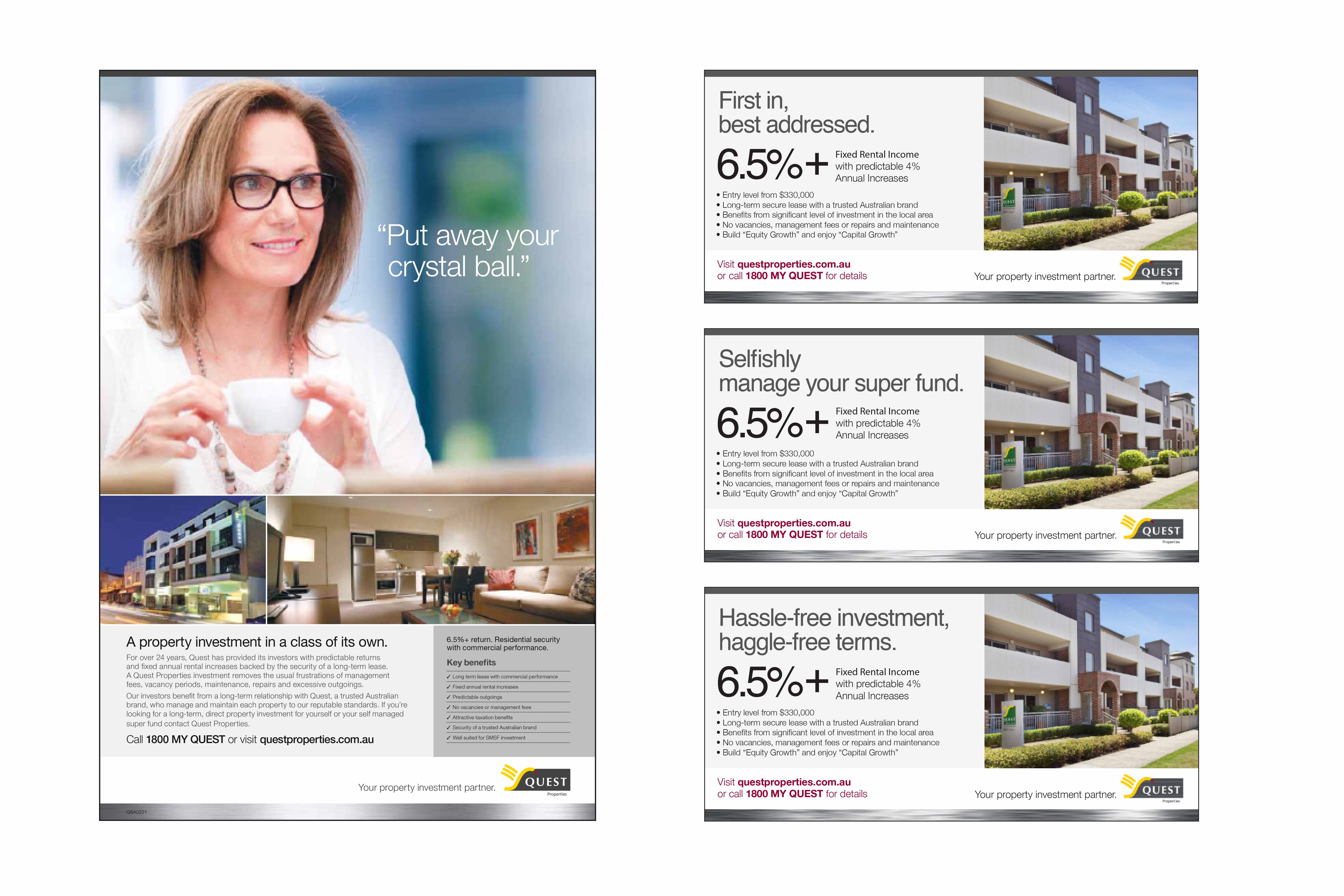
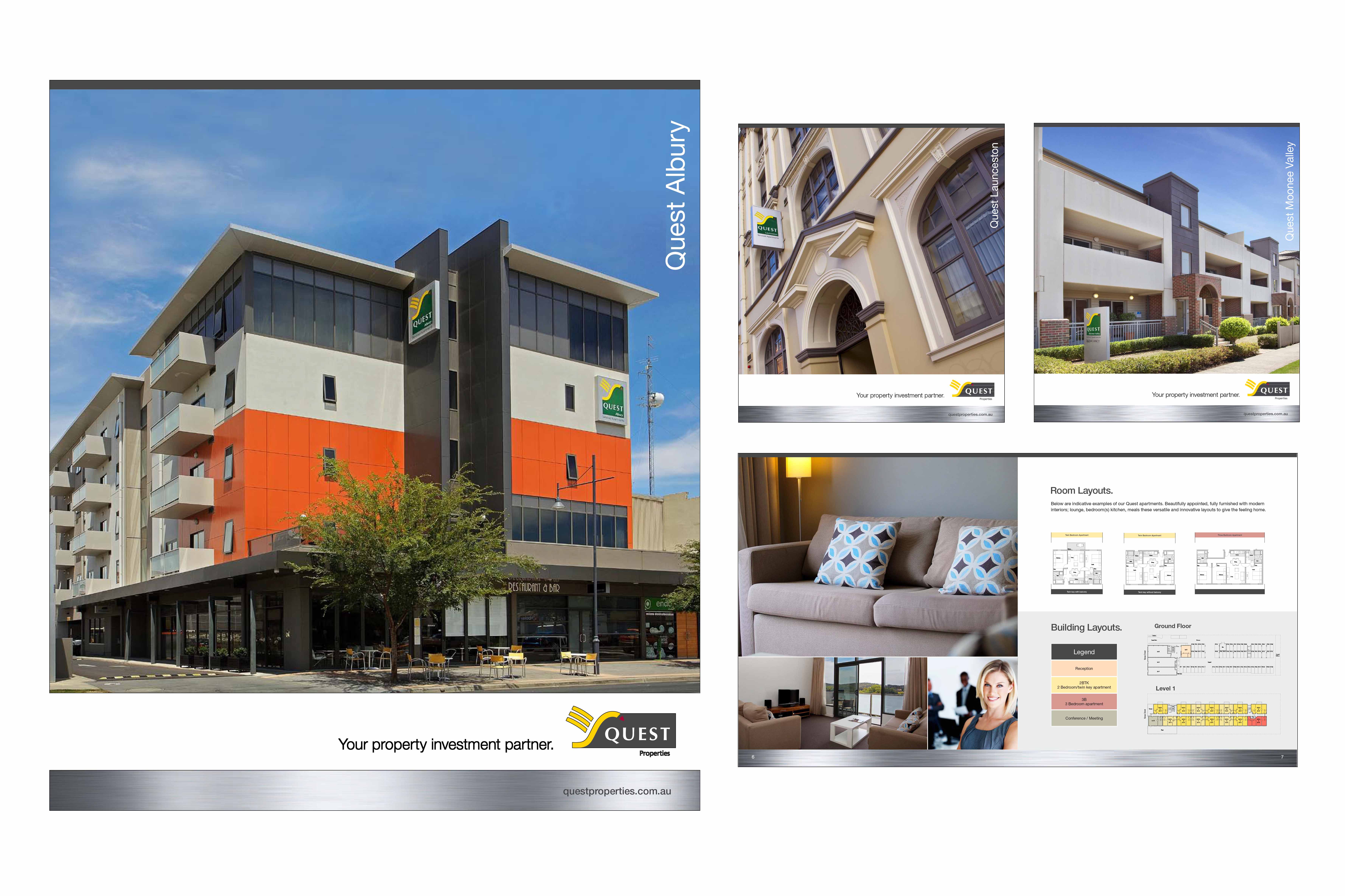
Quest Serviced Apartments circa 2012 – 2014 – Branding refresh and Tri-Brand Launch.
.
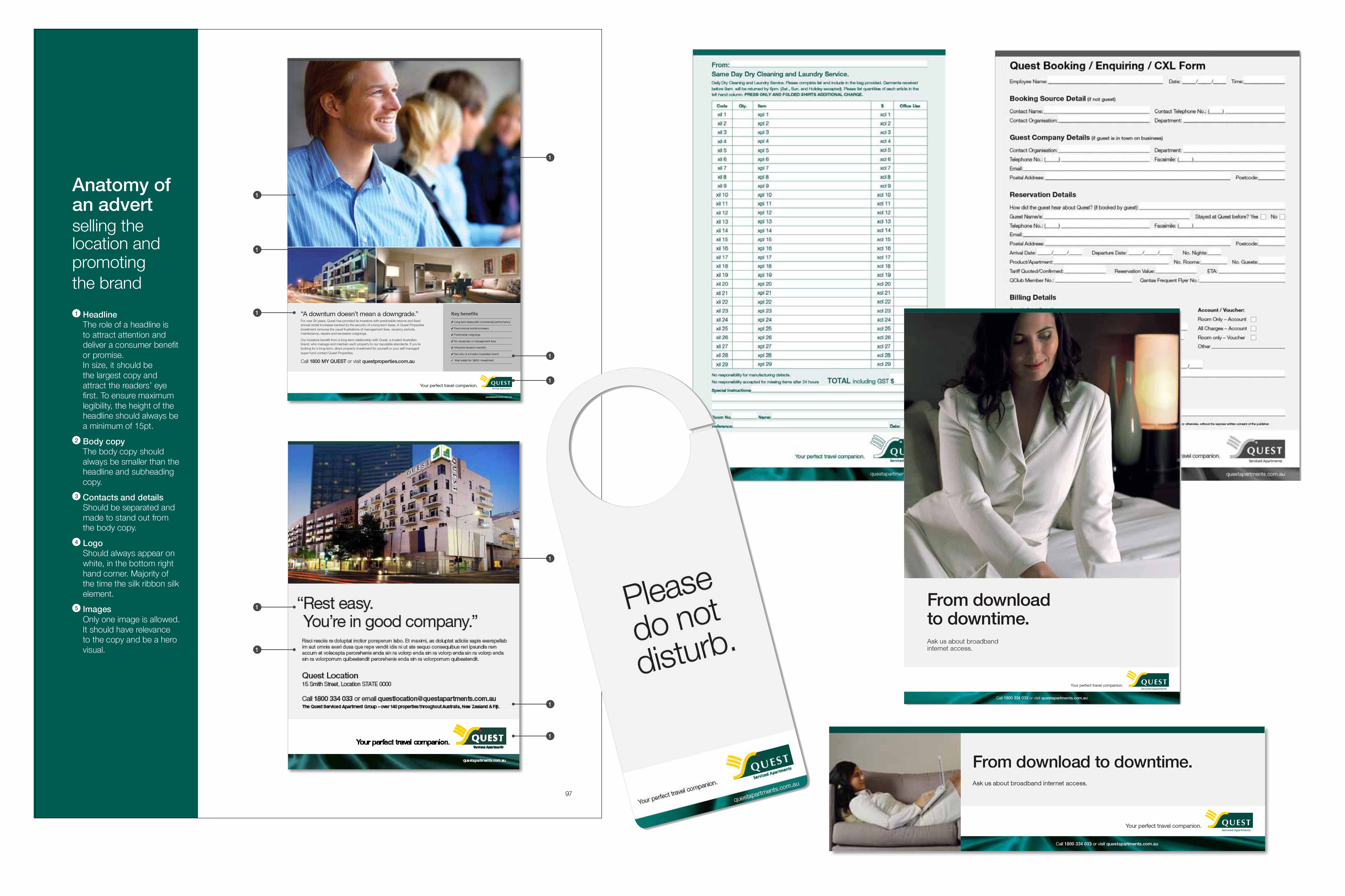
“Myke Mollard, worked on Quest for 3-4 years. Originally servicing the account at Plutonium, through DPA onDemand Printing, when he moved to Advertising Associates he developed their Tri-branded company departments (Quest Serviced Apartments, Quest Studio Apartments and Quest Properties). Myke launched Quest Properties in and set up style guides before moving to other accounts.”
.
.
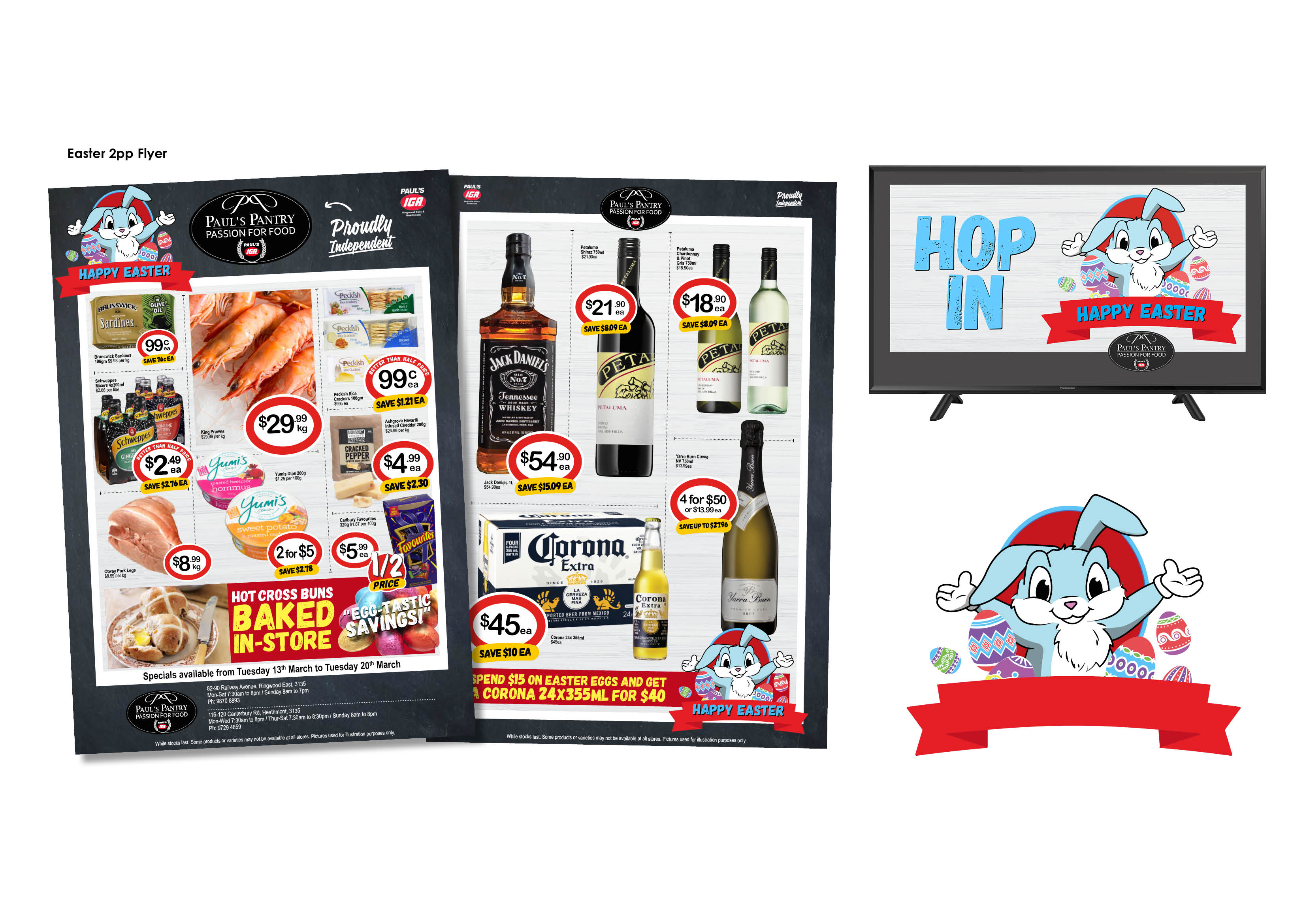
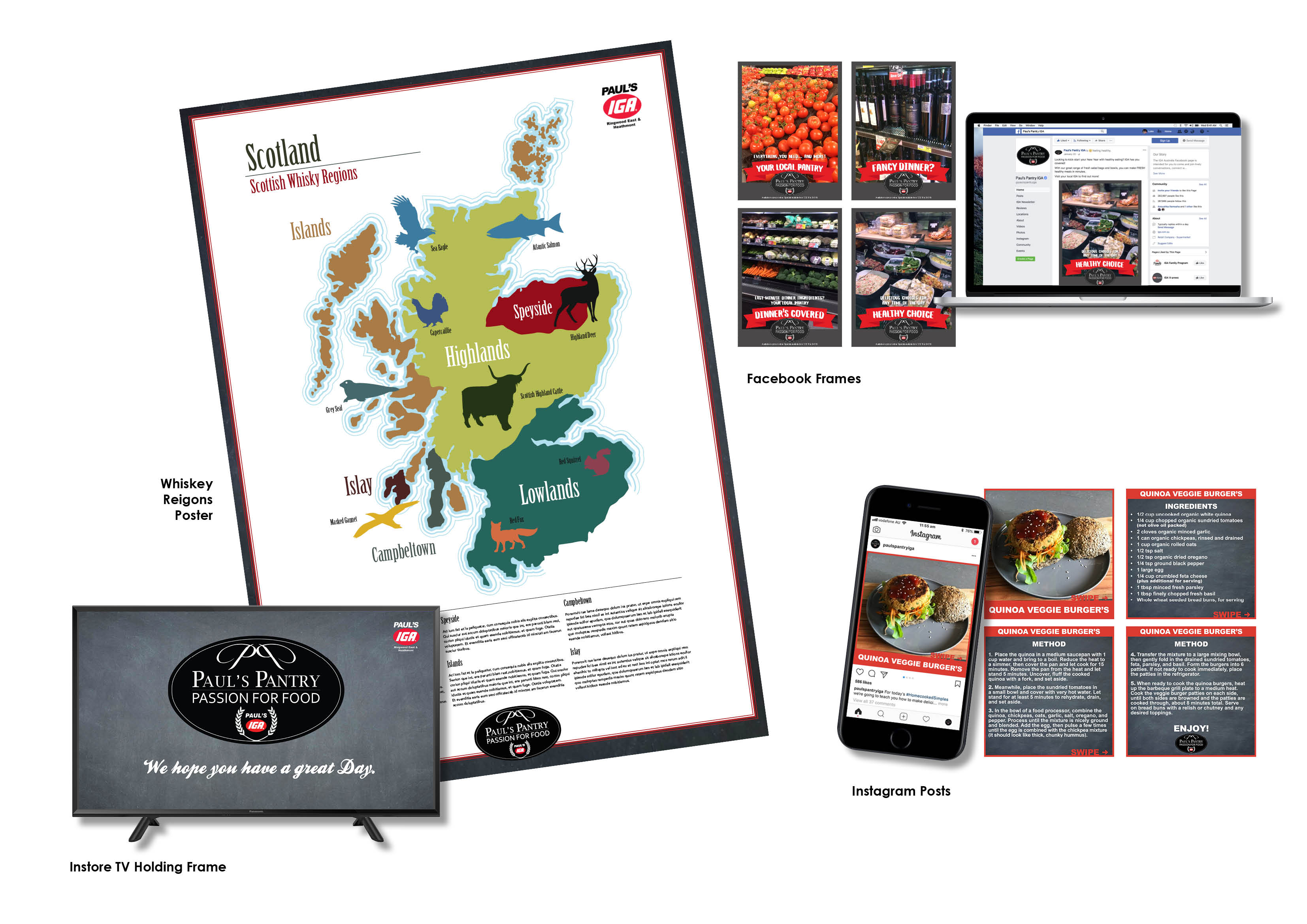
“Luke has just started, but it’s return to retail advertising for Myke as they have begun work with a local supermarket; Paul’s Pantry (Super IGA and Liquor) producing a range of materials to help online ordering, in-store traffic and seasonal promotions.”
.
.
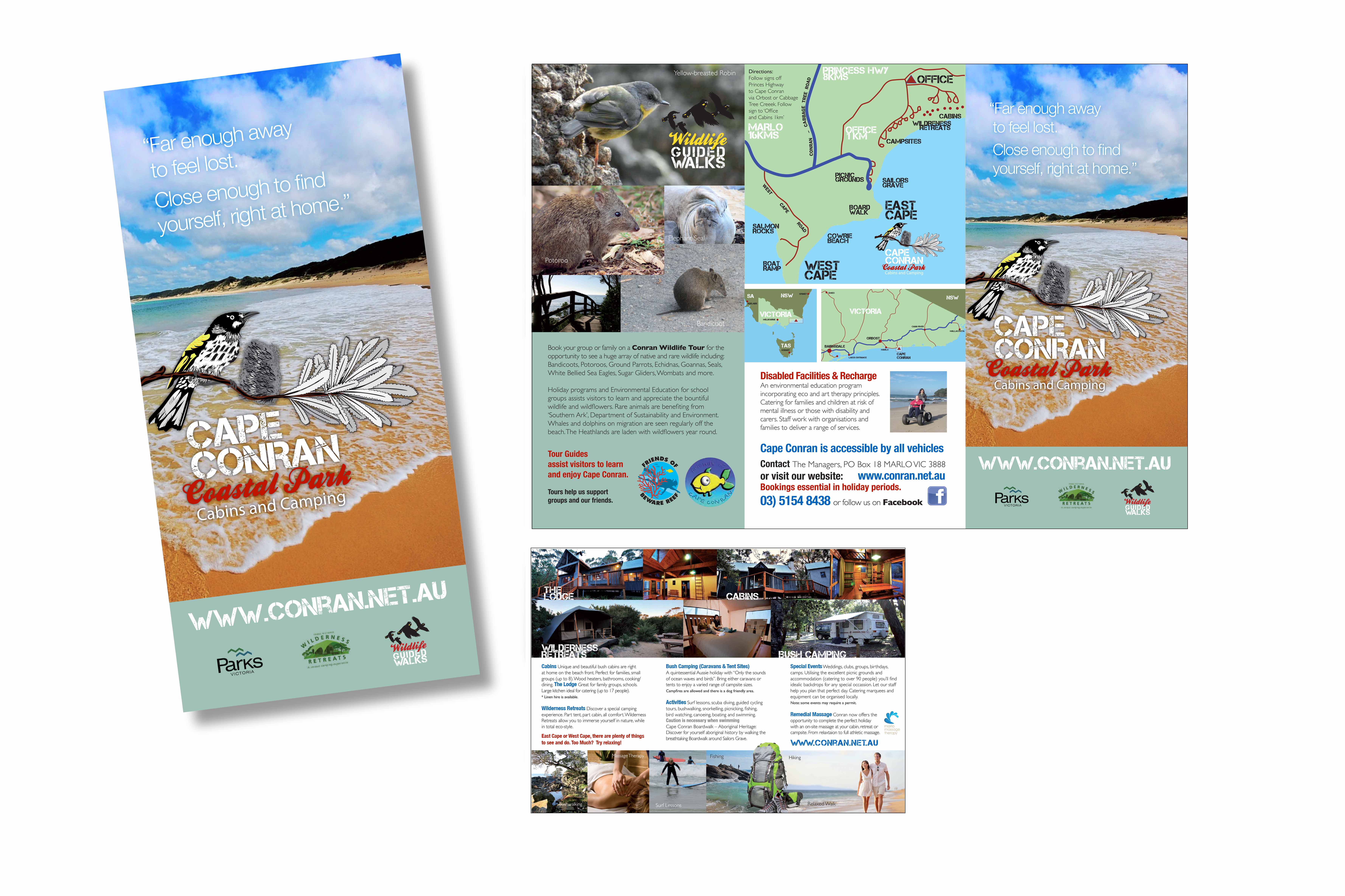
“Wildfire really enjoys promoting the great outdoors and adventure. Cape Conran Coastal Park flyer refresh is just one passionate project.”
.

.
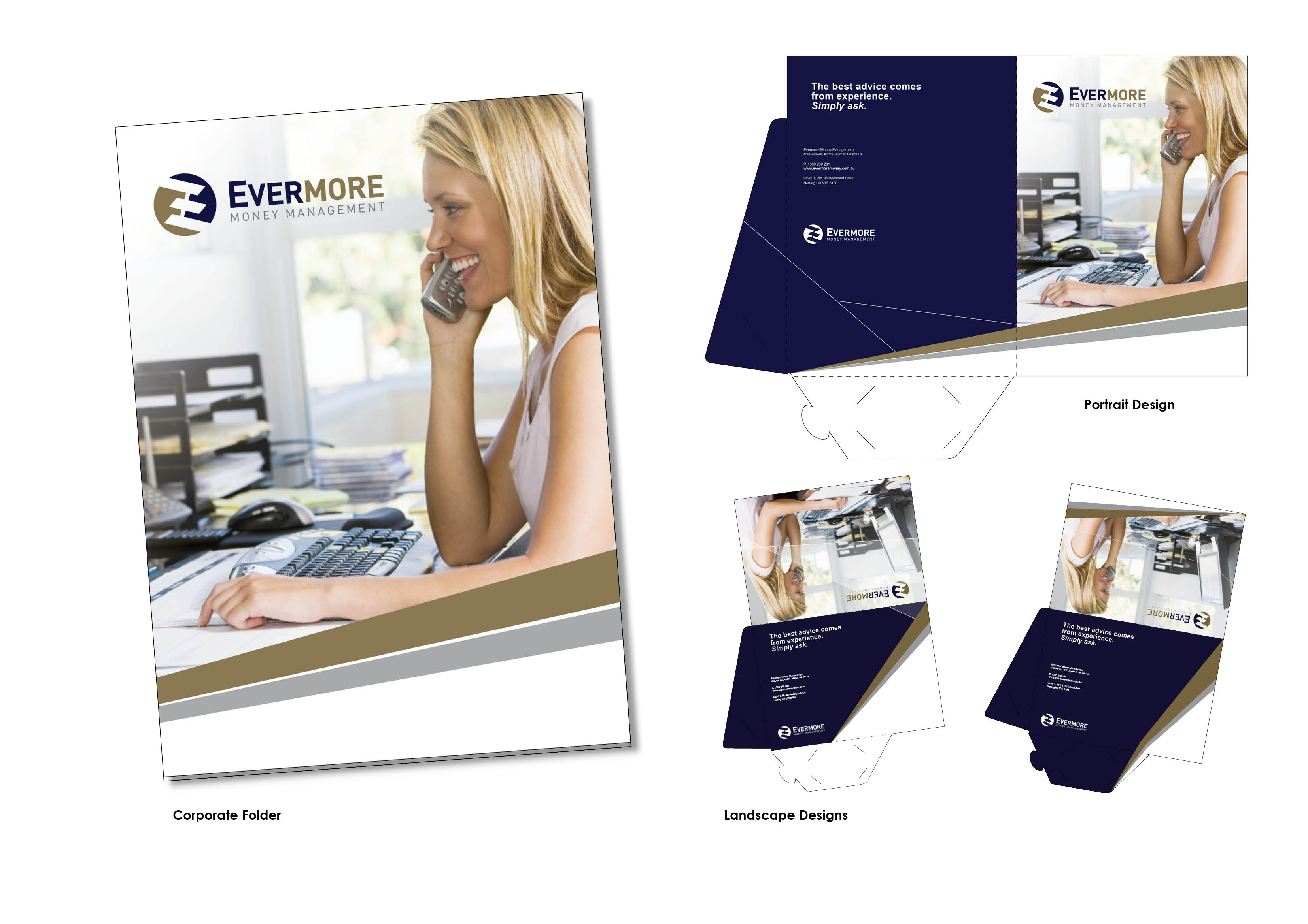
“Evermore and Cashmaster are linked. These logos above featuresd in the animated video for the Cashmaster App and The corporate folder design looks at portrait and landscape catalogues and documents Evermore are producing to stand out from the competition.”
.
.
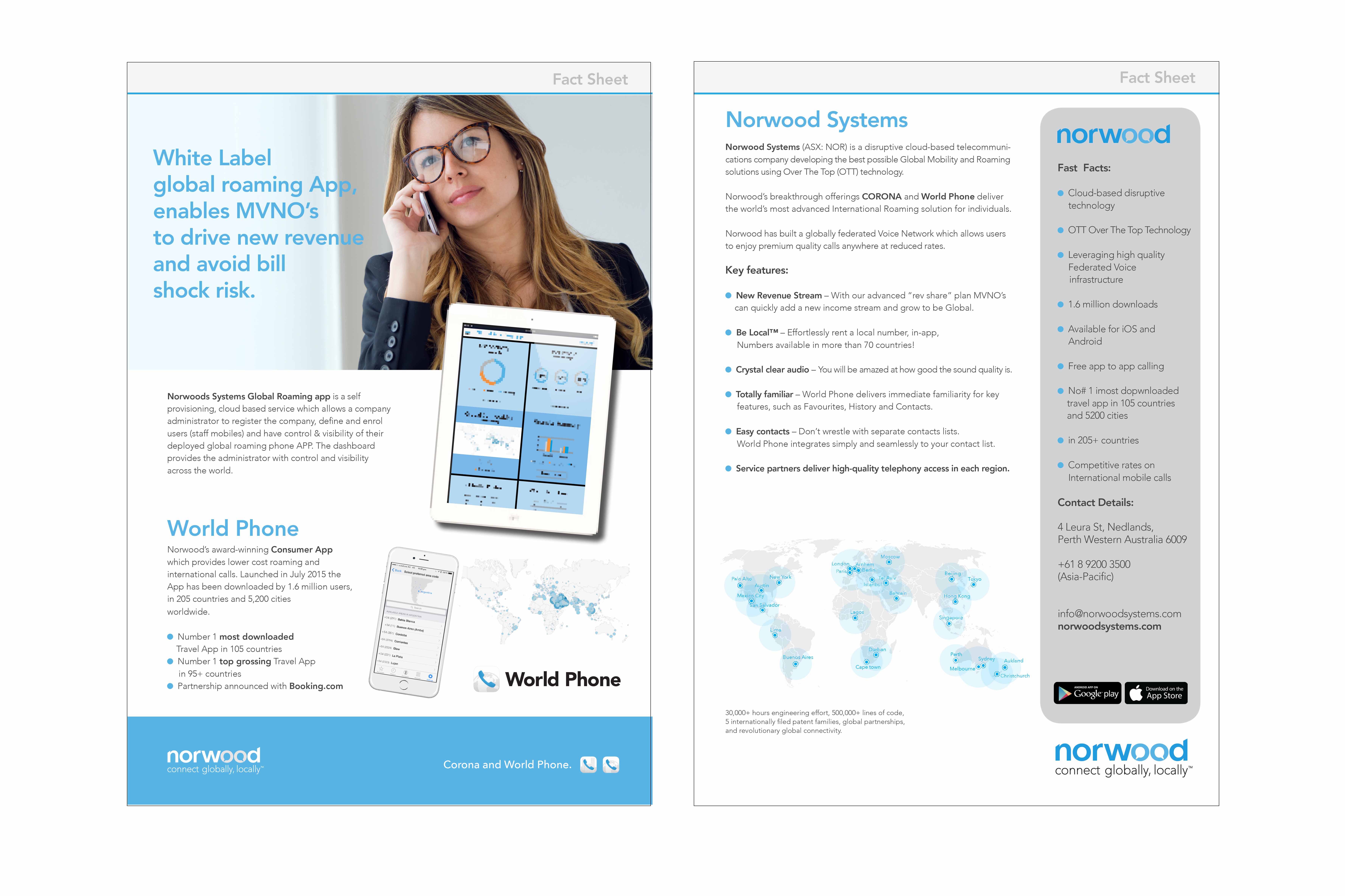
“Norwood designs above and below are demonstrated throughout this website. In 2015 – 2016 they did a major brand refresh. Wildfire really lifted the bar on their design and presentation as they launched onto the ASX before the design was taken more inhouse. Yet even now you can still see the identity Wildfire created back then as it was a modern and fresh approach. “
.
Our design “portfolio”‘ is primarily our print and branding design for advertising clients. Wildfire does “website”, “video” or “illustration” projects so if you want to see how out clients look please take a look at these folios on this website. We believe that all this body of work, demonstrates the highly immersive nature of design, logo work, layout and branding that creates an environment in which everything is connected and everything works and communicates to the audience. In a lot of ways, Wildfire isn’t formulaic or straight forward. Wildfire is organic and human-like and all our work has a personality and style which is classic in structure, but gregarious and bold in nature. It tells a great story about our clients it says a lot about our capacity as designers.

