
.
At Wildfire we have a pretty high standard of design.
We look for “elegant solutions” and ways to communicate high volumes of information in digestible and effective ways. We also help clients deliver single minded propositions and communicate clear strategic advertising design. Our process and production has a way of sticking to design principals, as well as, breaking the rules to get the best from our design briefs.
It’s all in the execution. It’s easy to get lost in design, but we love the pure adrenalin that comes with designing clients brochures, banners, advertising and stationery. We take big picture approach to our clients needs. While one job might be all we have to work with we adhere to brand guidelines and create design that is has garnished us the next job again has propelled Wildfire to where it is today. If in design and advertising you are only as good as your last job, then looking back over the past 26 years we have some pretty great jobs to look forward to the future.
.
.
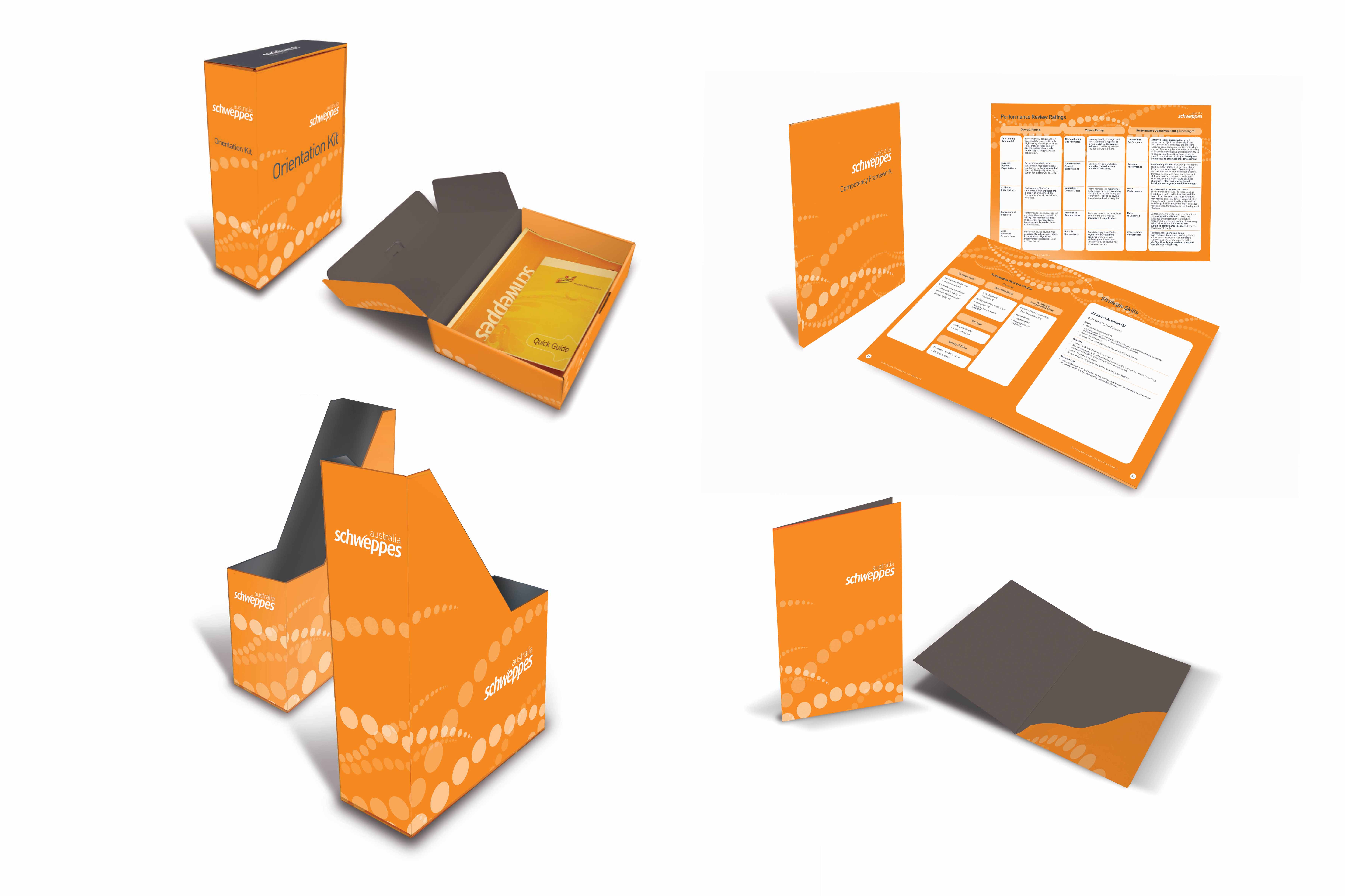
“Schweppes ask Wildfire to develop some old school branded Sales tools document holders. Plus a cardboard Sales pack for first time sales team members. These form cut stationery items had to have original forms created, go through a folding and testing and Mock up phase and printed both internally and externally. All the internal brochures and materials (to save cost) were colour matched and calibrated on a digital press as the packs and folders were extremely costly at such a small run. Schweppes were extremely happy with the result and it was deemed unsolvable by the existing agency at the time.”
.
.
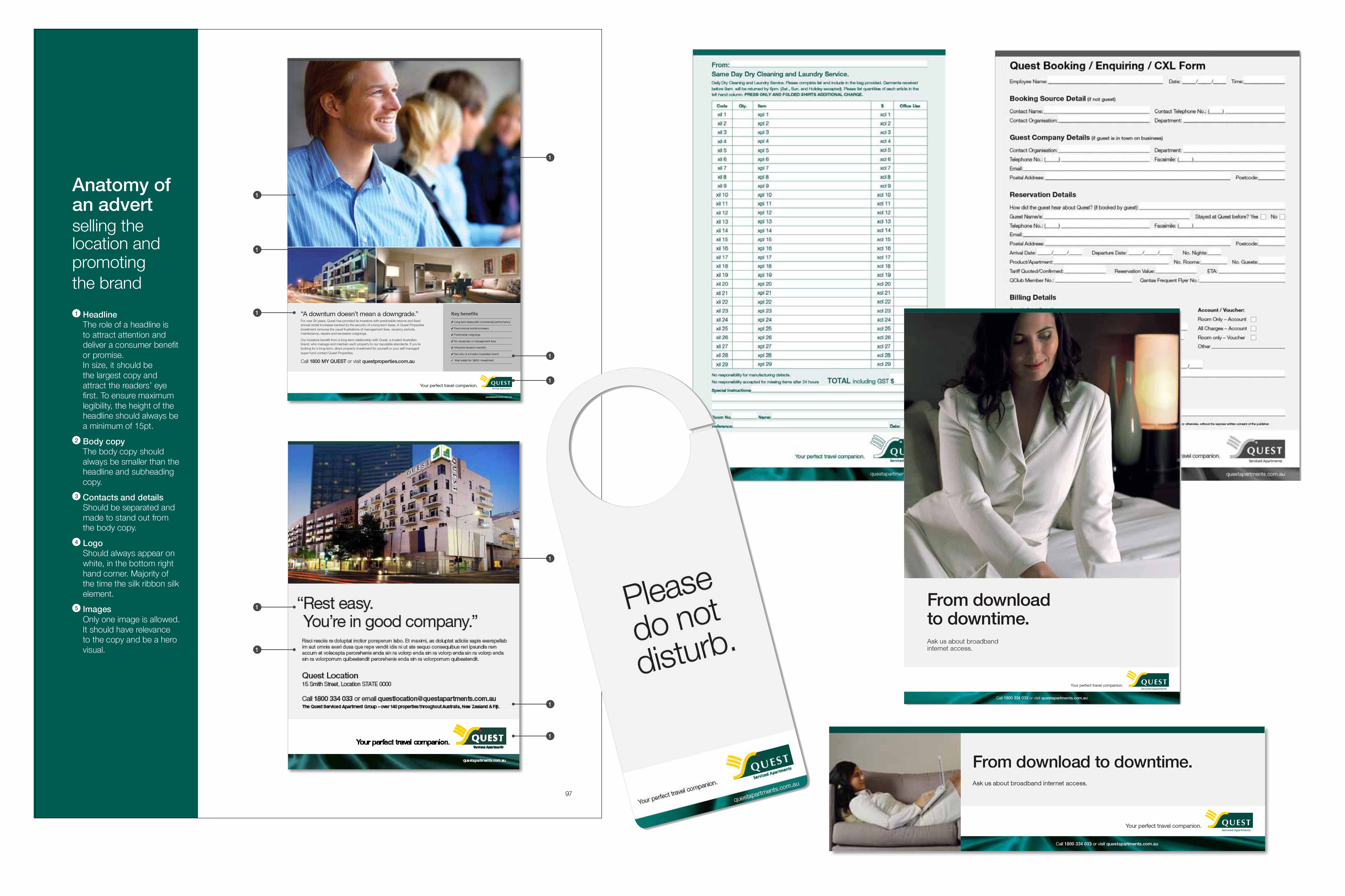
“Quest already had an existing database of “print-on-demand” stationery, originally developed by digital printing company DPA. The Franchises had accounts with the online printer and the stationery purchases were handled by each franchise themselves while Quest HQ handled the “look and feel” of the branding. Myke Mollard at the time was charged with updating the Stationery cache and creating a Tri-Brand extension to this database. The logistics were immense and the total design turnaround was 2 months for close to 1000 variations of stationery needed to supply the franchises orders. All in a days work for Wildfire.”
.
.
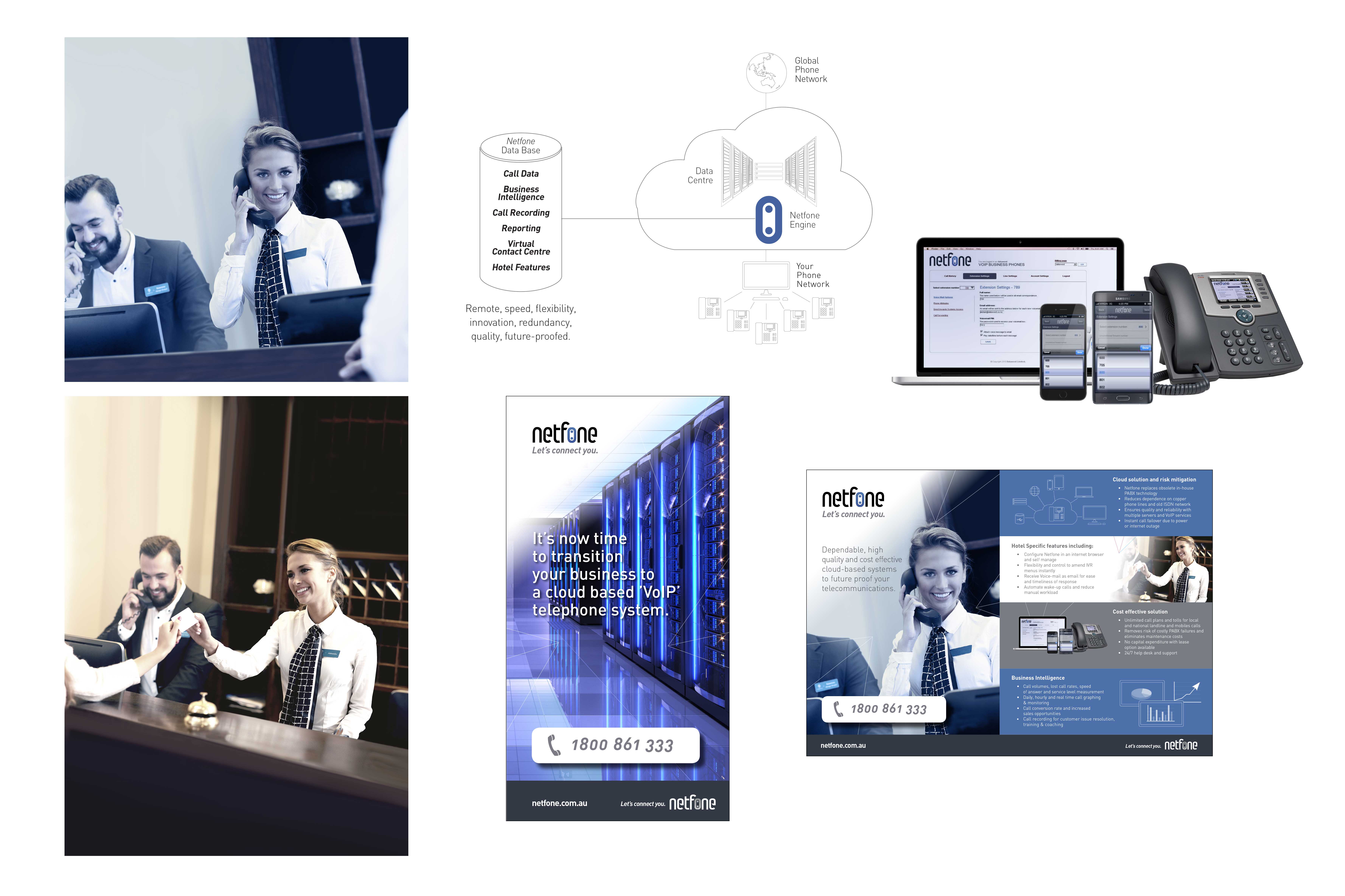
“New Zealand Teleco Netfone was launching in Australia and wanted to find a new telecommunications look. Primarily a digital alternative to the old PBX for Hotels and offices, Netfone wanted a elegant solution. Using its corporate colourway Wildfire developed Doutoned images with a hint of colour offset by warm receptions. The fine-line detailed diagrams and found some fantastic stock images with enough variety to keep the production on budget for a effective launch.”
.
.
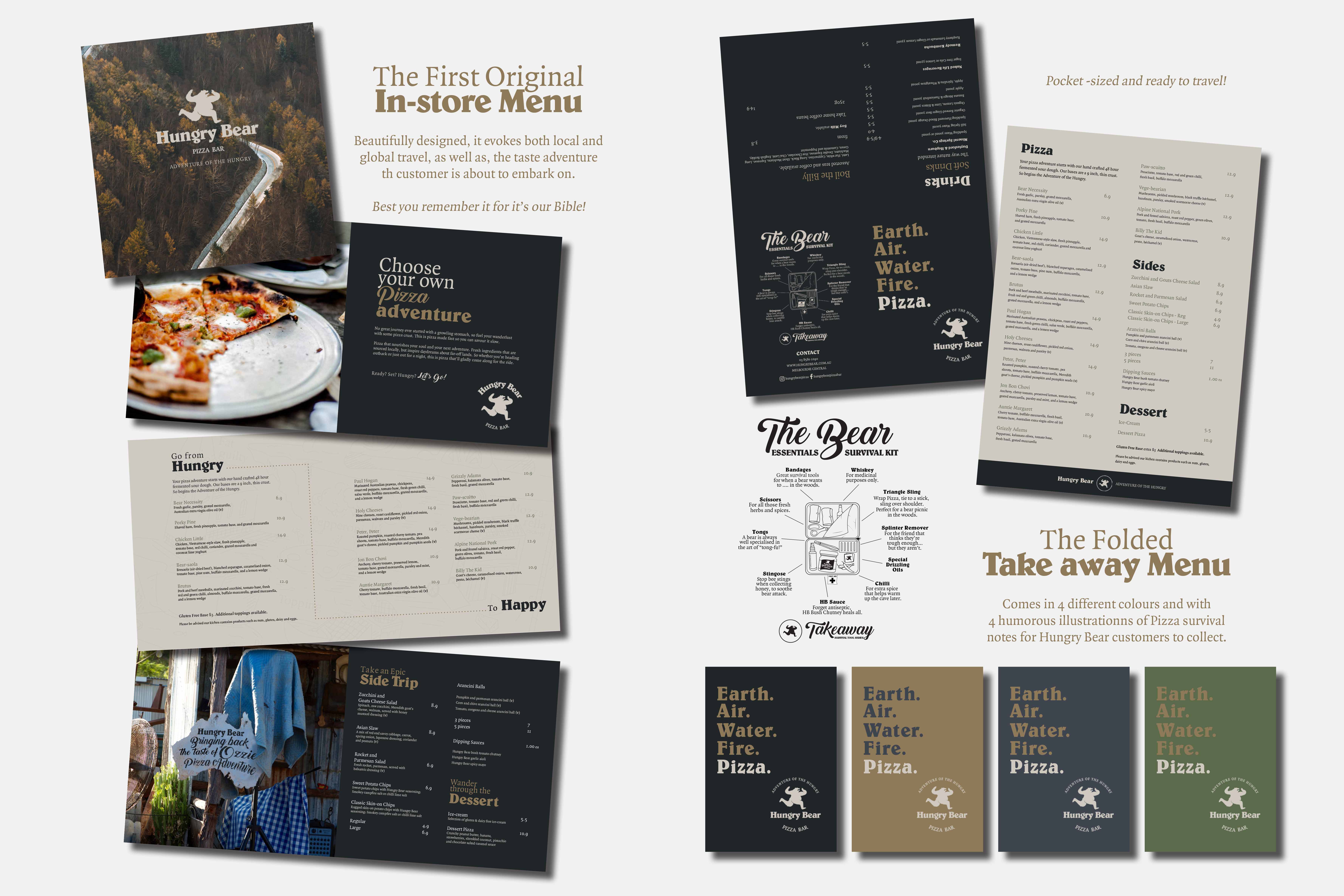
“Hungry Bear Pizza was a little lost with it’s Branding. So Wildfire did some market research and established and pretty cool slogan “Adventure of the Hungry.” The stylised Menus where a little bland so Wildfire created some adventurous quirky illustrations and infographics to sell the “Adventurous Spirit” of this new soon to be Pizza Franchise. The in-store feedback after the launch was that it felt like “massive franchise” and people loved the Pizza.”
.
.
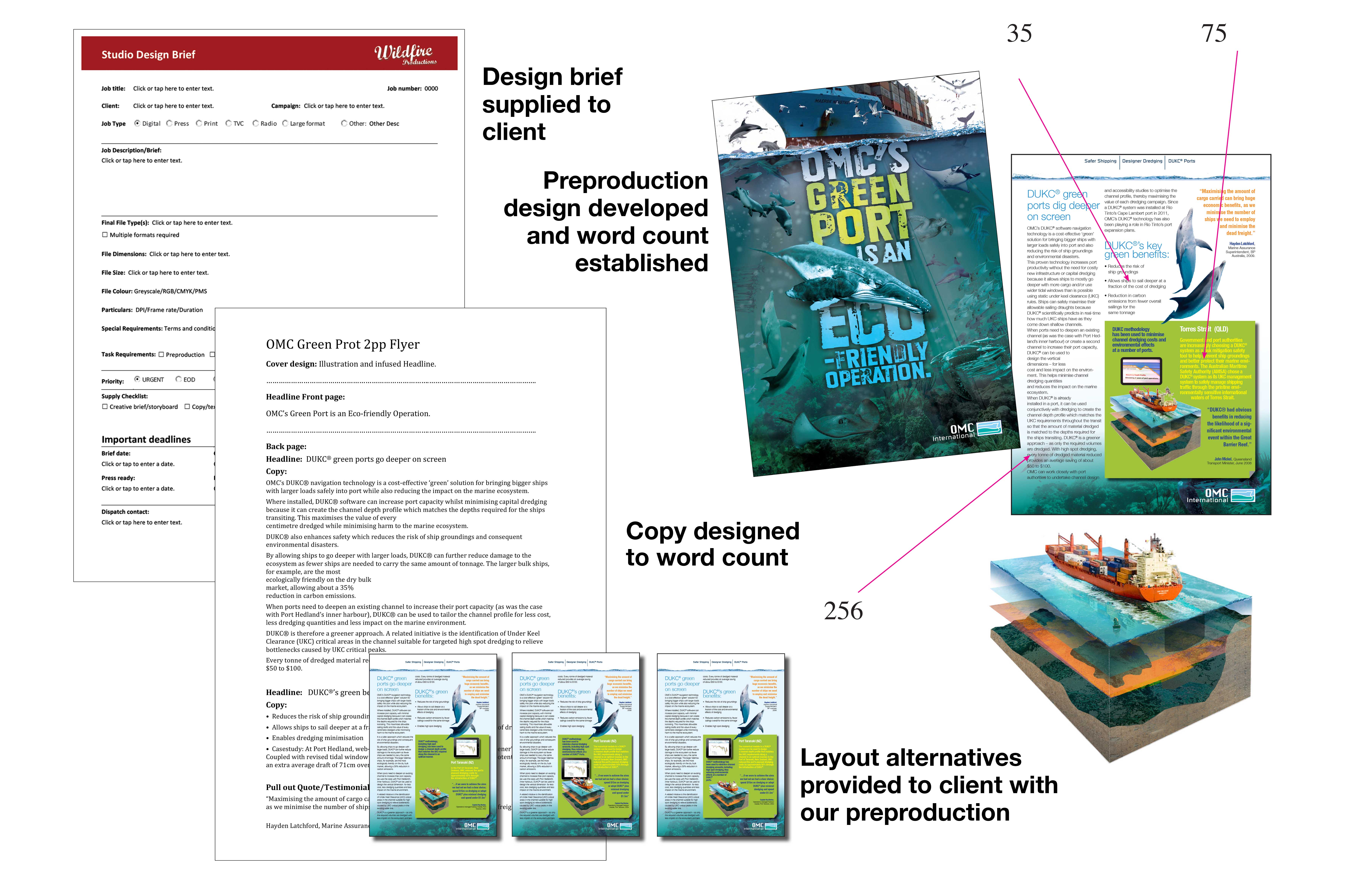
“Helping engineers develop marketing collateral at OMC International to get a complex range of software to a market. In the above slide we reverse engineered the collateral and created automated Microsoft WORD brief sheets to allow staff to design their brochures and flyers better and communicate these products.”
.
.
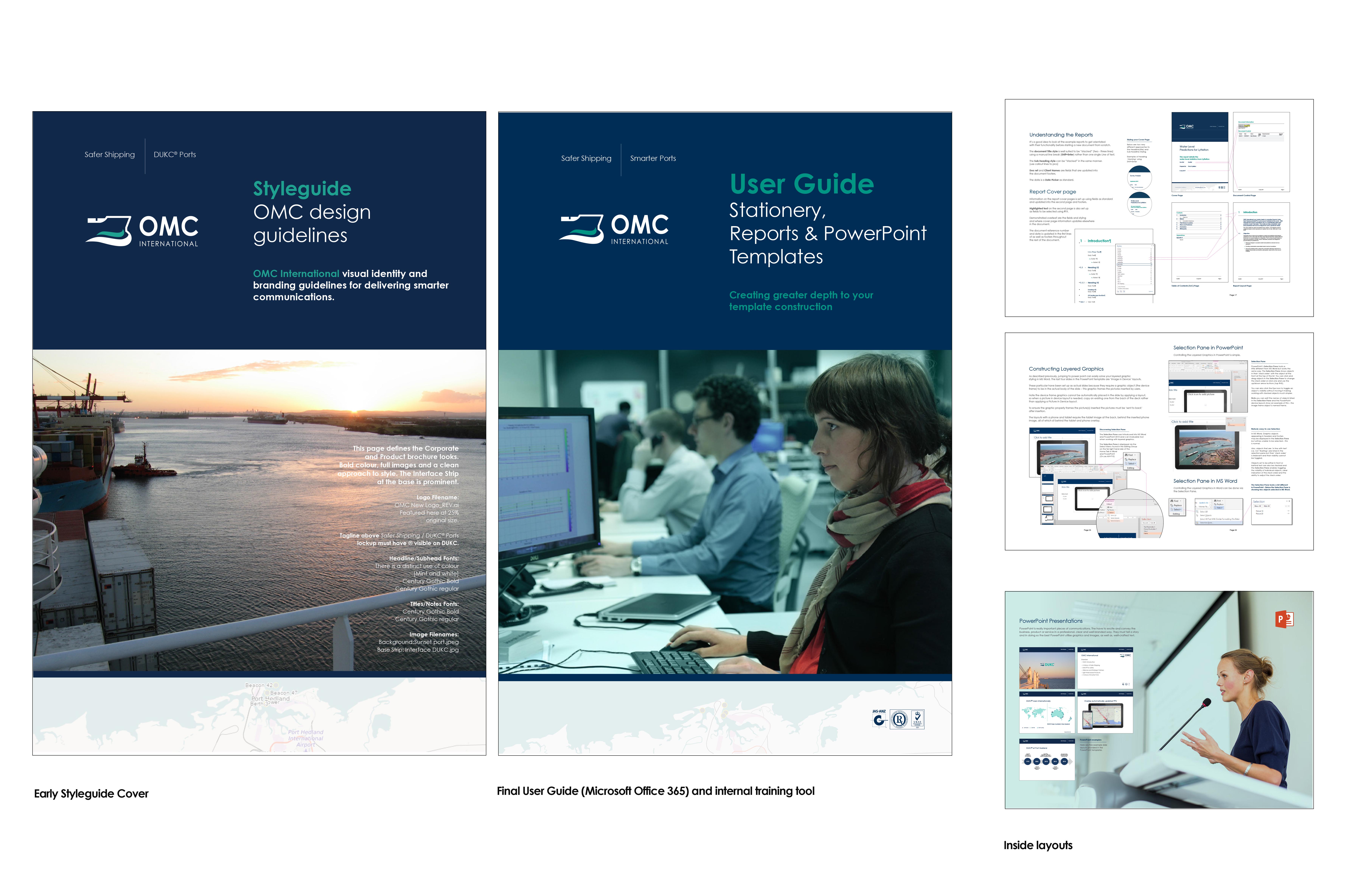
“Developing a Microsoft Office 365 digital Stationery cache was like developing a major website. Embedding styles, templates and matching them across all the stationery and PowerPoint so that everything matched and functioned for a range of users was intense. But Wildfire – got it done. We assigned and embedded quick keys the oldschool way and developed templates that had other functions for the highly evolved Microsoft users. The level of difficulty was developing the templates for up-to-date users and the senior staff that were not familiar and had bad Microsoft habits. We Created a simple well branded personalised “User Guide” which effectively brought the team up to scratch with common modern practice. Design solution delivered in spades.”
.

.
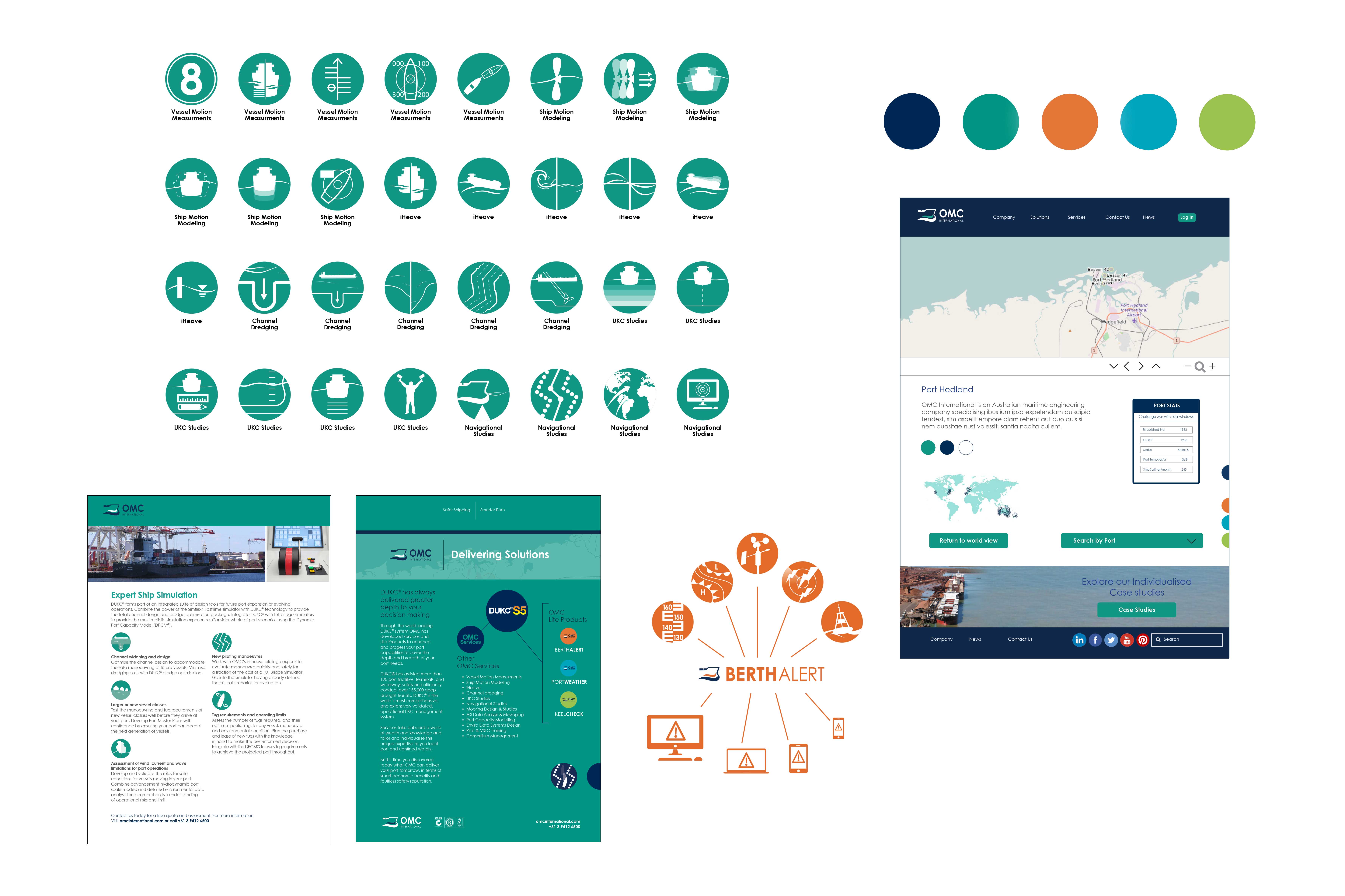
“Designing isn’t just desktop publishing! You have to develop all these unseen things that knit your design together across a myriad of advertising and stationery products. It all has to relate to the brand and in a way creates an invisible handwriting that often goes unnoticed. Above is the design grid developed by Wildfire to give a sense of branding across OMC Internationals communications cache.”
.
.
“Again we also developed icons and symbols to create a corporate language so stakeholders could quickly articulate and identify different products and services in a world or a brand universe where people can get bogged down in jargon and over written informational copy. This was interconnected with brochures, PowerPoint presentations and on their website and eventually in OMC International’s online Lite App products to help users navigate their programs. this is modern software engineering at it’s best and Wildfire have had a big role in their communications development for more than 15 years.”
.
.
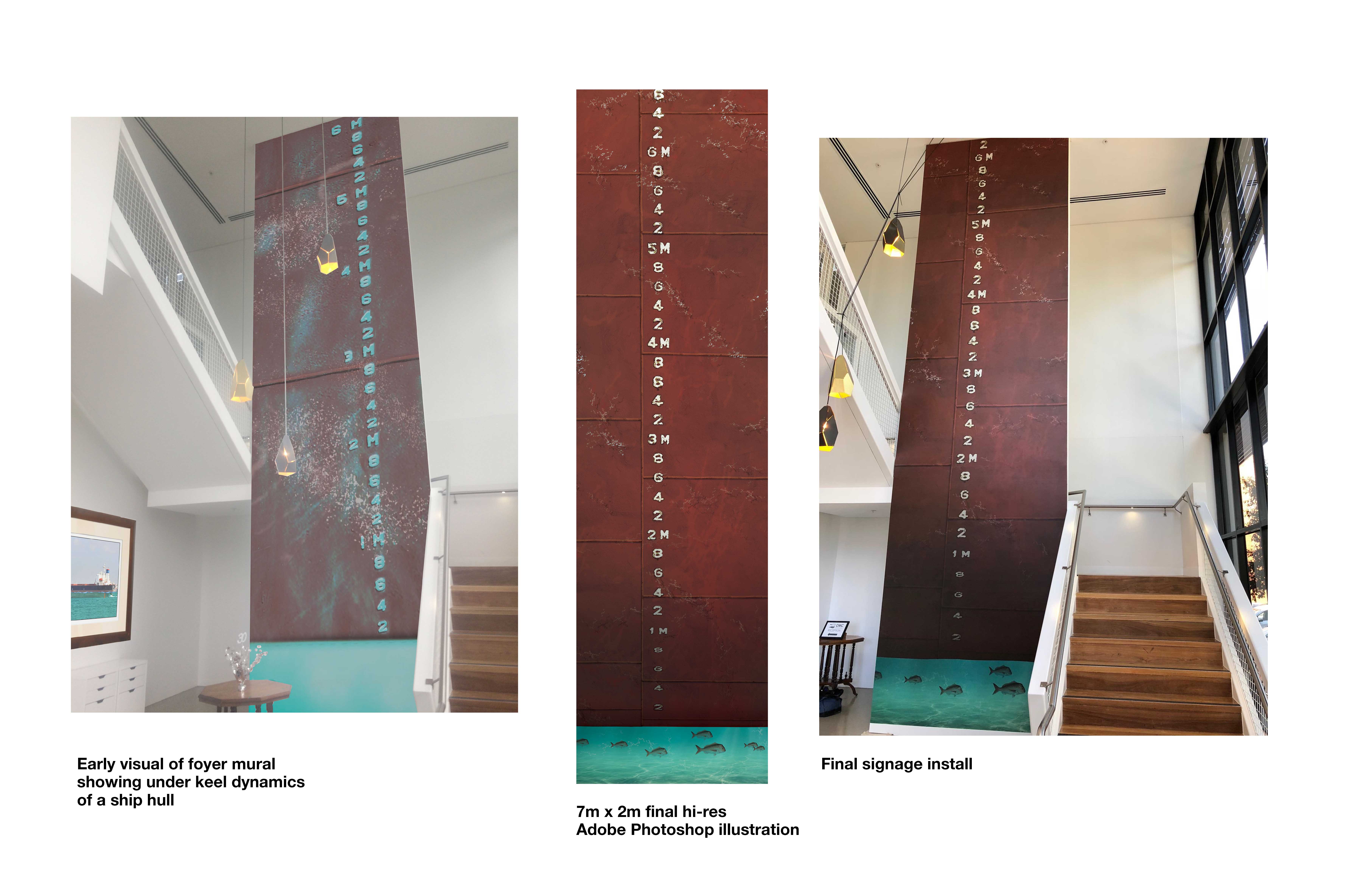
“Another design solution Wildfire have recently done is the amazing foyer mural at OMC International. 7m x 2m and 100% “to Scale” Wall Mural to highlight their “Under Keel Clearance” Technology. This mural was accurate to the centimetre and clearly demonstrates the 60cm of safe distance or (UKC) that OMC International has to play with in navigating bulk tankers in and out of International ports.” .
.
.
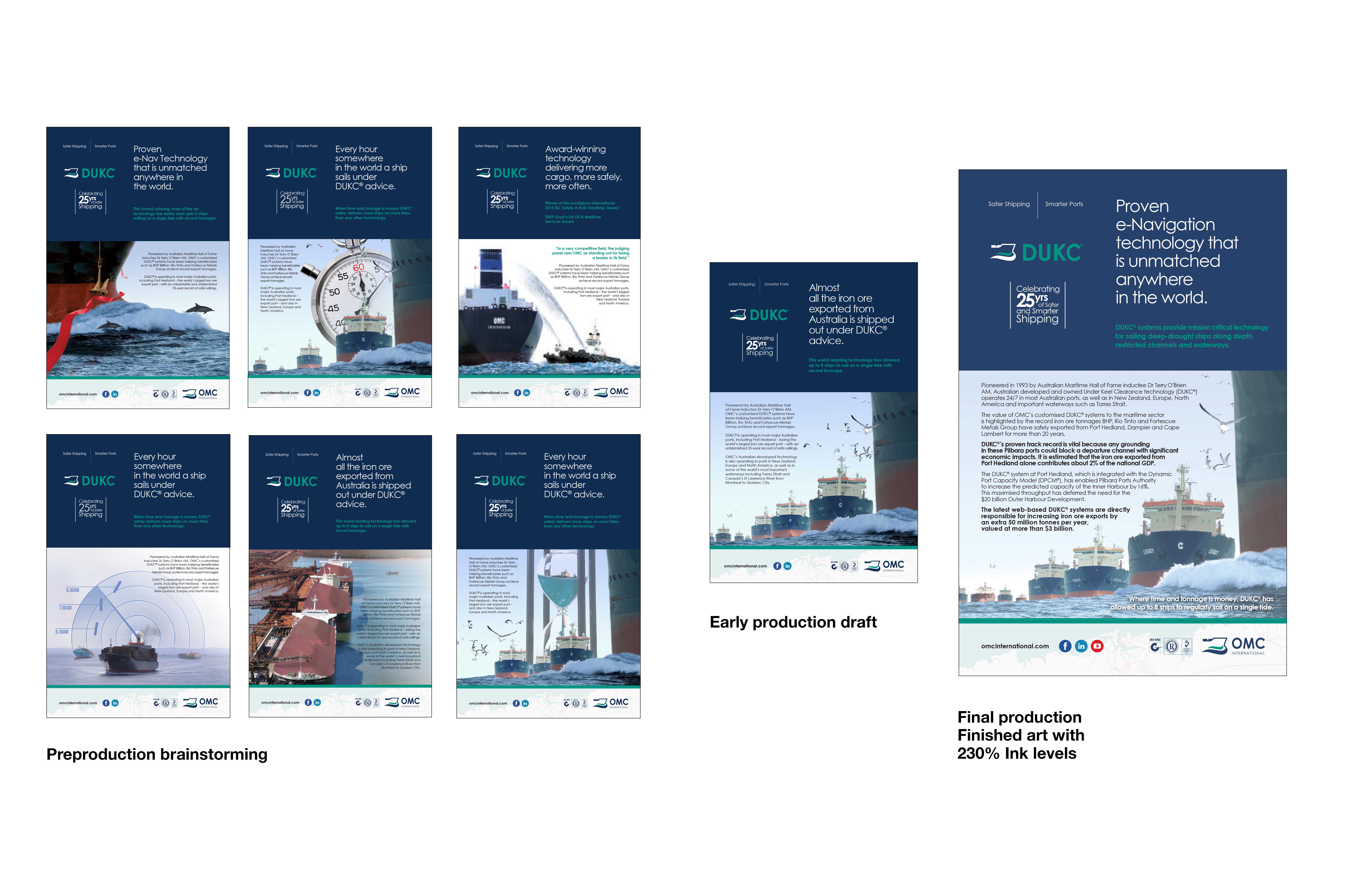
“The Australian (June 2018) recently did a special Australian Ports report suppliment liftout. Wildfire was asked to develop several ideas under tight deadlines and to met the Newspaper specs. Demonstrated here as a design solution, was the brainstorming, an early creative darft and then the finished final advertising submission.”
“The copy might look a bit long, but with their competitors featured in the report, OMC only had a small last-minute article and was invited to advertise and be interviewed at short notice. Wildfire turned this around on a dime and OMC strategically elected to showcase OMC’s market leading achievements to stakeholders in the longer copy for good measure.” .
.
.
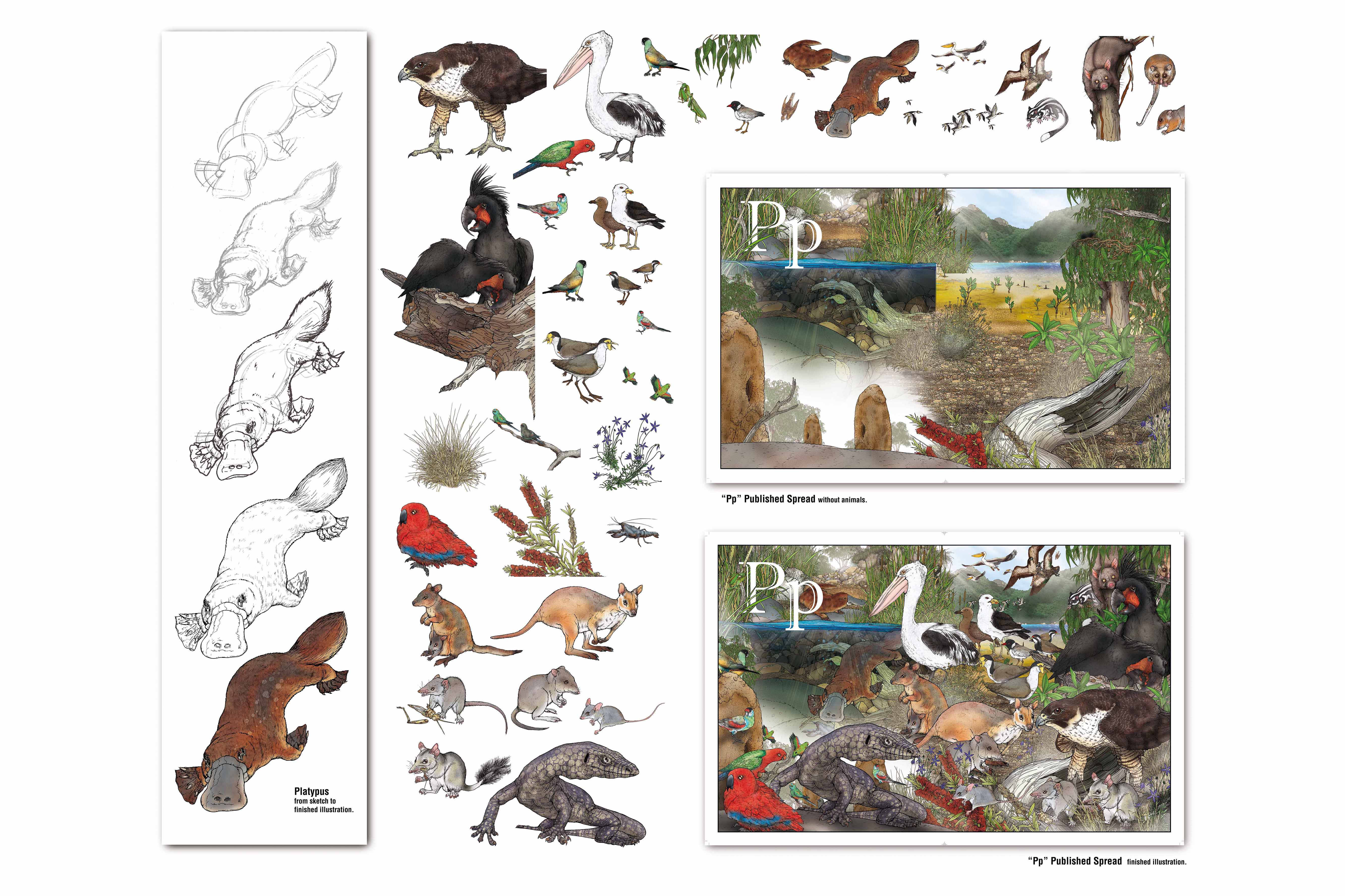
“It might seem out of place, but Wildfire and Myke Mollard have been designing illustrations to create “a stylistic universe” of Bush creatures for years. This method means elements can be stored digitally and reused, reassembled and other operators can use the library to create images like using clip art. Myke has been developing his style for over 15 years and this is where his inspiration for “Storyscaping” first originated. He applies the advertising skill set to illustration then grows and learns and reapplies the depth and learning discovered back into advertising systems and methods. Deliver better design solutions for his clients.” .