.
Art Direction is finding the perfect marriage between text and image that tells your brand story.
Below Wildfire demonstrates 5 ways clients can master the basics of Art Direction.
Art direction has to take in the branding, the layout design, the power of the copy, the action and the storytelling and the power of the image. Art direction is about typography and the dynamics. Whether you are going to be conservative and use principles of positive flowing design and symmetry or be radical and employ the forces of asymmetry and negative dynamic layouts. In other words break the rules and traditions.
.
1. Classic Art Direction

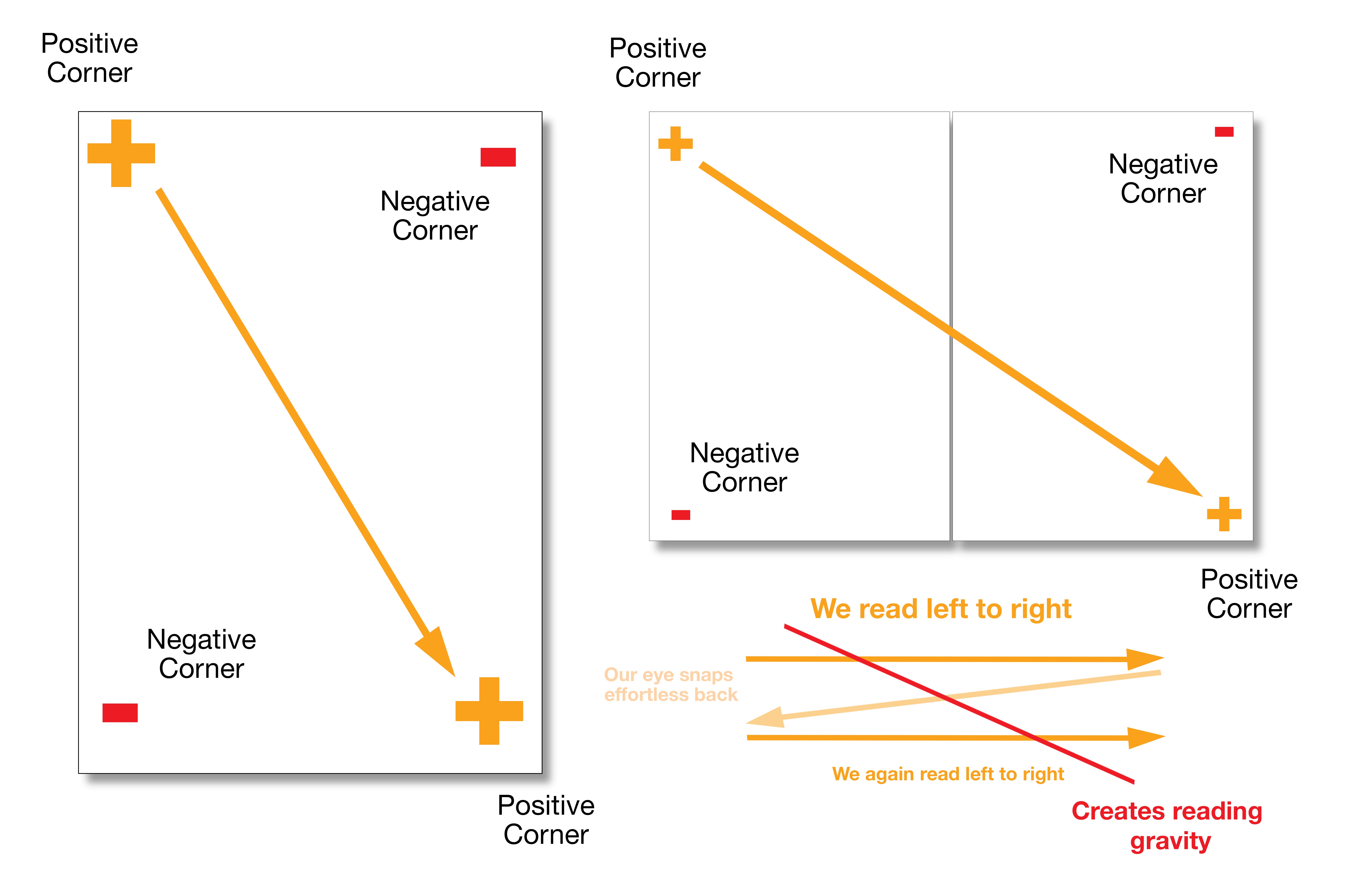
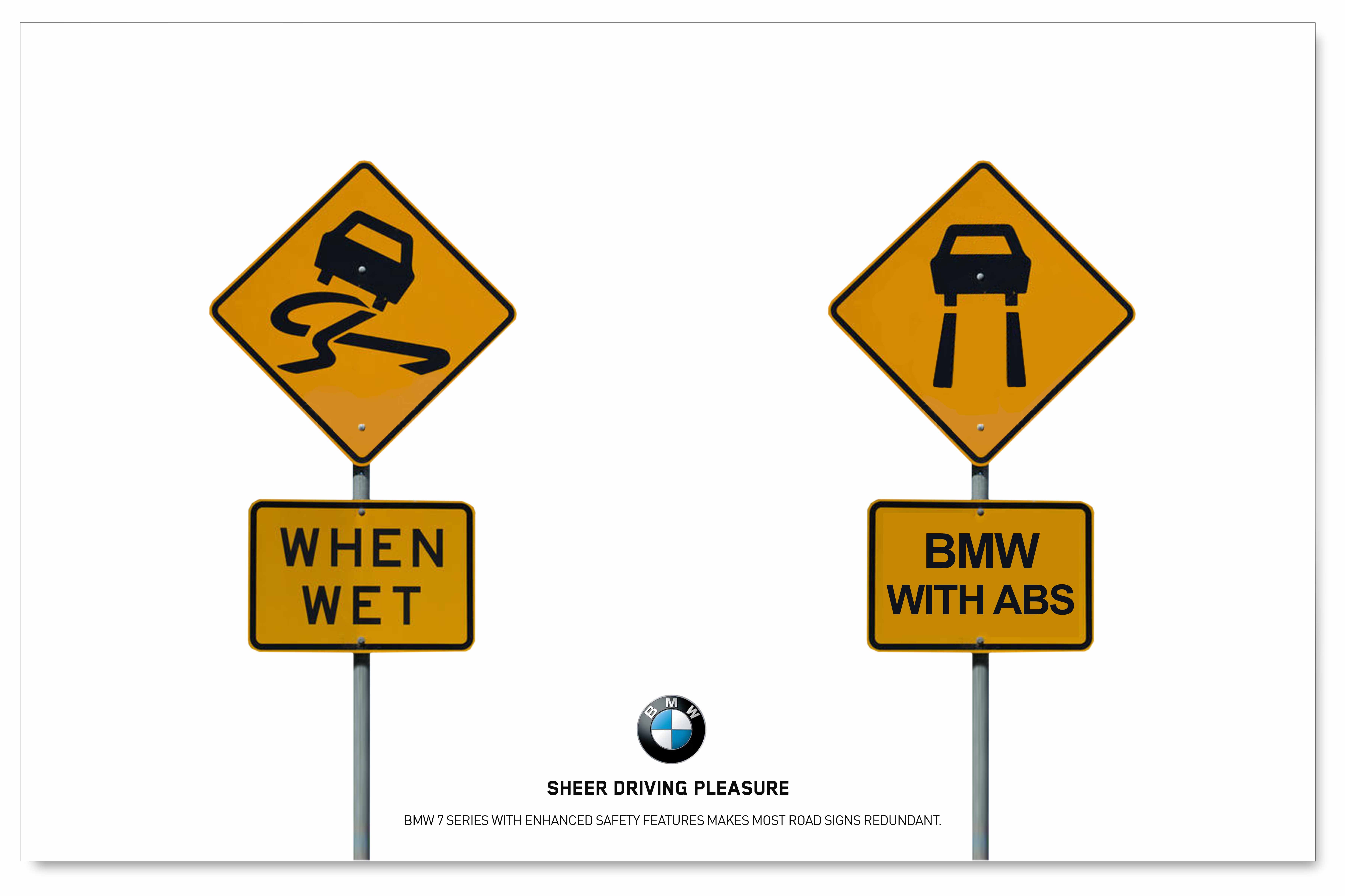
Employing “reading gravity” this visually driven concept completely heroes the product. The colour of the sign opposing the colour of the car sets up nice subconscious drama. The obvious dangerous conditions, the strong headline tying the concept together shows the action and the car handling itself under extreme conditions. The duality and balance across the page spread shows strength. All the text (headline, sub-headline, qualifying copy, call to action and corporate tag line) and typography is classy, clean and has good white space to allow the eye to enjoy the visual experience.
“It’s meant to take your breath away and exhilarate you into buying.”
The other nice thing is that the line and visual actually work quite independently of each other. You could “ditch the headline” and the advertising works. You could “ditch the visual” and the headline works. This is what good advertising strives for. It’s great when going to another medium because you often can’t illustrate the same concept in the same way, like with radio just with sound, dialogue, SFX and voice over.
Hence this becomes the perfect designed example of a “Classic Art Directors” advert. This simple approach is often what’s not taught to desktop operators and designers, but is to art directors.
.
2. Using asymmetry to great effect.
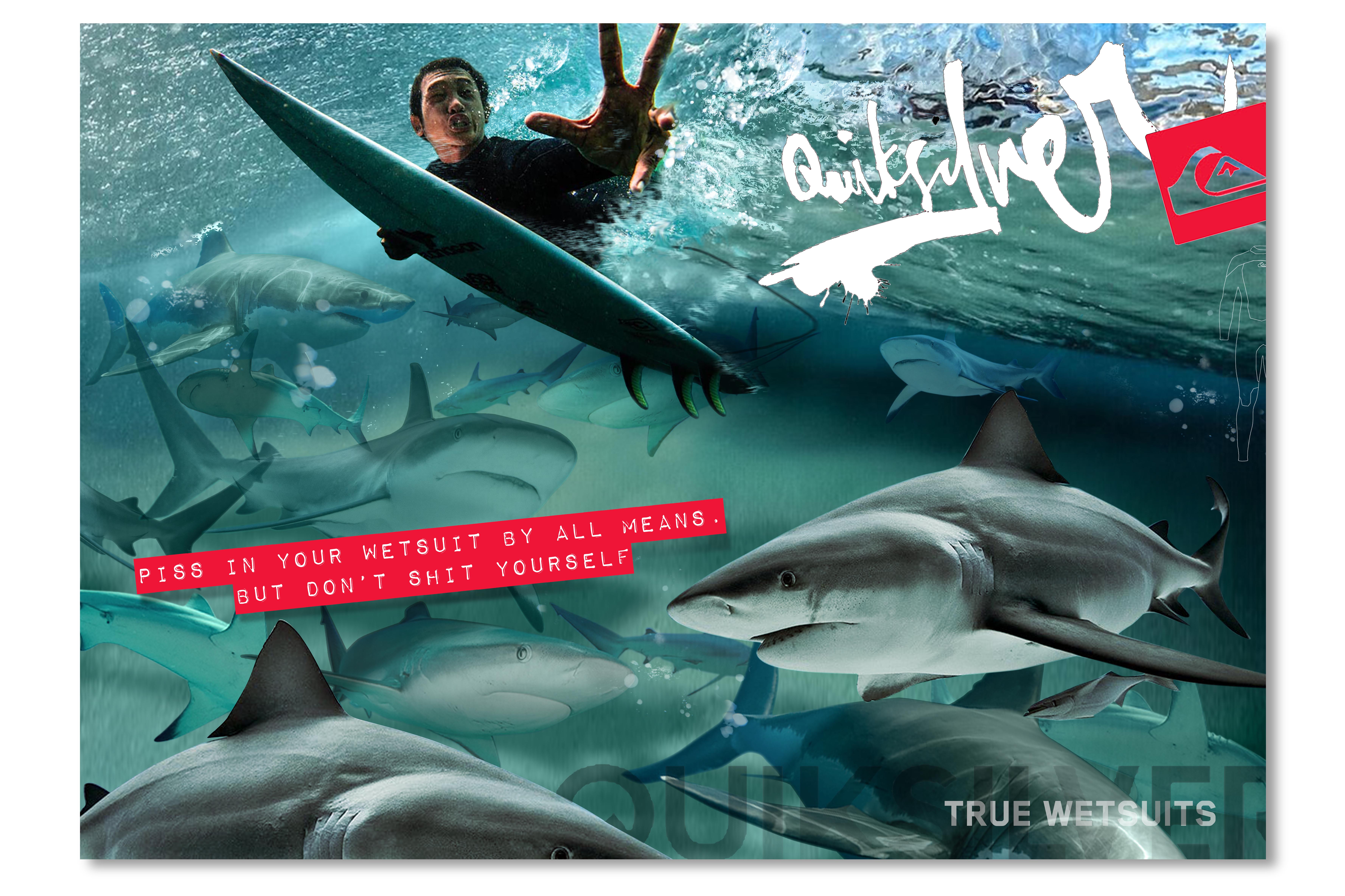
“The above double page spread concept for Quiksilver is a perfect example of using asymmetry and utilisation of negative space. Subconsciously it bring an edge, an attitude, and street credibility to the design. There is a super-real visual that taps into our classic fear of sharks. It has this “graphic novel”, comic book style sense of storytelling that is aimed at the surfers sensibility.
Whether it’s the savvy little headline that taps into our courage. Or whether it’s way the visual and the words plays upon the myth that sharks are attracted to our wee and our fear. Whatever the story you want to apply to the writing it stages the idea that it would be wrong to defecate in your heroically worshipped Quiksilver wetsuit. “So have some courage man!”
To give the design some extra edge we break the rules of “reading gravity”. We throw the logo and the headline into opposing corners of negativity. We set up the sharks in the hero corners of positivity. The design then follows the lines of asymmetry and “anti-reading gravity”. Plus by teasing the audience and not showing the product as much as our previous classic BMW advertising example we get an intentional disconnect. Why do this? Because kids know their products. They hate being told. They hate things to be boring and obvious. They know Quiksilver wetsuits and will respond to the extreme attitude of the design and communication rather than a boring product shot. They want to be entertained by the story. They are excited by the extreme and the graphic impact of the surreal. They don’t want to be patronised.
This is, at it’s roots, is the mark of great art direction.
.
3. Using Grids, Styleguides and designing across a range of different mediums.
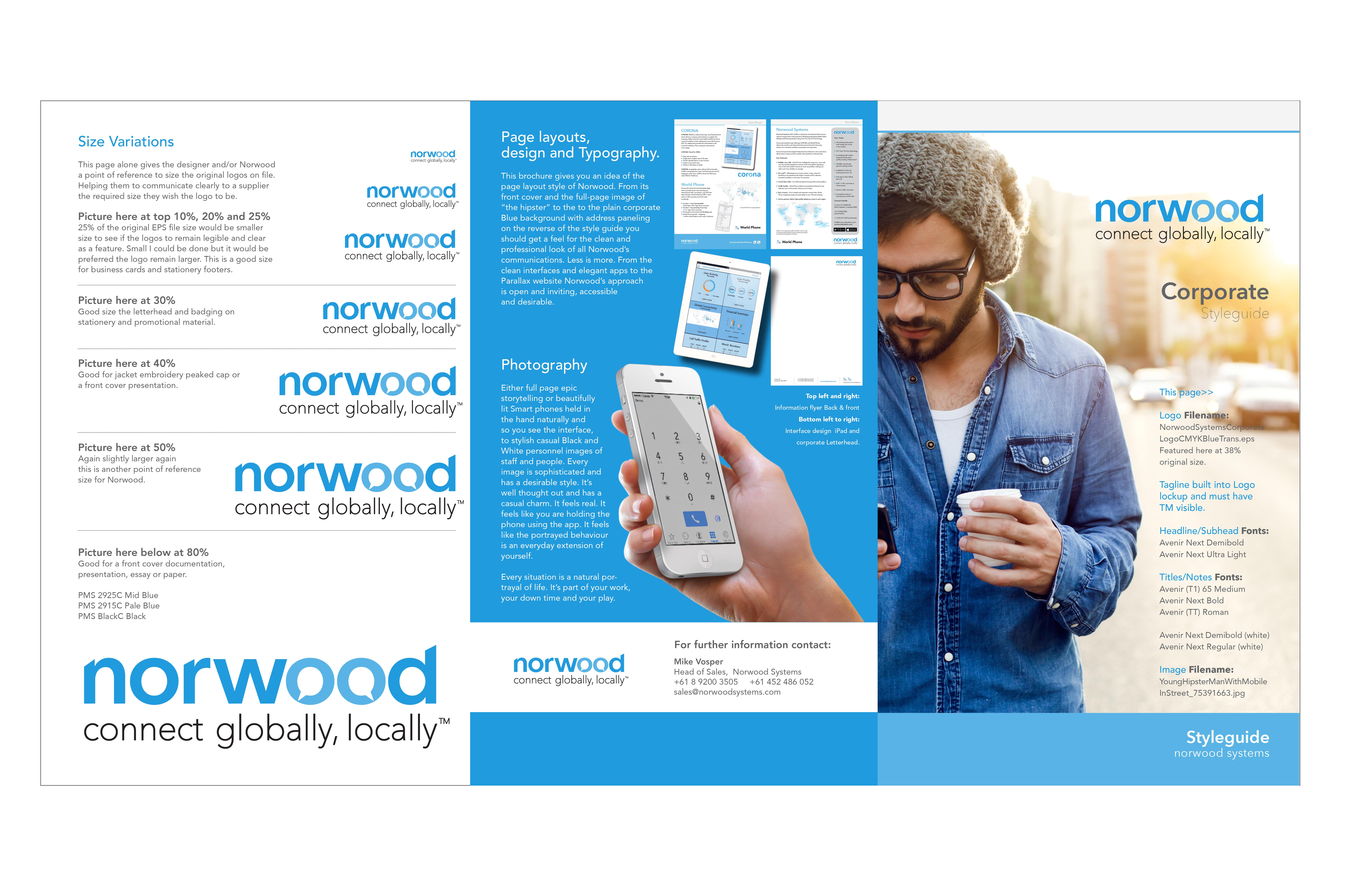
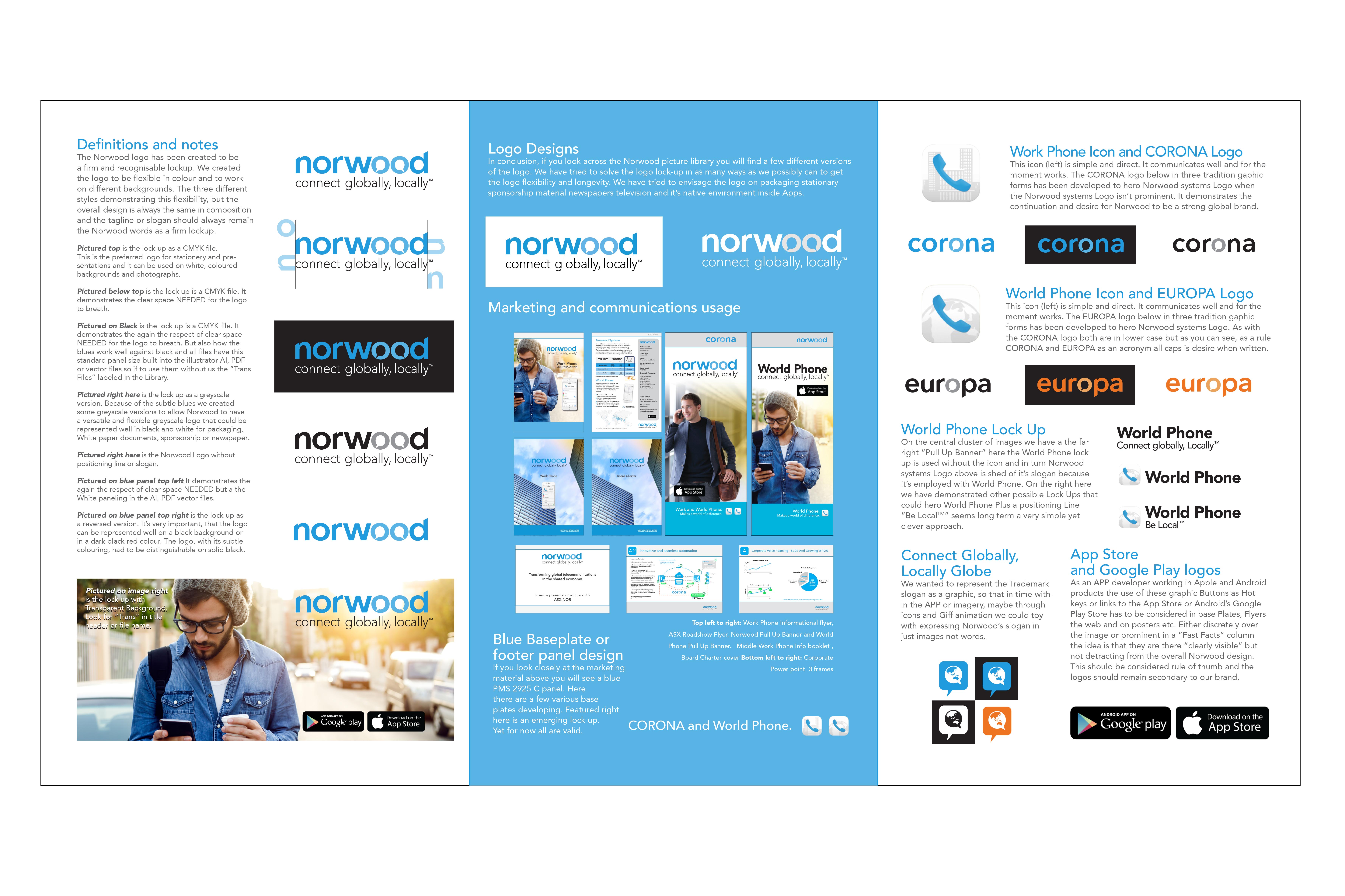
One of the other aspects of art direction, in both filmmaking and in advertising design, is ensuring that all the little details and “continuity” is well maintained in the style and branding. If a client, designer or mac operator is going to break the design or break the rules, It’s normally the art director that finds the “elegant solution.”
“Styleguides are important in establishing the rules, but they only go so far. Advertising creatives and seasoned art directors are masters of finding the best dynamic to make extensions on any given styleguide. Maybe it’s because they inherently deal with so many different styleguides and are often “authors” of these guidelines themselves.”
In their role, they are always dealing with “Brand architecture” and art directors are in a sense “the architects of visual communication” and constantly working design to fully convey “concepts” within the design structure.
It’s important to follow a styleguide, because it stops opinions changing constantly and allows for economic efficiencies. The less opportunity stakeholders and committees have to interfere in the design process down the track the better. It holds things together; the brand values, buying vital “frequency over reach” for creating a brand signature and familiarity with the customer.
Ultimately it gives you “Brand Consistency” to grow the brand presence. “Consistency and Continuity” is key to creating a brand’s personality. One that is strong and well remembered and it’s the art director’s role to make this as adaptable and flexible to the many mediums needed in advertising communication, from print to banners and posters to social media.
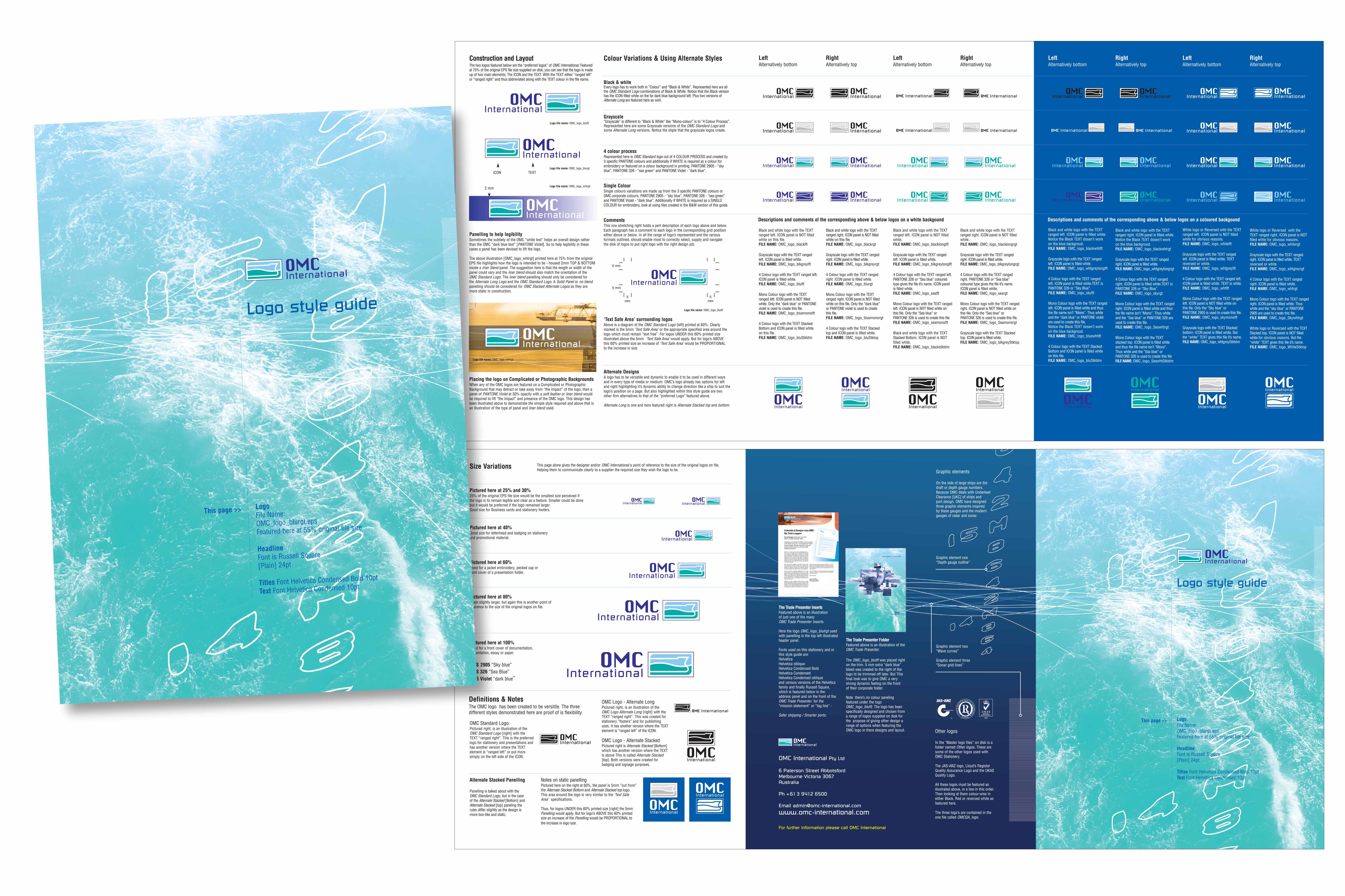
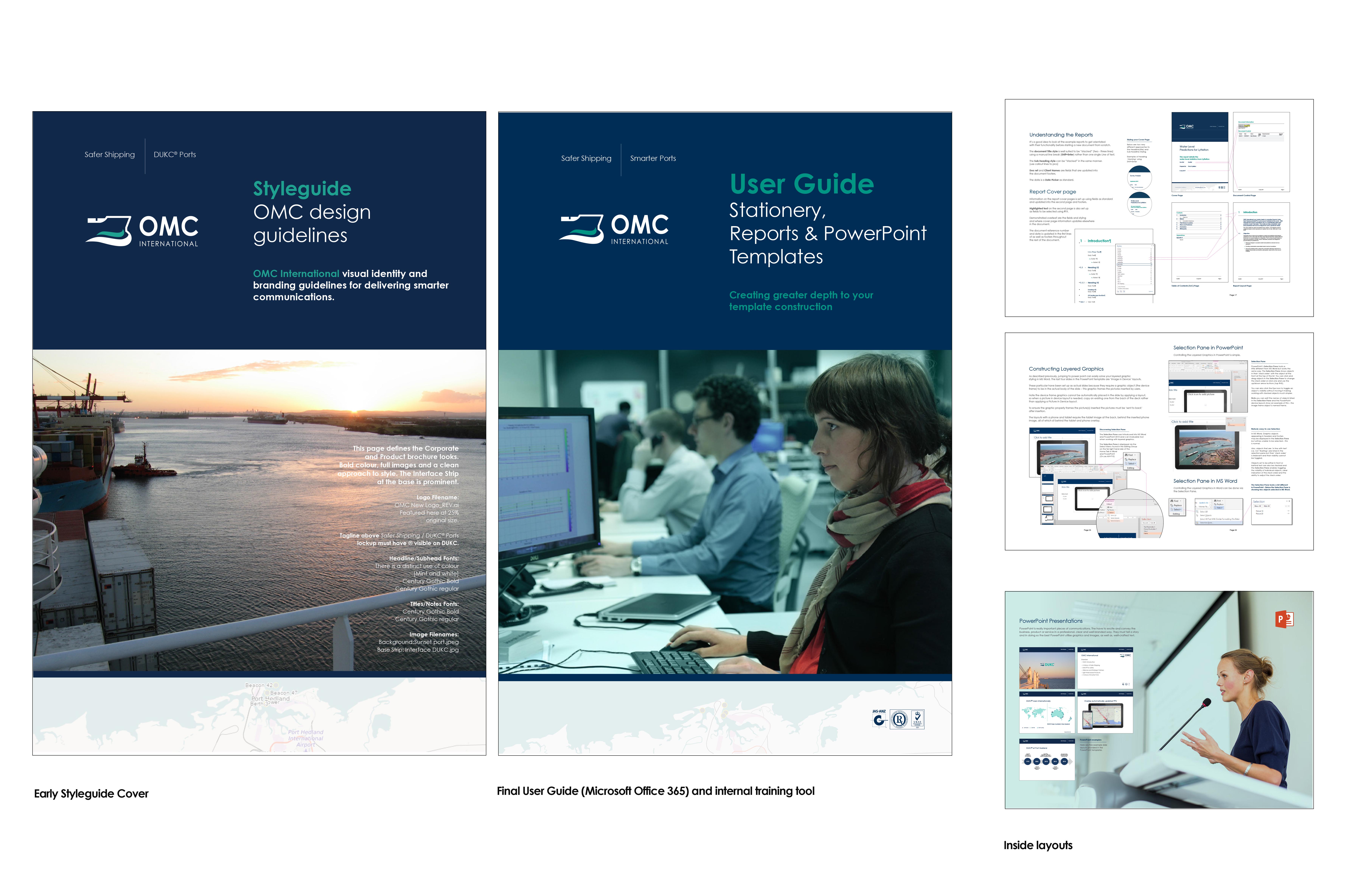
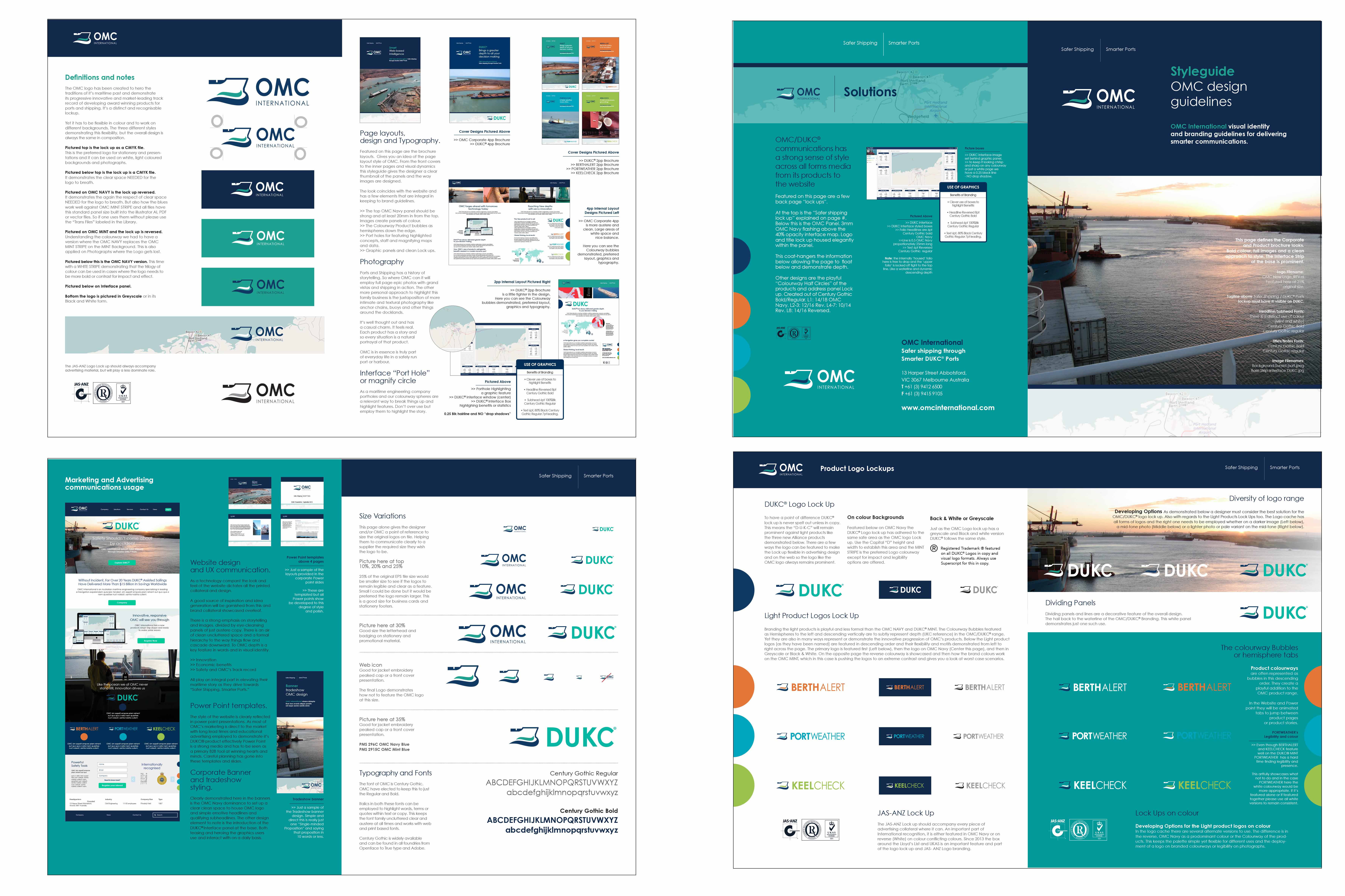
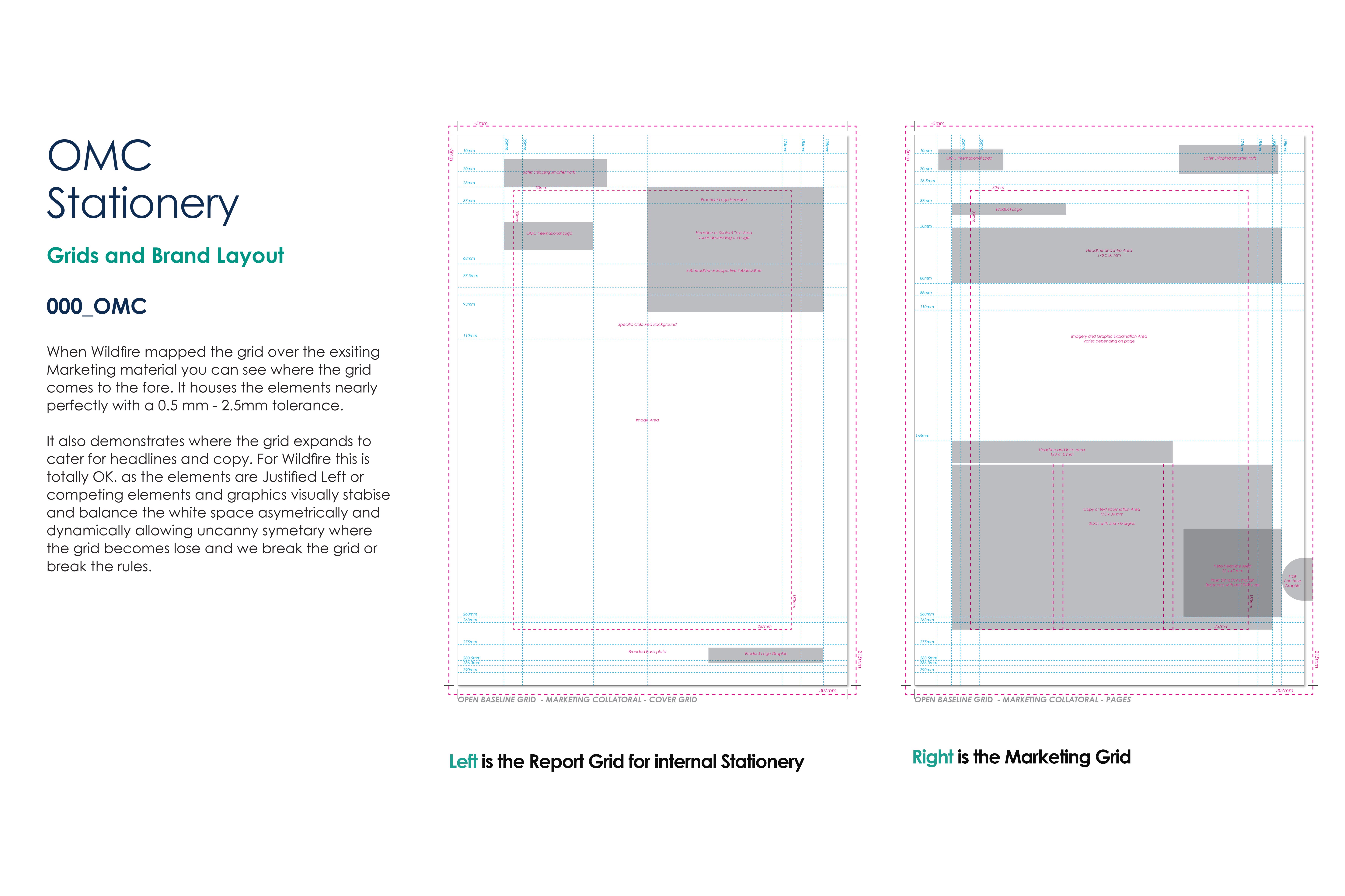
Footnote on grids.
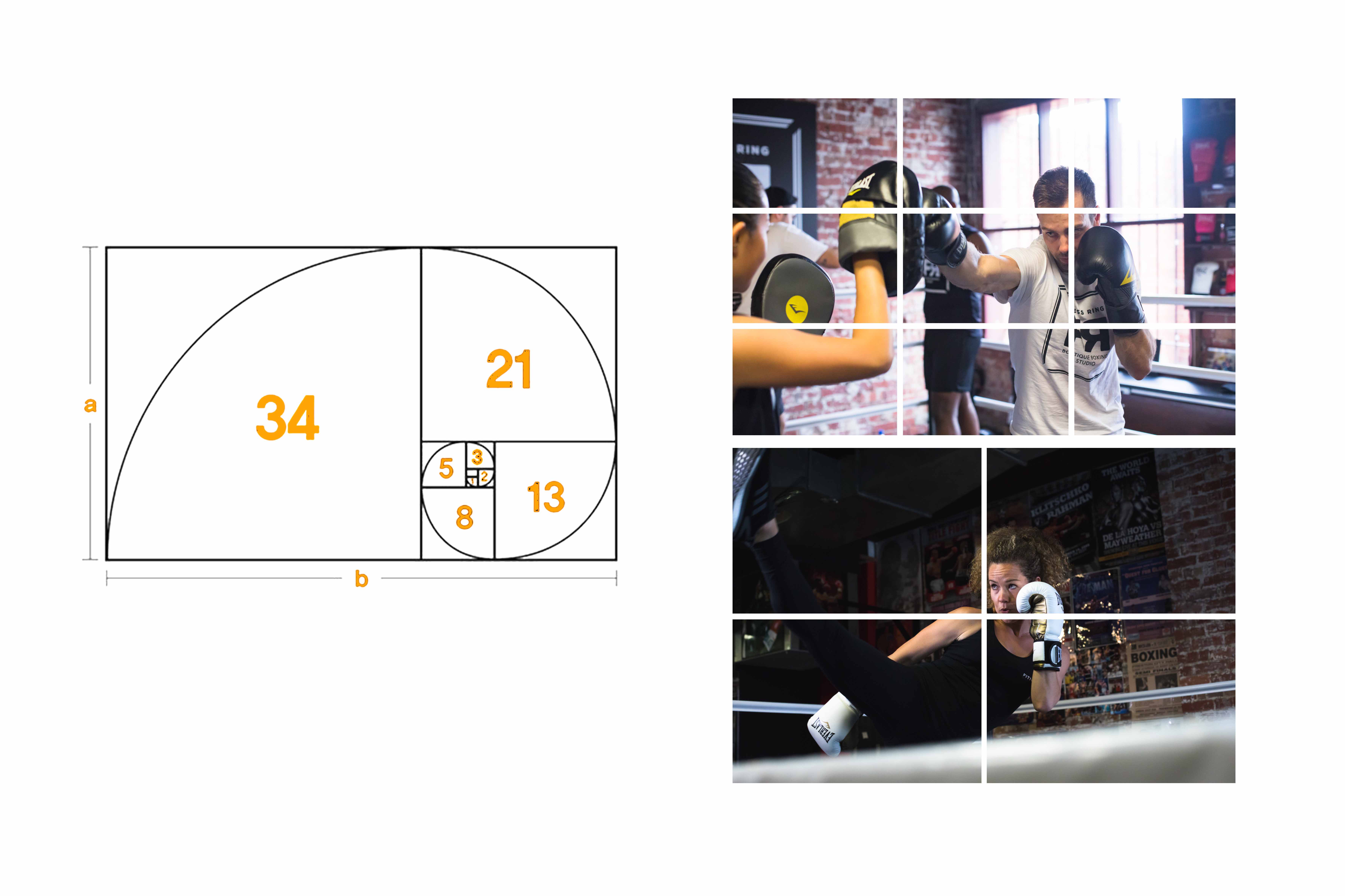
The only other thing to remember with art directing “grids and guides” is know the rules. The difference between “doubles and half grids” and “the law of thirds”. Newspapers have narrow “columns and editorial grids” (Often 5- 7 columns) and magazines more open “Single page, double or triple page grids.”
“Using “The Golden Ratio” and employing unseen balance is a great way to judge a good design. Whether its actually used or innate within the design or the actual absence of use is important. Also employing patterns, repetition and spirals is a fantastic way to set up interesting grids when taking risks with bold design.”
Art direction and design is a wondrous profession and we at Wildfire are very passionate about finding the best solution and design language for your business to subconsciously elevate your market position and brand personality.
.
4. Understanding how to direct – Trash or Treasure.
Years of working in retail advertising Myke Mollard has learnt to “fill the page!”, “stuff the catalogue!” and design “trashy, loud, screaming and cheap advertising!”. Also in his career as a keen painter, artist and illustrator he has worked on BMW, Honda, The Australian Ballet and other more “Classy and refined” or “Artistic and elegant” accounts. The underlying ability to communicate both the loud and garish and the clever and elegant is something unique to Wildfire.
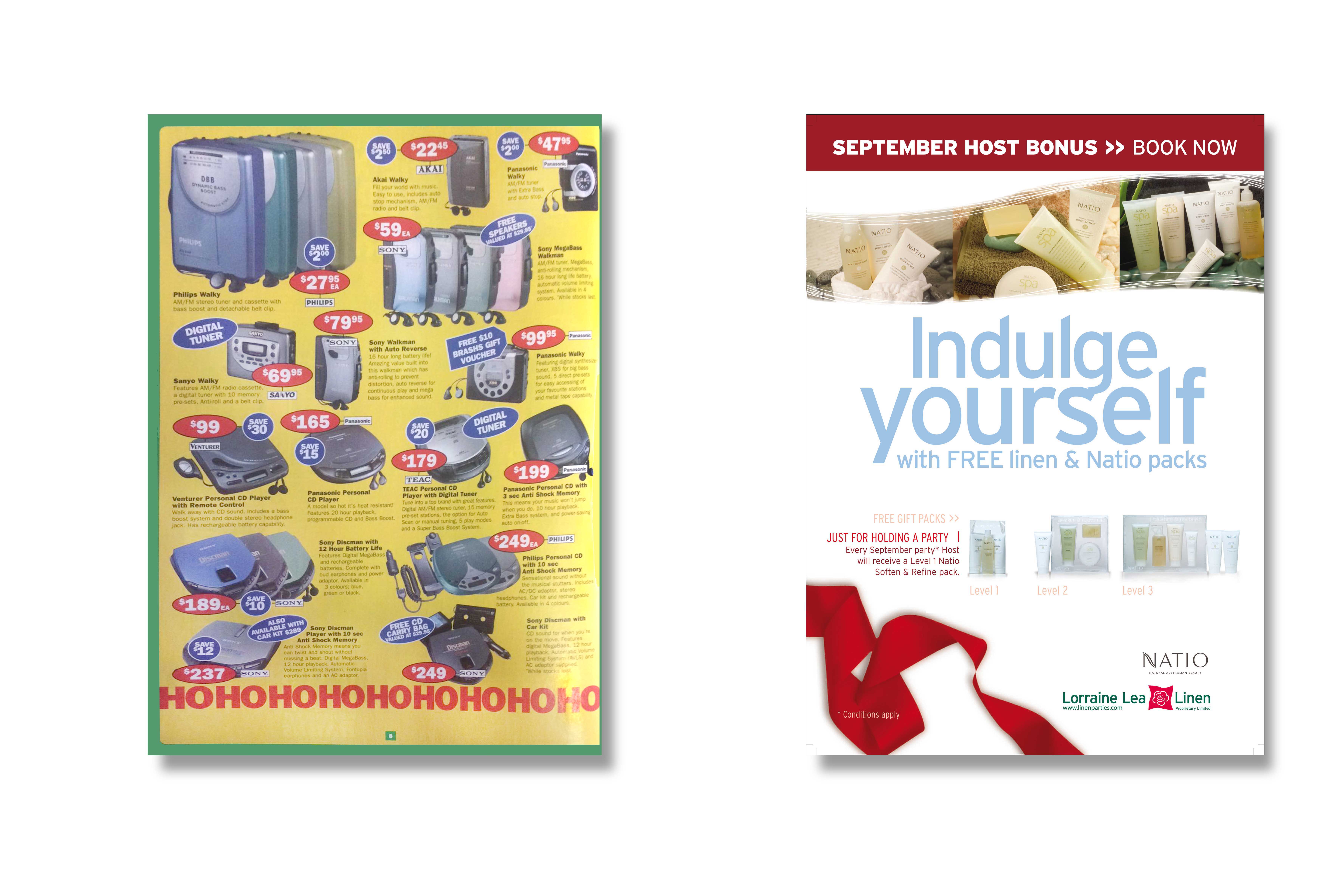
Trash.
The retail throng! The visual mob! Products stuffed, struggling for space, competing frantically for positions. Cheap retail catalogues are a page-for-page fight for your attention.
The art of this is finding “balance in the chaos” Designing legibility with all the noise of interlocking images, type, titles, product names, headlines, price points and graphic icons that scream “quality” “save” and highlighting product benefits like “Highfidelity.” Finding a balance to this obnoxious noise is an art director’s talent. Organising this infernal “sea of products” and “price points” into grids, squares and boxes. Making it all work and capitalising on every inch of catalogue space. Catalogues are in a way “visual real estate” and this visual space is cannibalised and consumed in a way which speaks volumes.
If a catalogue is charged by the inch. Newspapers charge by the column. The cheap things need to be stuffed to the rafters, larger than life. It has to look like a “maddening crowd” or products like “the masses” fighting for space – cheap space. this is the subconscious science of retail design.
In a sense, they are loud, obnoxious, rude and trashy.
Treasure.
Yes, it sounds obvious and simple, but it’s true. In the exact opposite fashion, “class” is about visually portraying items with an abundance of space. It’s the ability to harness “white space”. To frame and showcase products with opulance subconsciously suggests a higher value. So the way an art director approaches hi end products is they frame things with white space, balance, beauty and use colour or a dynamic splash of nondescript aesthetics. They employ or create a graphic environment, which in turn creates an elegant dance between the background and the products. In a magazine, it’s images and blocks of copy. The visual dynamic on the overall page that invites the eye to; “entertain opposites” fin things “in balance” or “out of balance”, in other words the use of classic symmetry and asymmetry to find unexpected grace and elegance.
You see it in magazine publishing, art galleries and design posters. They are all exploitable inspirations for every art director to employ. The “classy solution” demands states of minimalism and balance, a way to allow the layout itself to dynamically effect the products emotional. Allowing them to breathe, or leave you breathless. Heroes on the page to shine like treasures within the page layout.
In short, “Space is expensive!” So to use lots and create a feeling of “less is more” on every page, subconsciously suggests the items you are showcasing are of greater importance and are in turn more or very expensive.
In a sense, they are treasured.
.
5. When to just use copy or just use an image for impact.
In a traditional agency model art directors were teamed up with copywriters. Art directors would toil over the design dynamic and the copywriters were the word smiths trying come up with that golden line that delivers the message. A good art director knows when to marry the image to the copy and when to bow out and let the copywriter have the day and let the words live on their own.
A good art director will also plan layouts and styleguides to cater for when “copy is king” and images are redundant.
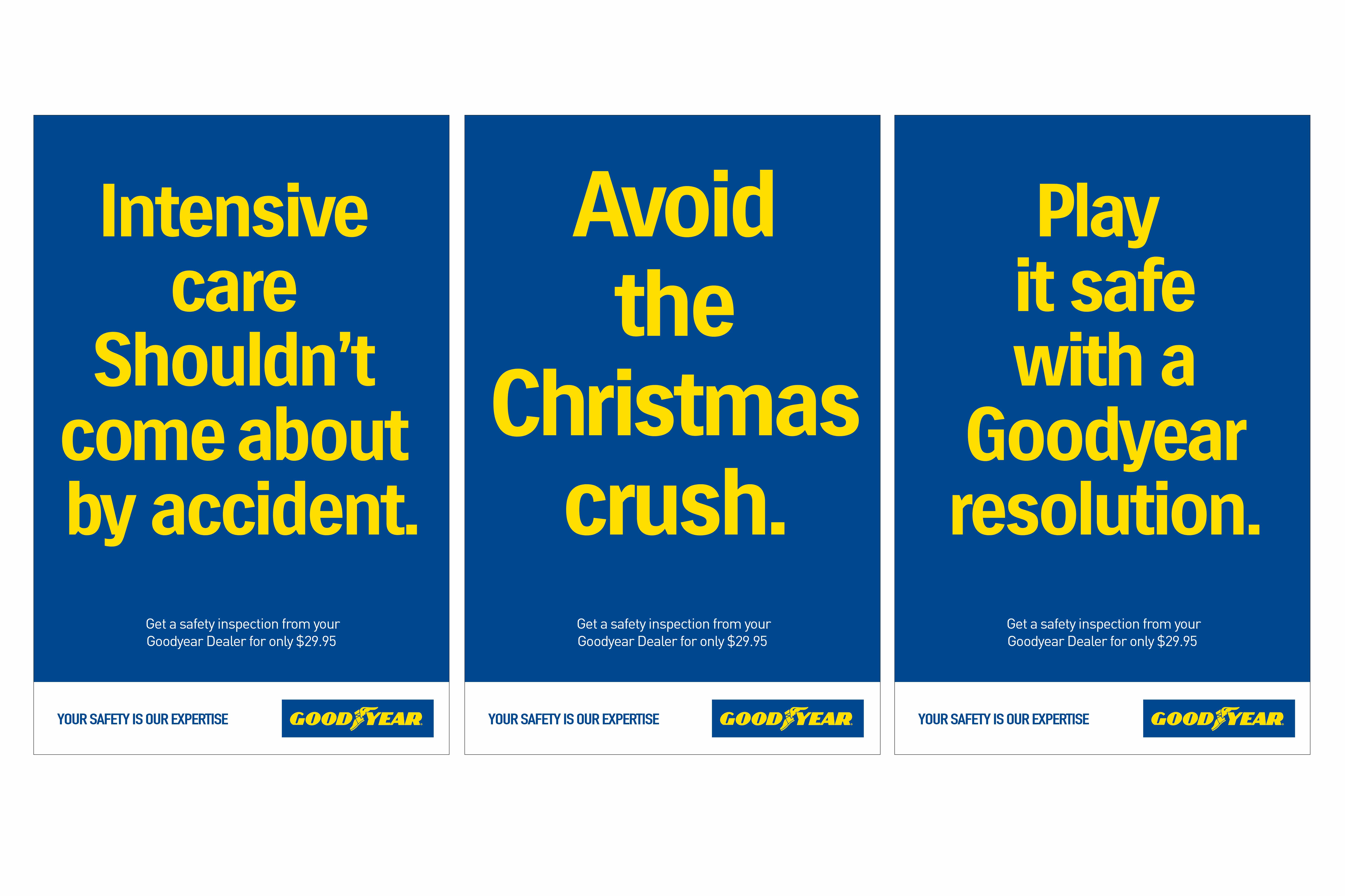
It’s also a good measure of branding design to have the ability to allow both copy and images take a back seat from time to time. Always adhering to strict rules of design can trap the art director into boring communications.
There is also this idea that advertising shouldn’t patronize it’s audience. To explain, a great art director makes the audience work for the idea. They make the audience want to “own it!” They wrap the concept up in a story or entertain the audience so they discover the message on their own – “the penny drops!”
I guess what we at Wildfire are saying is that that “storytelling” is NOT about “telling people” … its about “enveloping them” in your story. Laying down the landscape of your brand story, so they walk in and experience; the visual effect, hear the sights and sounds, experience the actions and results of the your message. In a way they determine for themselves if your story is worthy to pass on via word of mouth or “go viral”.
These nuances to art direction create a cleverness and profound state of mind in imagination of your audience. With this level of attention to the visual direction, the audience will enjoy the reward of discovering your punchline in the communications. This all about delivery! The execution of the communication. It can be busy if required or employ the adage that “less is more.” But great art direction “lets the audience into communication” to allow them to; have a laugh, understand the seriousness of the message, teach the audience, inspire sales, inspire behaviour. Or even just allowing the audience time to tie the visual and the copy together by themselves. This gives your audience pause to contemplate things by being; sparing, entertaining, loud, in your face, clever, beneficial, subtle or beautiful. That surreal or super-real effect of great art direction is in the overall delivery and final execution.
There is an art to this this! Wildfire hopes that these 5 tips resonate with clients looking to improve their branding and art direction.

