.
Logo’s are about creating something more than just a pretty design. They have to have personality and impact.
Logos also have to work in colour, black and white. They have to work online and in print. They can’t take up too much space. They can be stacked vertically and be versatile enough to work length-wise. They Also need to come in RGB, PMS, CMYK, B&W and Greyscale options in various sizes. Finally the client has to like them and need to capture the imagination of the audience.
Wildfire have done many logos across the years. Some for products, some for companies. Some have been good, some of them exactly what the client wanted and some really great – What the client didn’t expect and what Wildfire was really proud of presenting. Opinion is always divided in design so we present or logos as a folio or more of a reference so that future clients can see the diversity and styles we employ to get you a logo you are ultimately happy with. Wildfire put a lot of hours over the years into designing these logos – Enjoy!
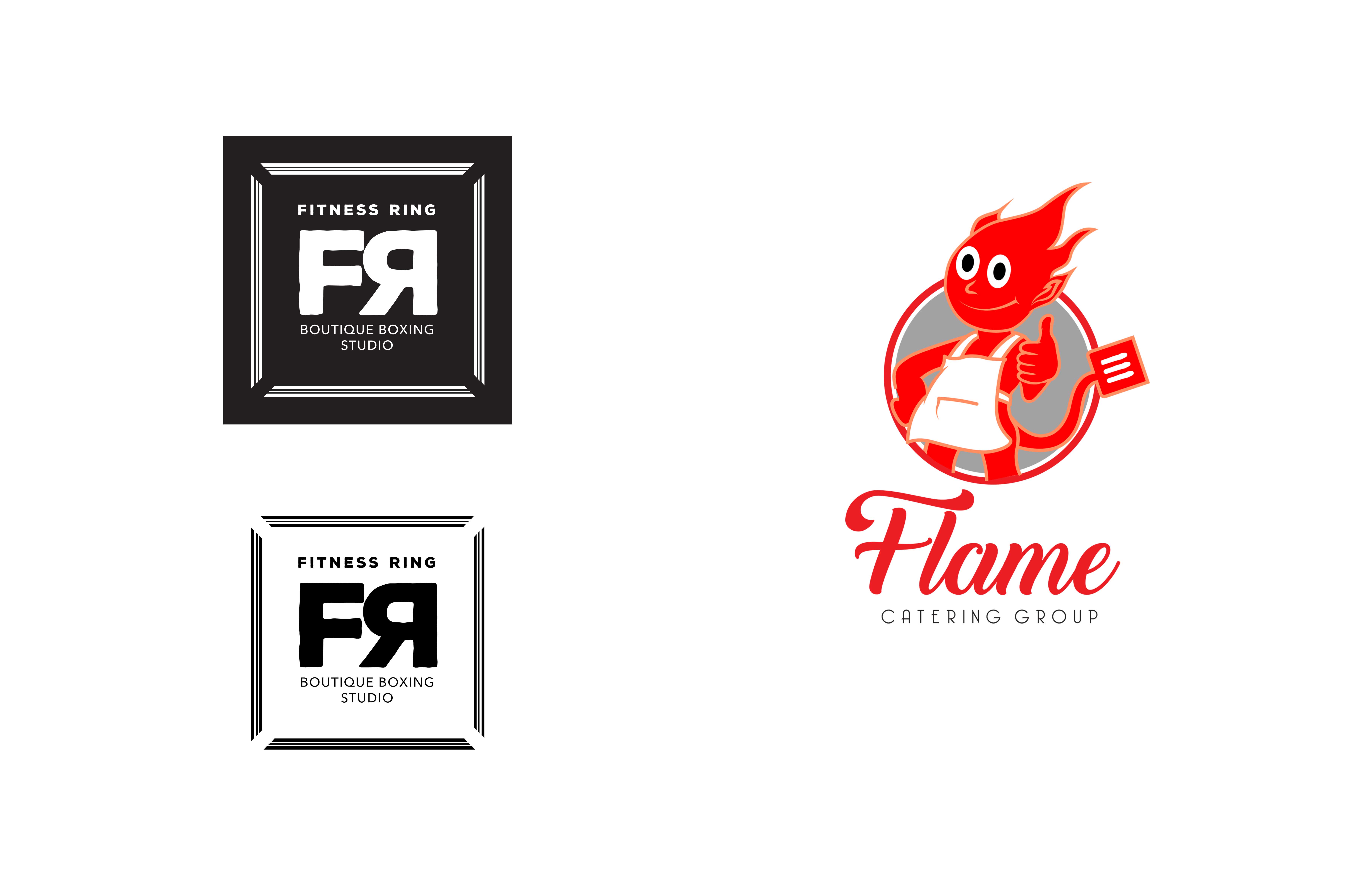
“When Fitness Ring wanted a ring for a logo they wanted a circle. Wildfire choose a Square boxing ring design and opposed the initials as if fighting in the ring. It just works on every level. Same with the “Flamin’ Good Food Dude!” This character design developed by Myke and Luke, and beautifully executed in Adobe Illustrator by Luke McCallum – It really has some street credibility! “
.
.
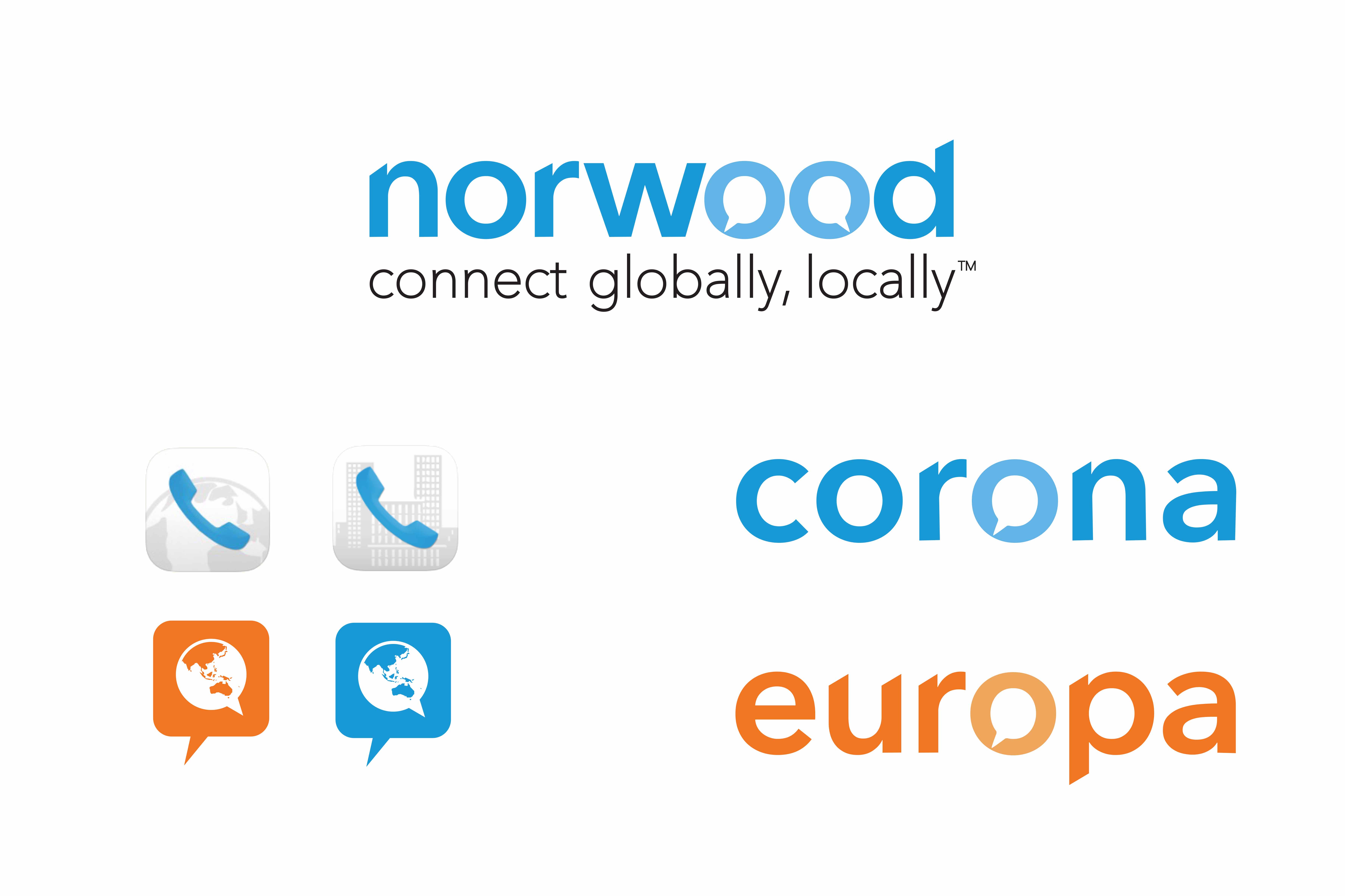
“Norwood Systems was Launching on the ASX in 2016 and wanted a whole new branding look. Wildfire Productions developed a whole new logo set, infographics and telecommunications icons for this tech company from Western Australia.”
.
.
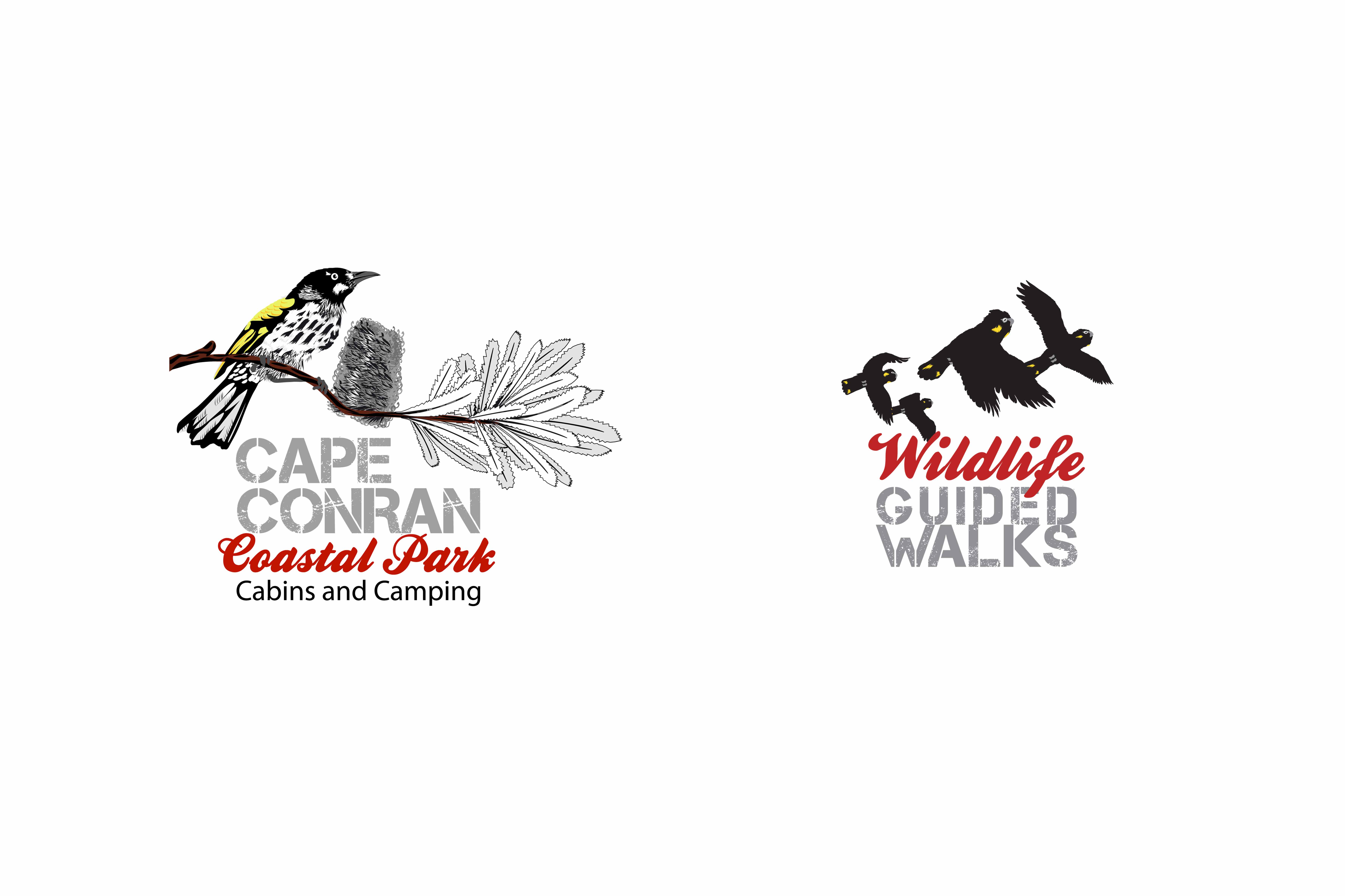
“As Myke Mollard has been visiting Cape Conran for many years and is a professional wildlife illustrator he was asked to upgrade their logo (as it was never professionally created) and give them a modern creative look. Developed from an original JPEG Wildfire hand-drew these two logos in Adobe Illustrator.”
.
.
“Paul’s Pantry (A Local Super IGA) asked Wildfire to create an Easter Motif for their 2018 promotional period, and featured right a fun little idea for a local plumbing Business concentrating on gutter maintenance created by Wildfire’s young gun – Luke McCallum.”
.
.
“This stunning design was created by both Myke and Luke. It shows the balance of teamwork between them. From a simple sketch highlighting; the honey pouring, the bees gathering, the native tea-tree that gives the honey its unique flavour and delicious typography, which Luke illustrated and executed beautifully. This design also has a subtle honeycomb and unique colour palette which Luke infused into the sumptuous texture of the design.”
.
.
“I remember getting the brief. A famous agency had started this job, but their designs looked like a “Purring Disney Kitten”. They had royally lost the job! Wildfire’s brief was to make look fearsome!! We researched extreme sports t-shirts and sports mascot iconology to inspire a fearsome motif with some modern street credibility. As you can see it delivered and the Army – “loved it!” Now Australia’s top frontline Armoured tanks and regiment officers wear this as their logo, emblem and badging. I also remember when The Hon. Tony Abbott MP, was Prime Minister and my friend rang me up excitedly to say “my Logo was being worn by the PM on the evening news training with the 1st Regiment” It was a nice moment. I was also glad to see Tony Abbott wasn’t in his ‘budgie Smugglers’ for once.”
.
.
“From star designs, to circles or the asymmetric shapes and icons of “diggers” inside type lockups – logos take on all shapes and sizes.”
.
.
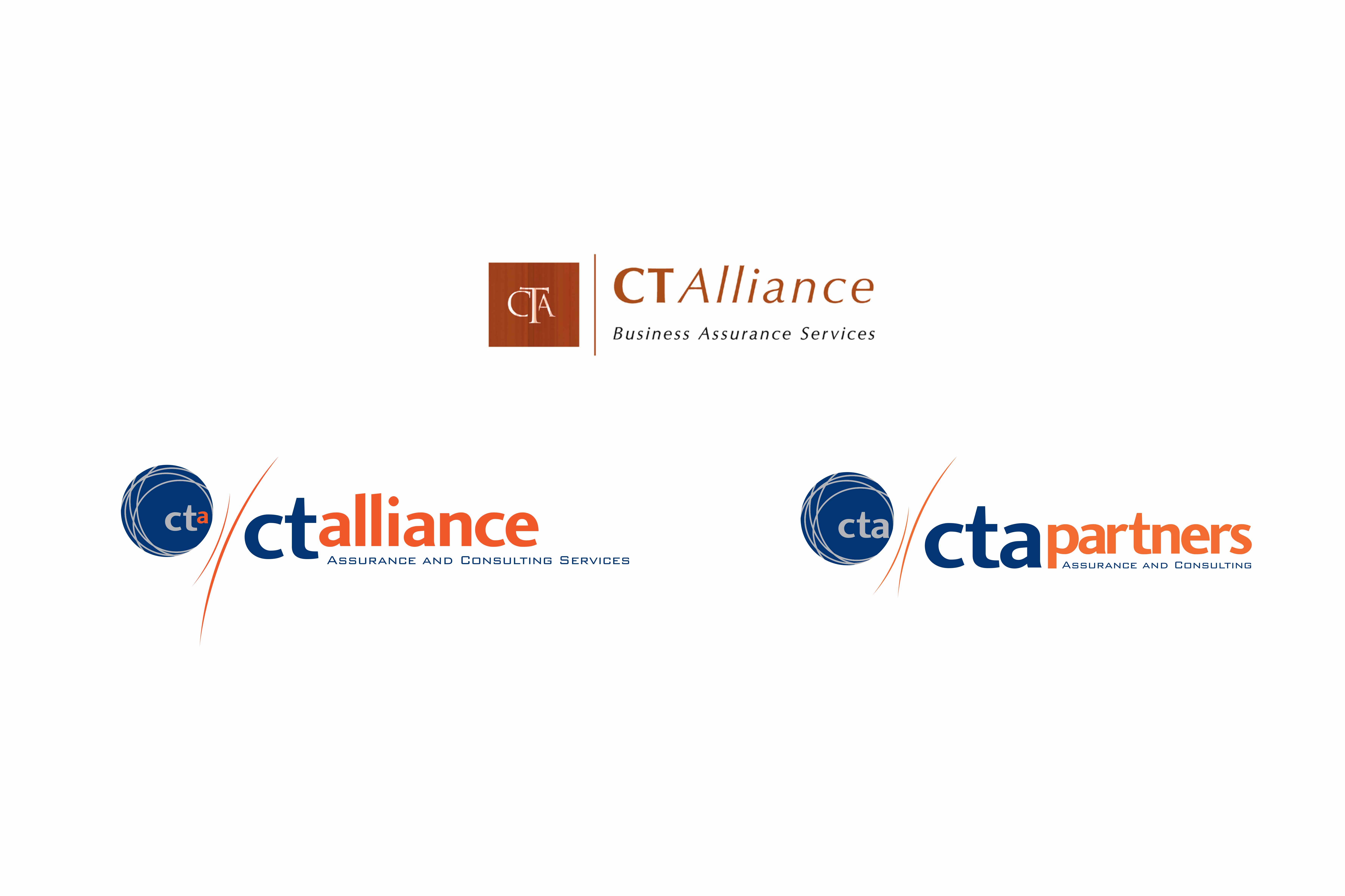
“Wildfire has been designing logos for all types of businesses. The CTA Alliance and Partners, demonstrated above, shows the progression of a logo design from its inception in 2000 to its current forms now in 2018. It also shows the timelessness of the logo to be still strong more than a decade on.”
.
.
“Between Luke McCallum and Myke Mollard there’s isn’t much we can’t envisage. Wildfire is really lucky to have two innate illustrators as it’s base stable of senior designers. Wildfire can design and articulate your next logo or icon design for either your company or products or an extension of a product license. The magic is in how both Luke an Myke work together to get a stunning result.”

