.
Often Concepts never see the light of day.
Concepts are the most important part of any creative communications business. It works on three levels; the ability to tap the “conscious” appealing nature of a design coupled with the required strategic approach. Have a cleverness to create a more profound and “subconscious” idea. Finally the way you deliver the “wow factor!” In other words, harness a more surreal ‘Storyscape’ in a more “unconscious” way. This gives our creative communication a power and a presence.
Ideas and concepts are worthless unless they work. In their inception they hold the promise of a “Big Idea!” – They are like catching lighting in a bottle. You ultimately need a client to want to take the idea to market and you need an audience to fall in love with the idea to effect a big idea and have great gains from the communications. Ideas, start out as sketches, visuals with promise, but they all need great art direction, design, strategy and copywriting to help them live. Originality and an engaging brand story is what Wildfire strives for, but if they are so original or out there they won’t be effective communications.
So how do you find the balance?
Following is a showcase of concepts. Some have seen the light of day and worked well for our clients and others have never ever been pitched to clients or businesses. They are just purely a demonstration of copywriting, design and art direction strength which creates the perfect gallery to showcase the power of Advertising Ideas and concepts.
.
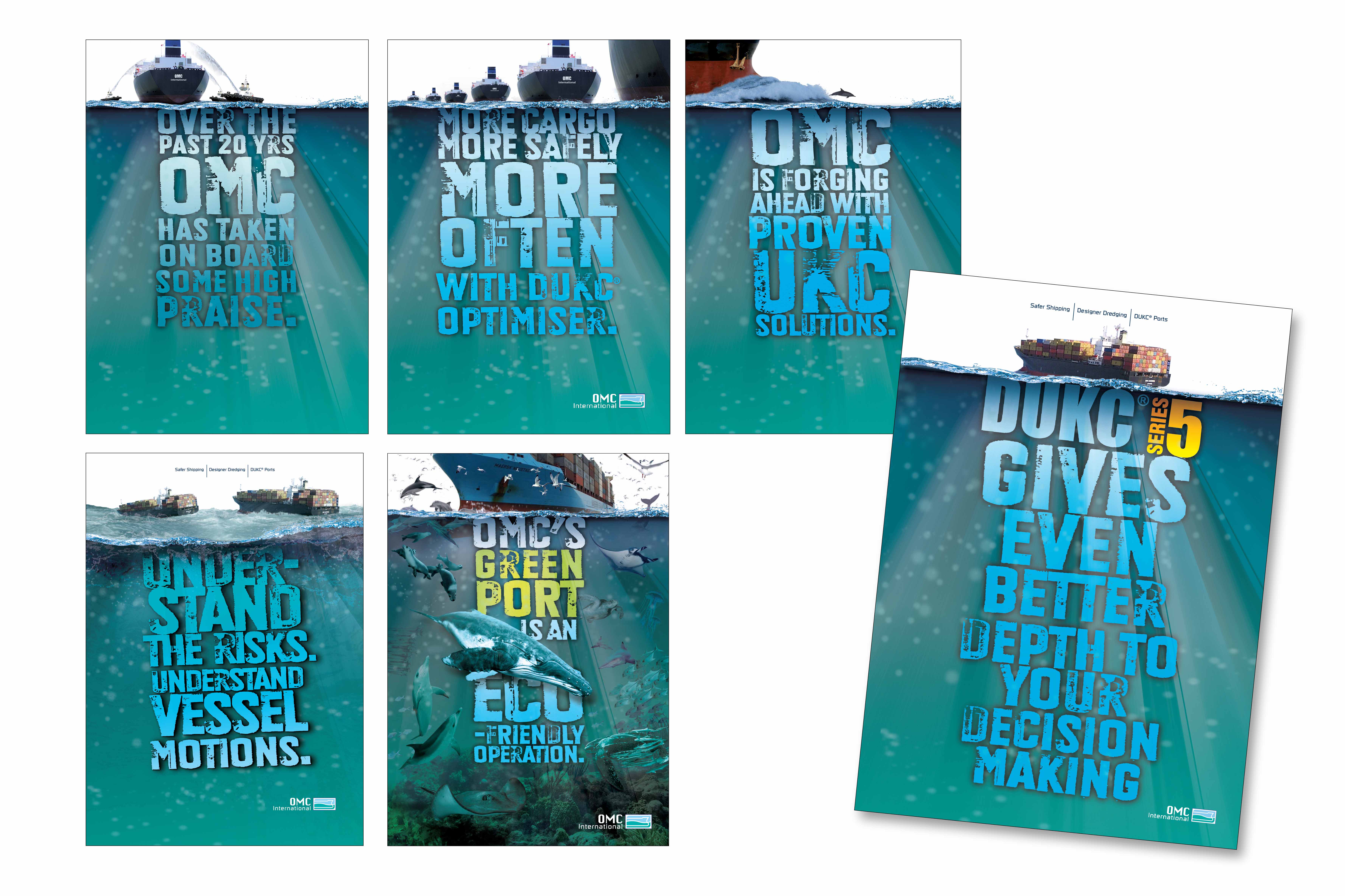
“OMC International is an engineering company, which deals with the Under Keel Clearance (UKC) of ships coming and going on hazardous tidal windows in and out of ports. Using the surface or waterline, this concept aptly visualises and highlights the companies brand essence and visually illustrates it’s primary benefit of giving More Under Keel Clearance to ships.“
.
.
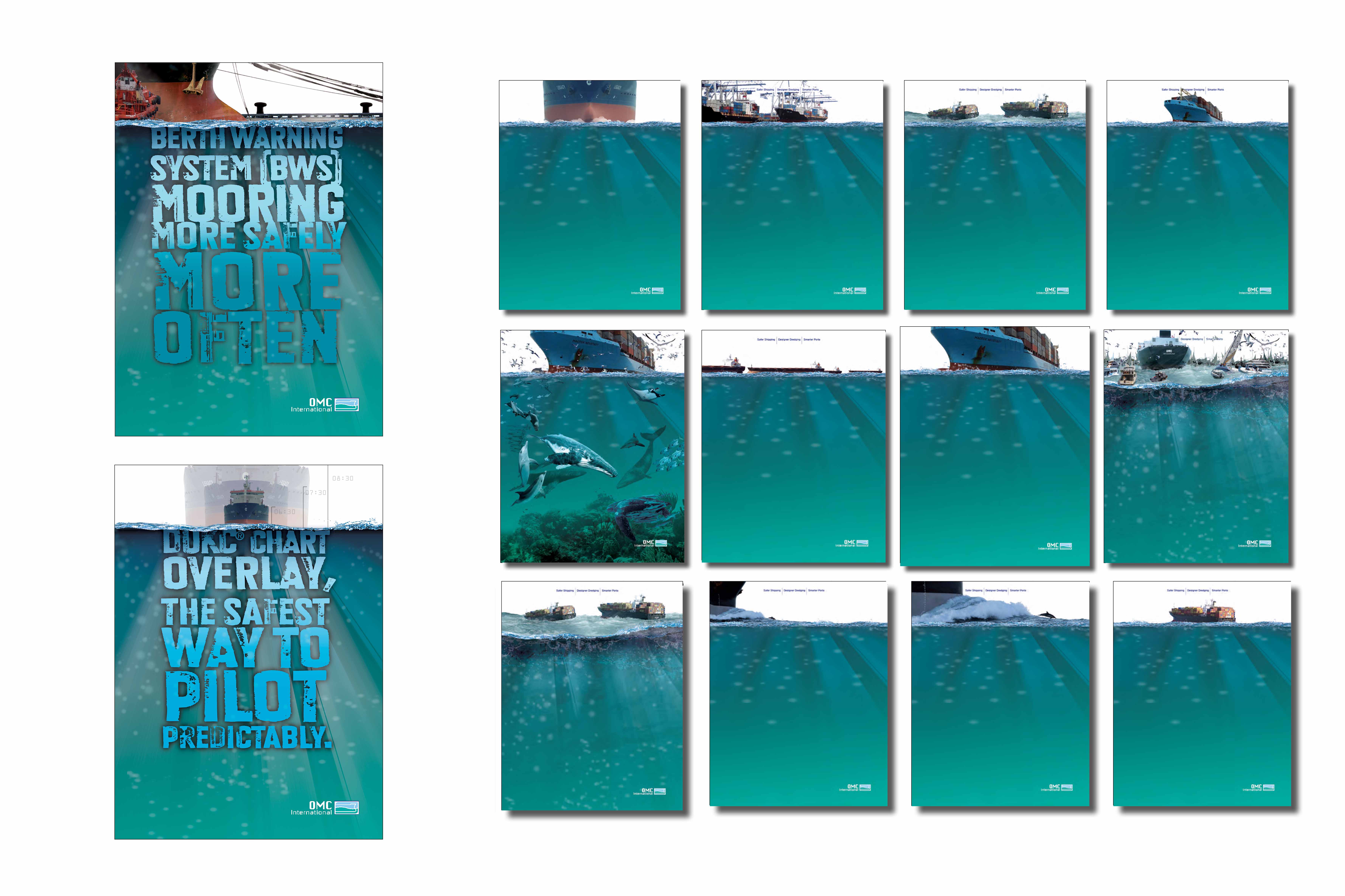
“We had some really powerful copylines so we wanted the art direction to be confined to the top 1/5 of the page. leaving the underwater effect for the headlines. The strong typography, was to give the ads a look and feel like they had ‘industrial strength’ engineering as OMC International was a Market leader. But Art directionally we had to see what kind of ‘Storyscaping’ we could effectively employ in the top few inches to make the concept into an effective marketable campaign.” .
.
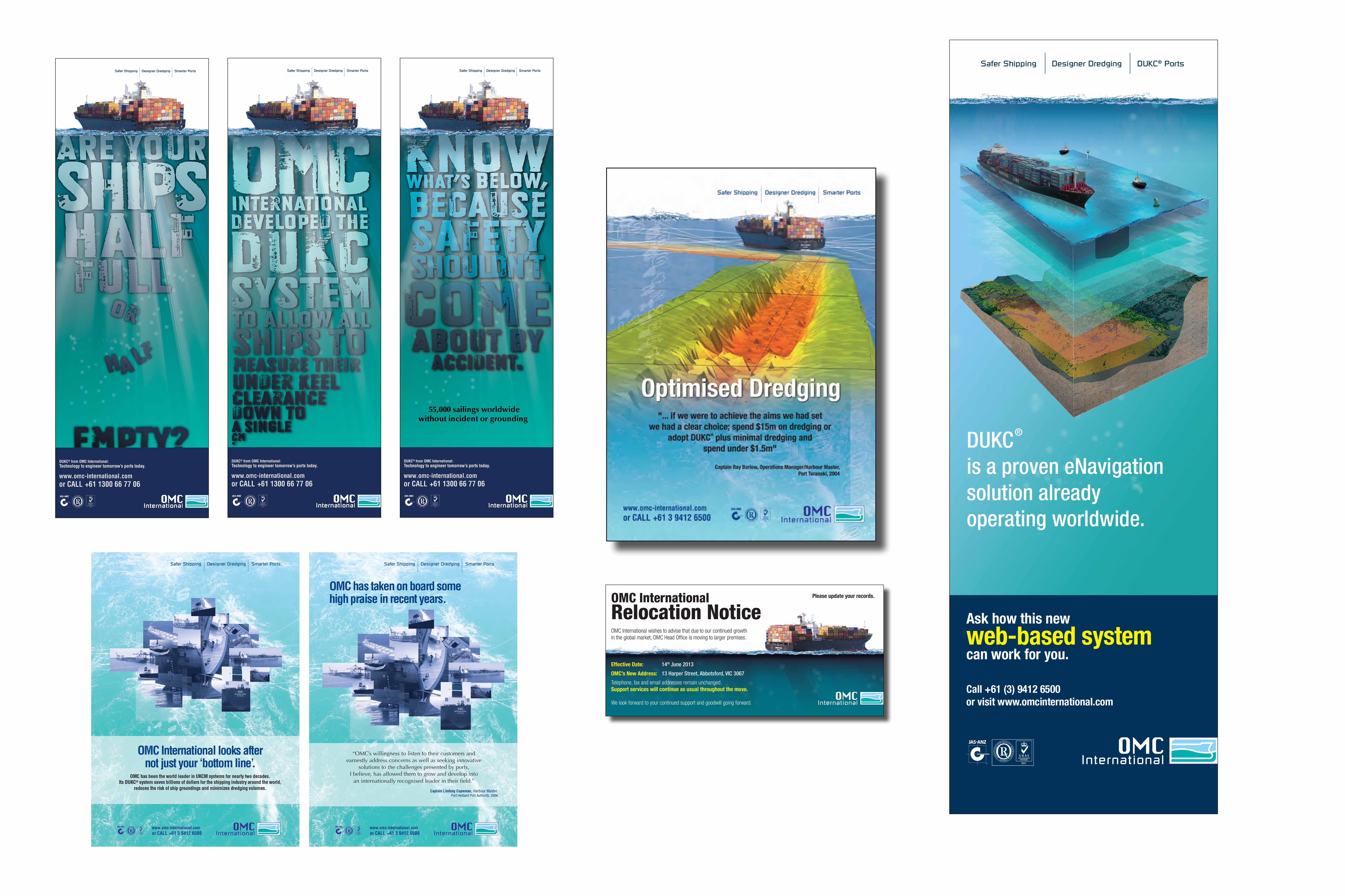
“Above is how the Under Keel Clearance (UKC) concept evolved from 2008 – 2014. It started out as a generic maritime concept. A cluster of shipping images in corporate colours with strong headlines. Then in a leap of faith it moved to fusing screen data and scientific journal-styled illustrations demonstrating more Under Keel Clearance to ships. before the graphically bold leap to the Under keel clearance look.“
.
.
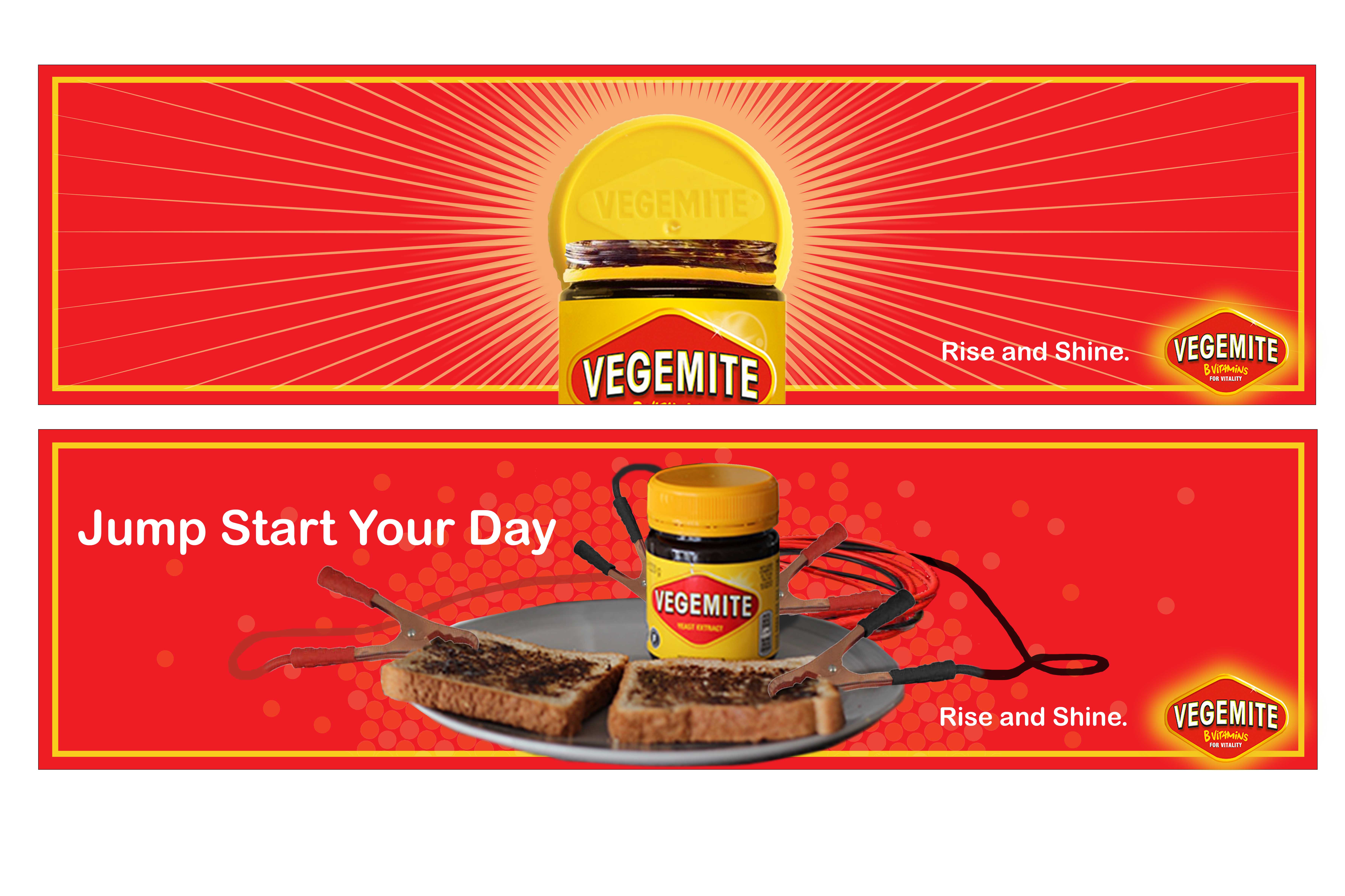
“Vegemite is an easy proposition -“B Vitamin Energy”. But how to give some fun to the ever-fickle millennials? Through simple clever visuals and personality!”
.
.
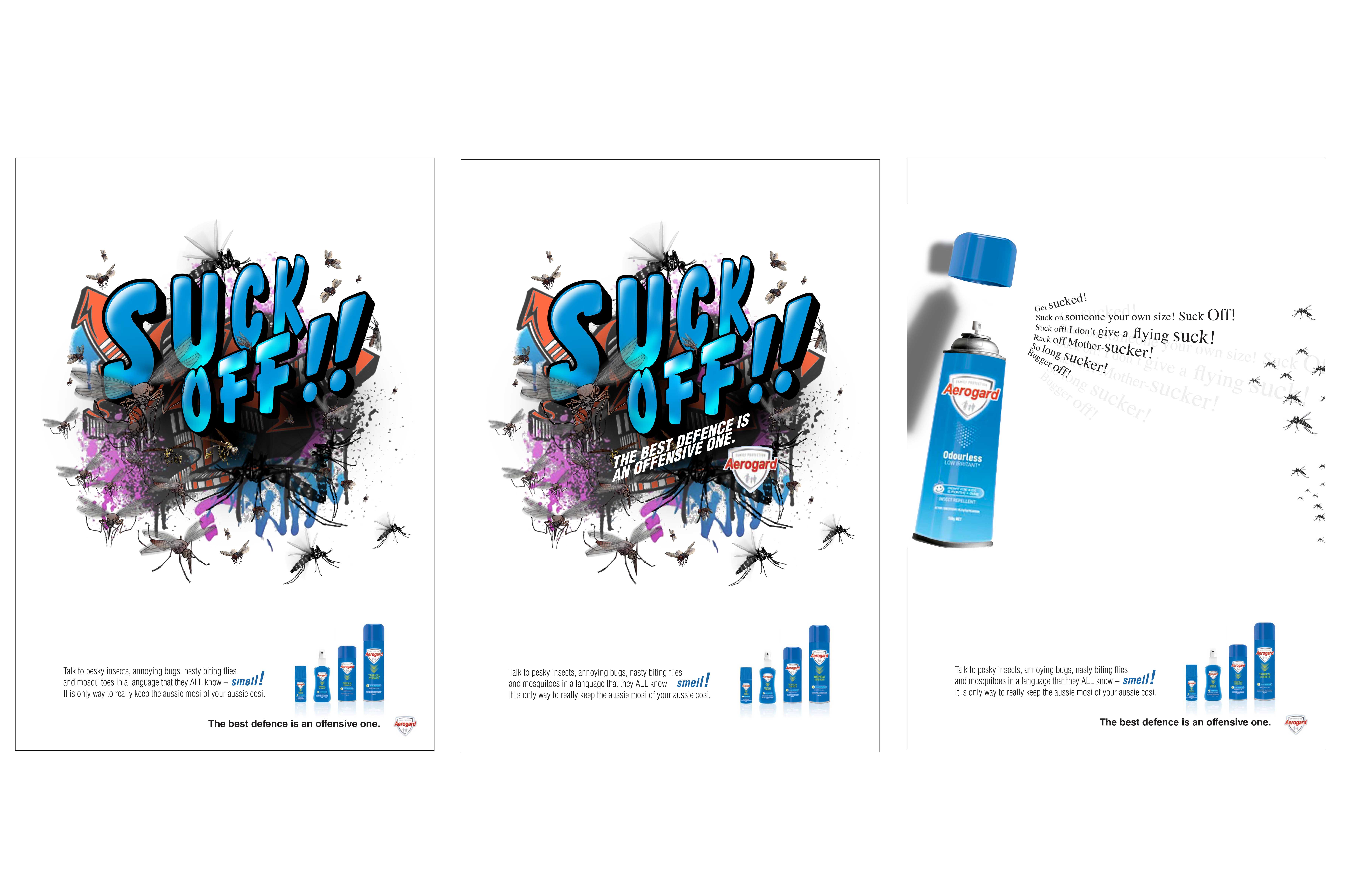
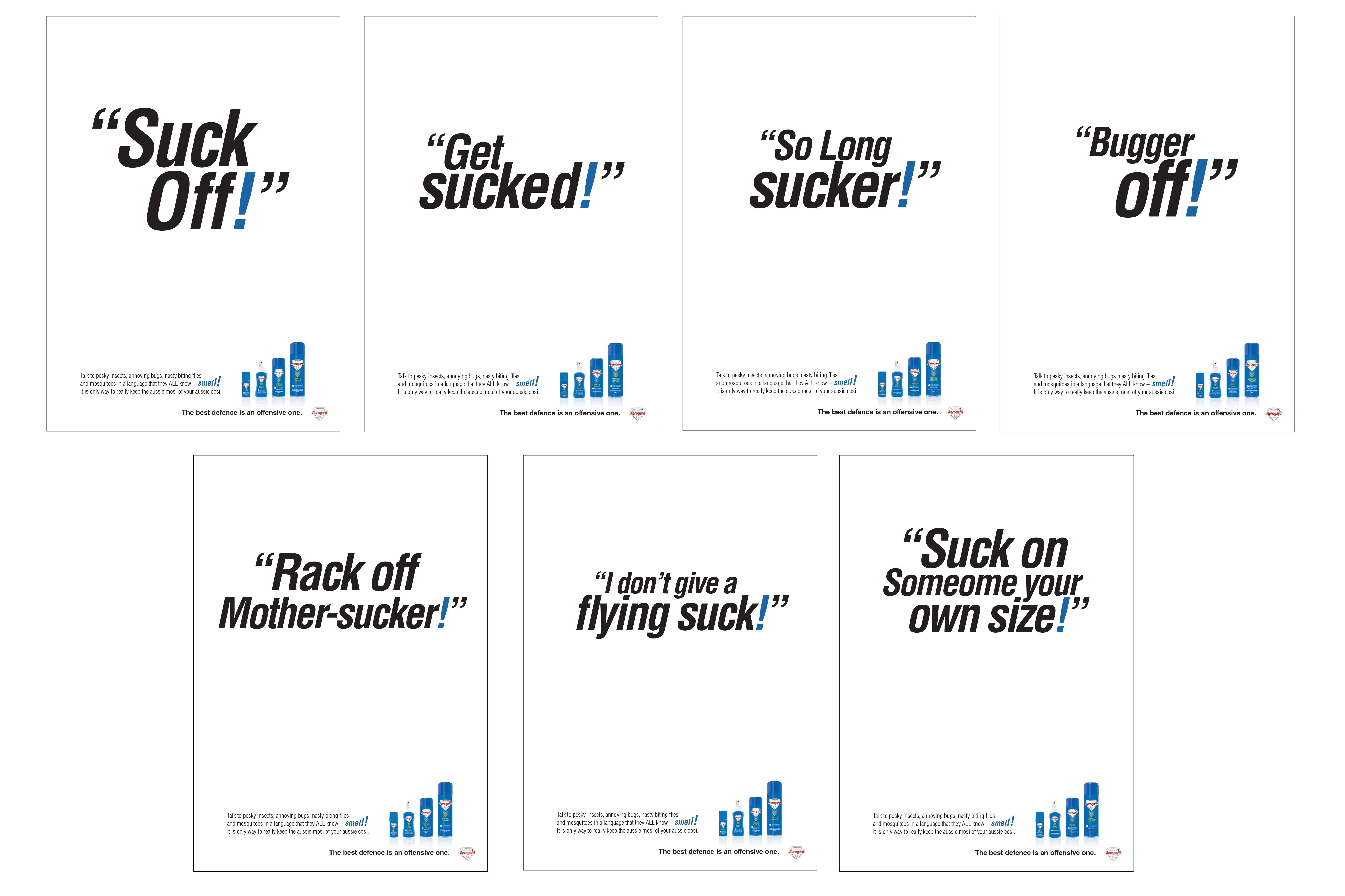
“Aerogard is a great proposition. DET is the best repellant known to mankind. The reason for this is the science of Smell! The smell is highly offensive to insects and Mozzies! So why not use “colourful language” to talk to the insects! It has a powerful premise. The language could have a way of exciting Millennials to use Aerogard. Yet it might piss off a few people, it could work as a great online targeted campaign.”
.
.
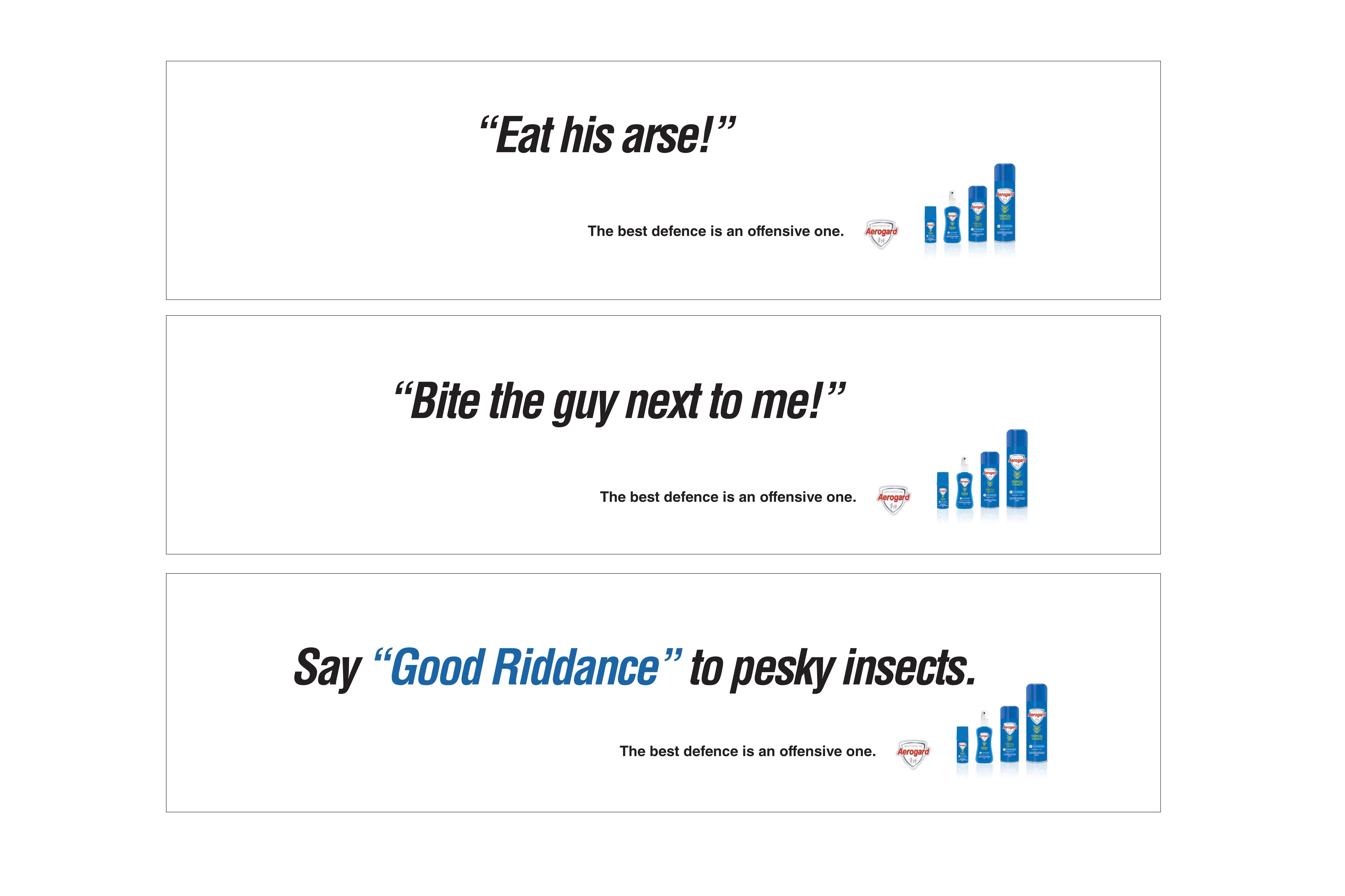
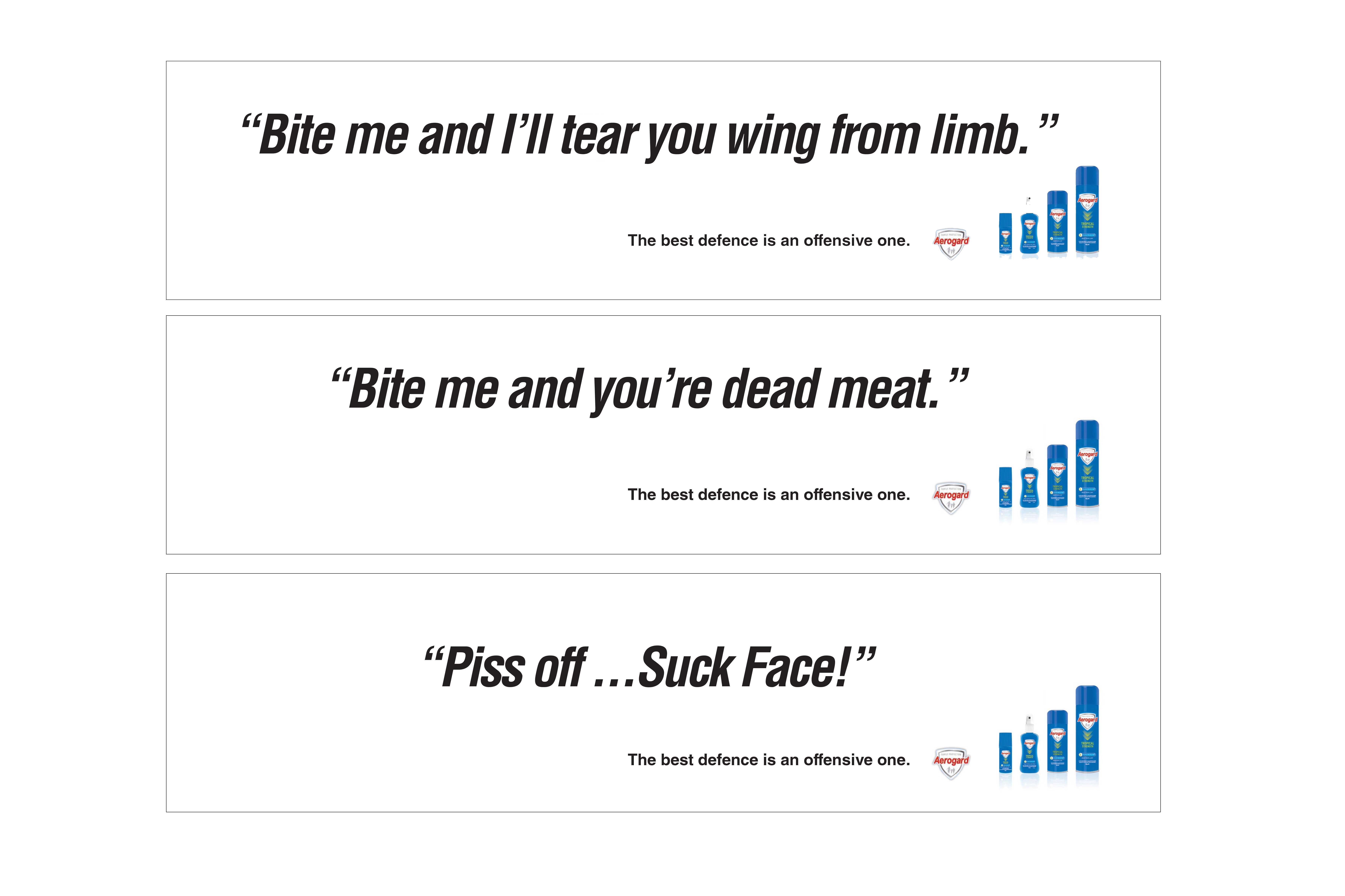
“Using offensive language is so easily extended in a highly powerful campaign it’s virtually “viral” before I even get out of the brainstorming session.”
.
.
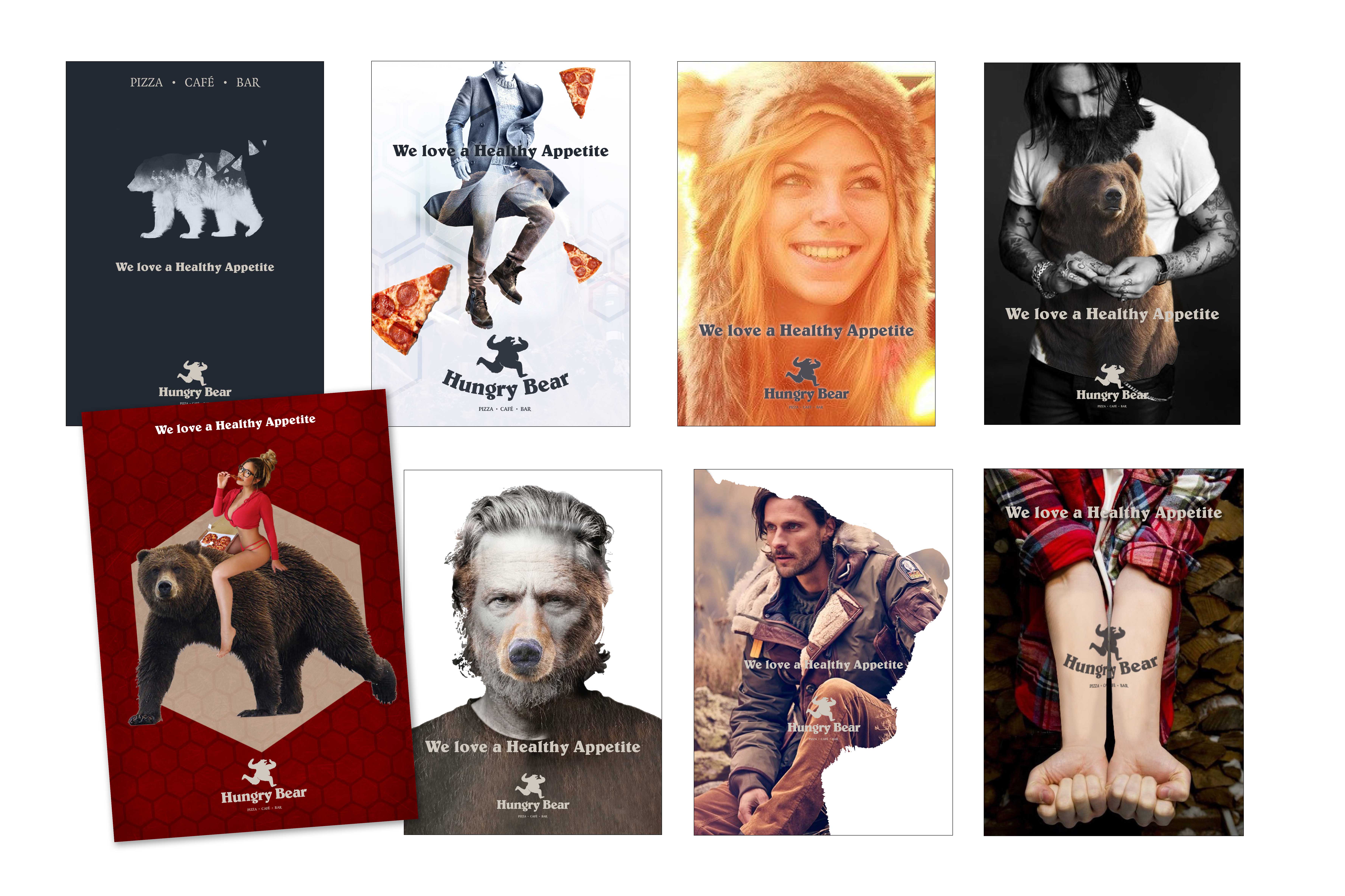
“This was an awesome idea! Created as branded art pieces for a cheap as chips “bill poster campaign” to launch the new opened “Hungry Bear Pizza”. The art could double as in-store postcards and the ideas we saw as quirky, adventurous and fun. They would attempt to tap into the Millennials audience with images that mimic Pinterest, Facebook memes and art of different periods. The concepts infused bears, fashion, art, double exposure ideas and earthy adventure type images that could become seasonal collectable postcards and even coaster sets and T-shirts for merchandise. This is just eight of the 20 or so presented to the client. The idea was seen as too risky! – But Hey we tried.”
.
.
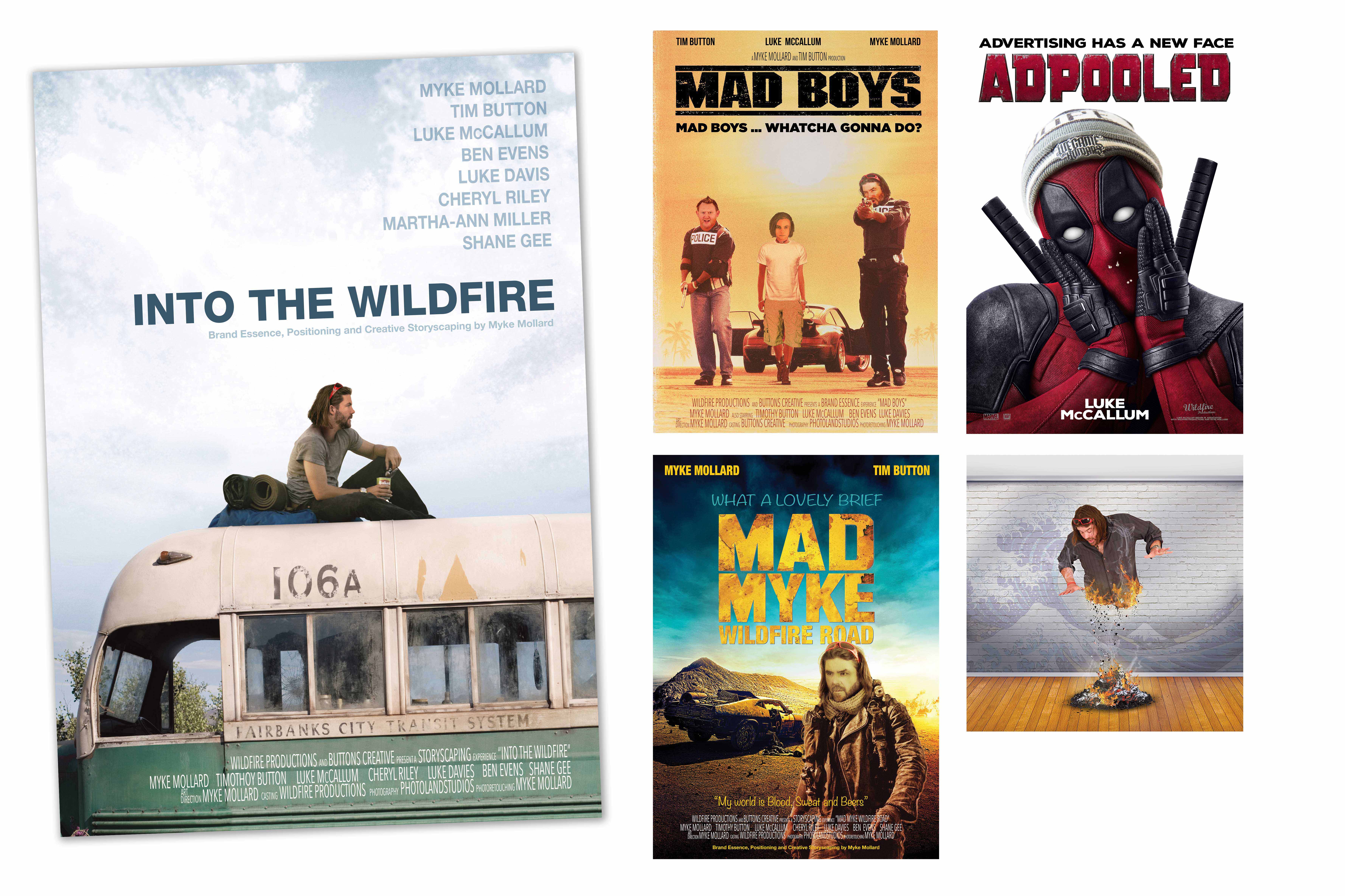
“To highlight “Storyscaping” and have a cinematic environment, Wildfire created some huge movie poster spoofs to demonstrate the different ways you can recycle and employ and mimic other media and genres.”
“Plus, dotted about this website, are another “HOT” self promotional series like a visual “Website easter egg”, demonstrating Luke and Myke’s serious photo-retouching talent [featured here bottom right].”
.
.
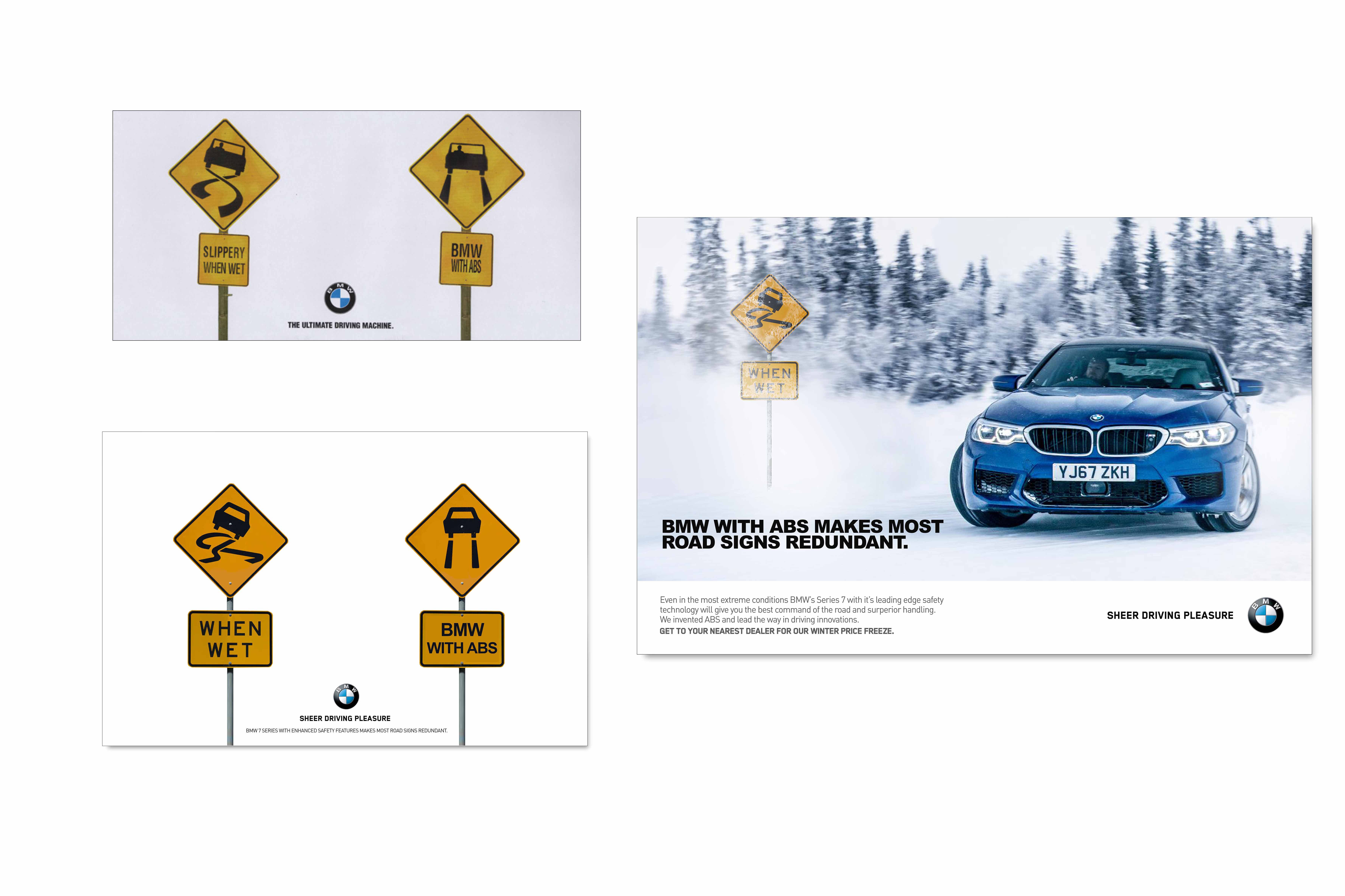
“BMW always like to show off there product. That’s marketing in the highly competitive car industry. So to just show a couple of warning signs is way too ground breaking for the client. Yet with great art direction and clever copy writing this surreal concept can come to life as a clever and powerful BMW communication.“
.
.
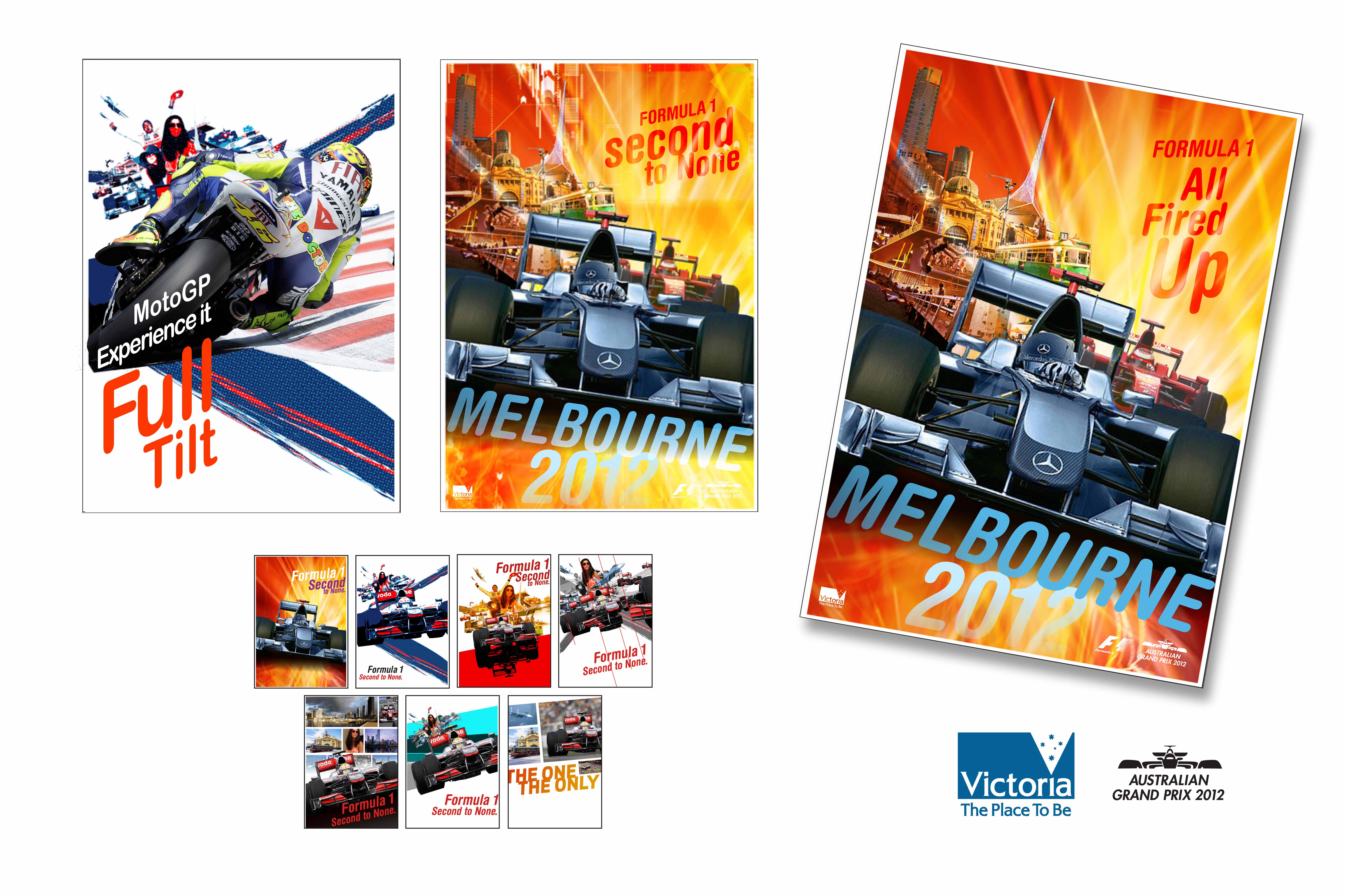
“I love the way this concept is visually exciting. It was never presented and the account was won by a competing agency (which had a concept nearly identical to this). In development, Myke researched every advertising poster from every world Grand Prix’s and noticed that they seemed to rely on a more artistic approach and use of the vernacular to drive the emotional ride of motor sport home to their audience.“
.
.
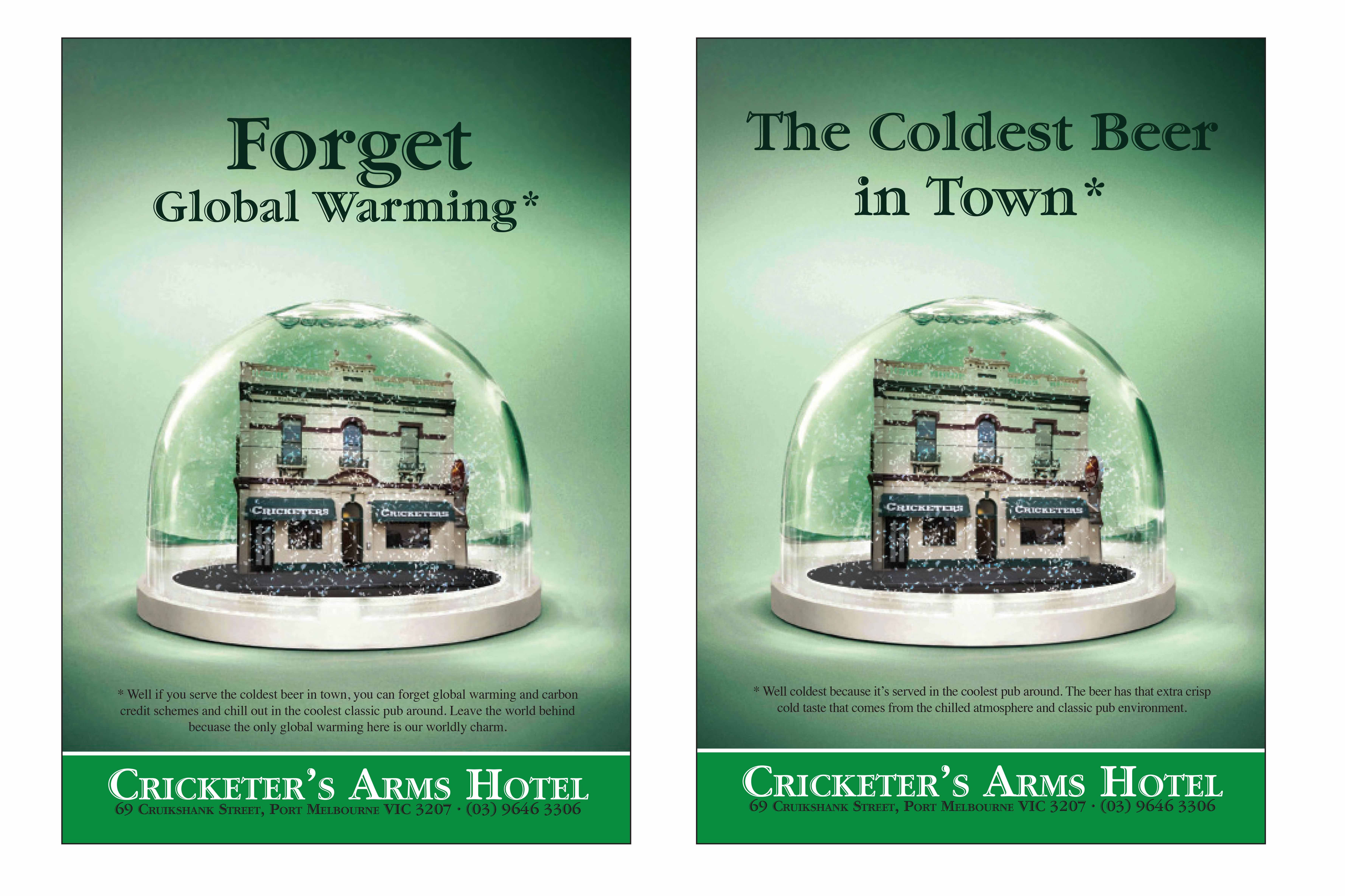
“When Climate Change debate was just “heating up!” We thought it would be “Super cool and fun!” Myke Thought if you juxtapose Climate Change with chilling out at the Cricketer’s Arm’s in a “Relaxed Atmosphere” we would save our planet from the ravages of climate change fake news or do our bit chilling for the environment.”
.
.
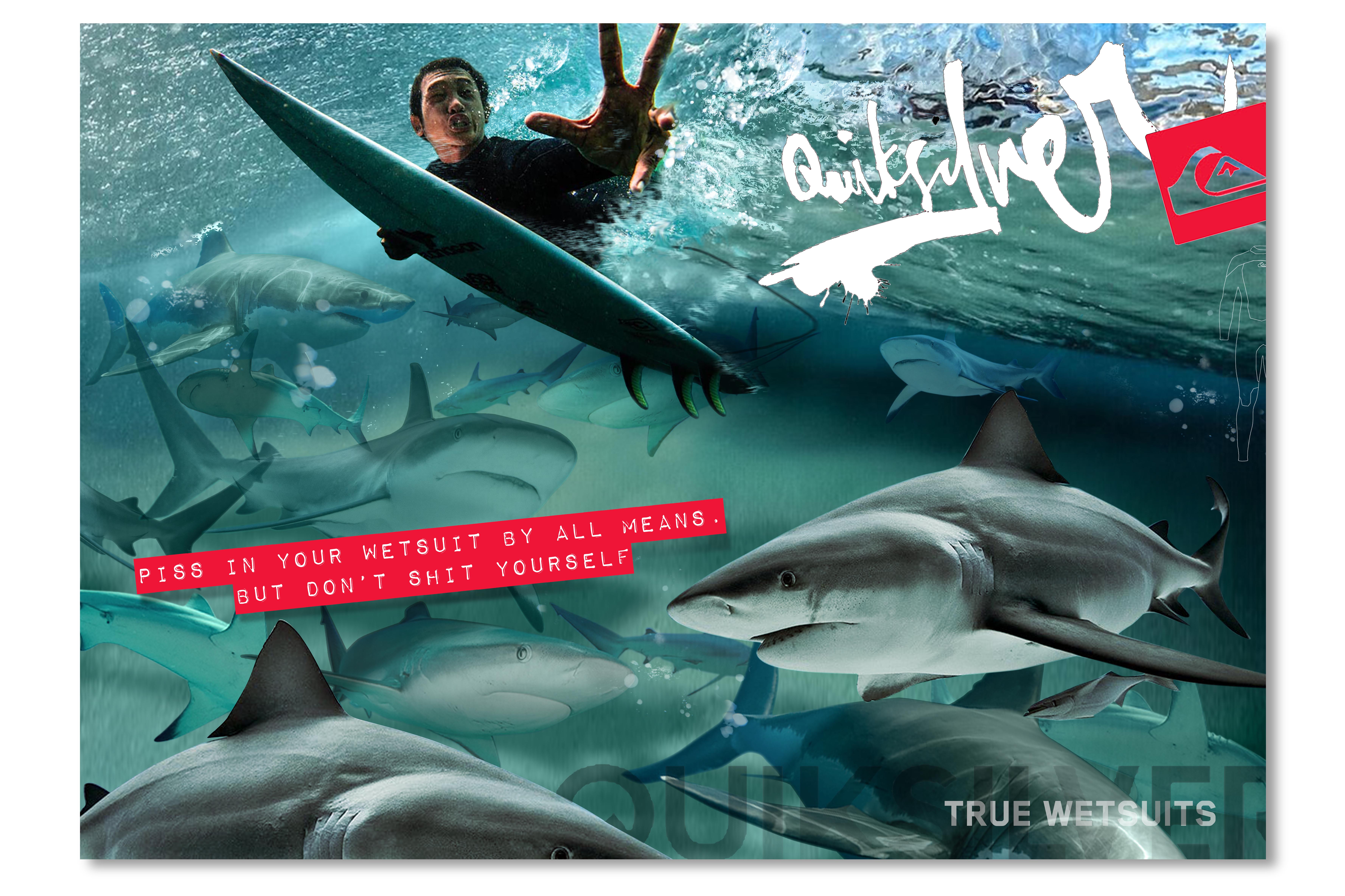
“Everyone pisses in their wetsuit! But not everyone is brave enough to tackle big swell and has the courage to pull big surf manoeuvres in the small stuff. Hence the line – Piss in your wetsuit by all means, but don’t shit yourself. Using a spirited vernacular with an edgy attitude, this concept highlights a gusty copyline and some powerful art direction to speak to its surf savvy audience.”
.
.
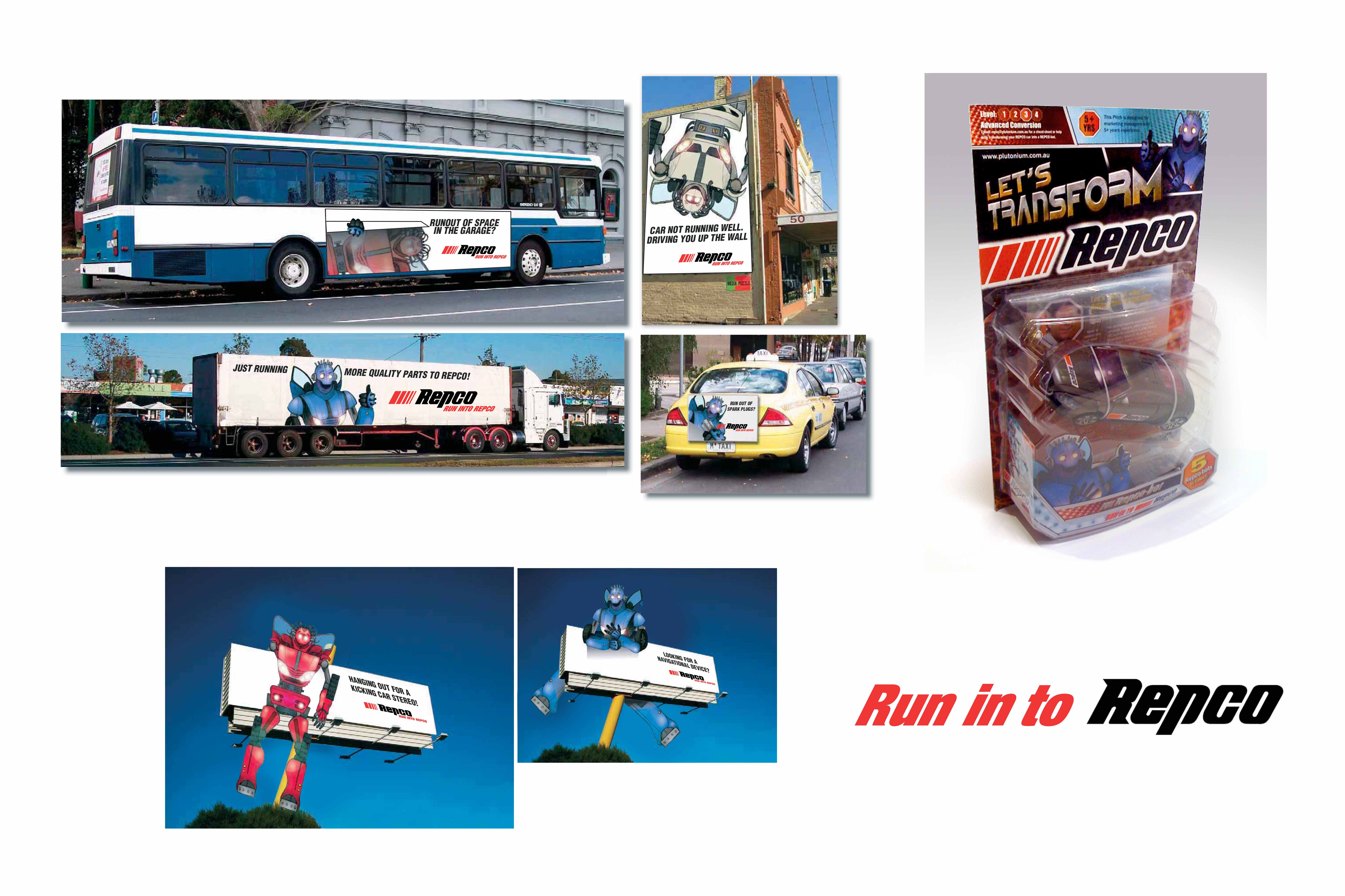
“Around 2009 – 2011 only the first Transformer movie had just hit the box office. SuperCheap Auto were ahead of the game and REPCO needed an out of the box idea. We pitched the REPCO-BOTS because we believed that “piggy-backing” of the franchise could elevate REPCO. The key strategic premise here was that people use parts to transform their cars. Because of REPCO’s roots in manufacturing parts and car racing we tossed up a return to a more simple and easily campaigned tagline like “Run in to REPCO” and “Race in to REPCO.”
.
.
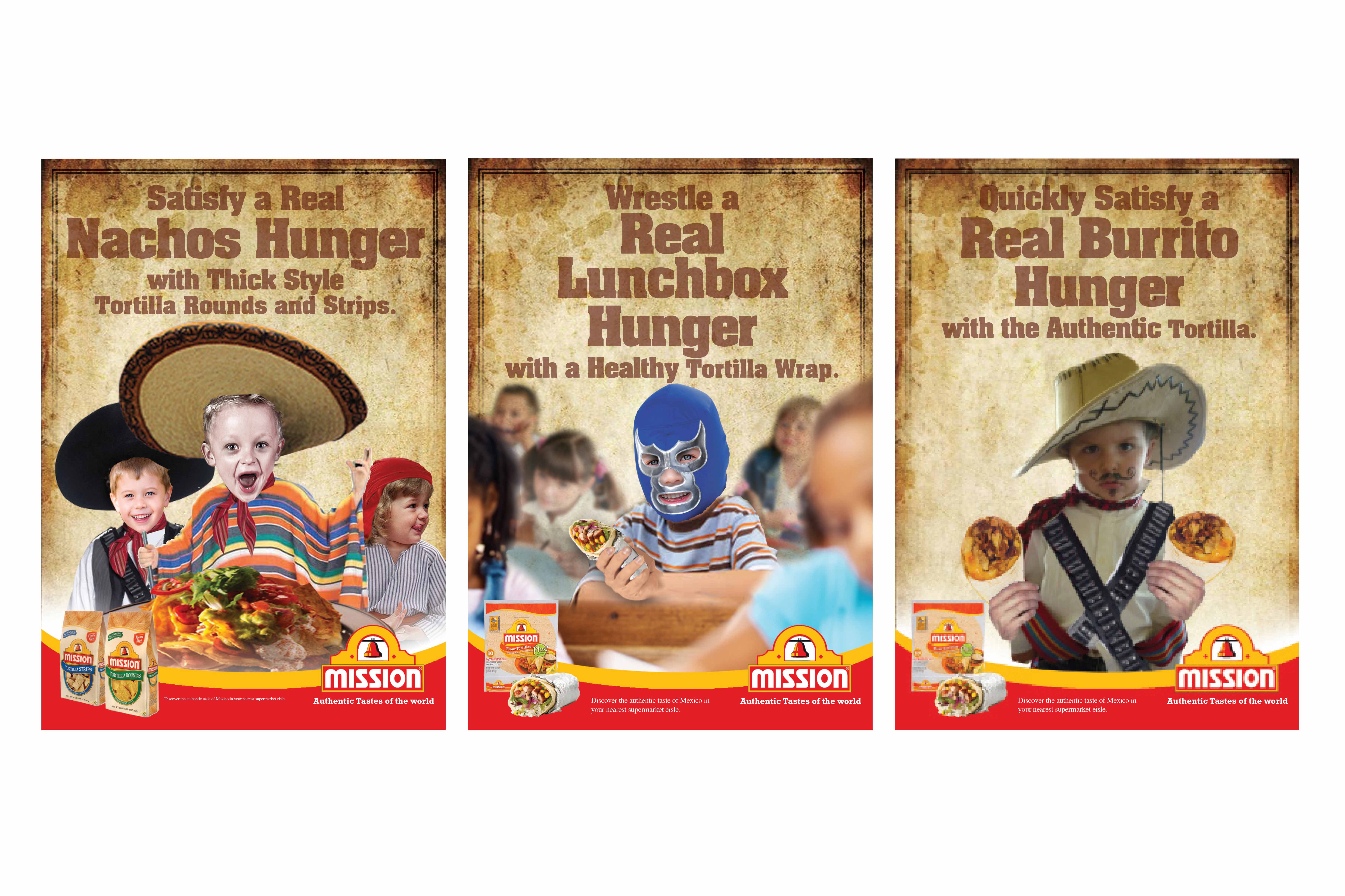
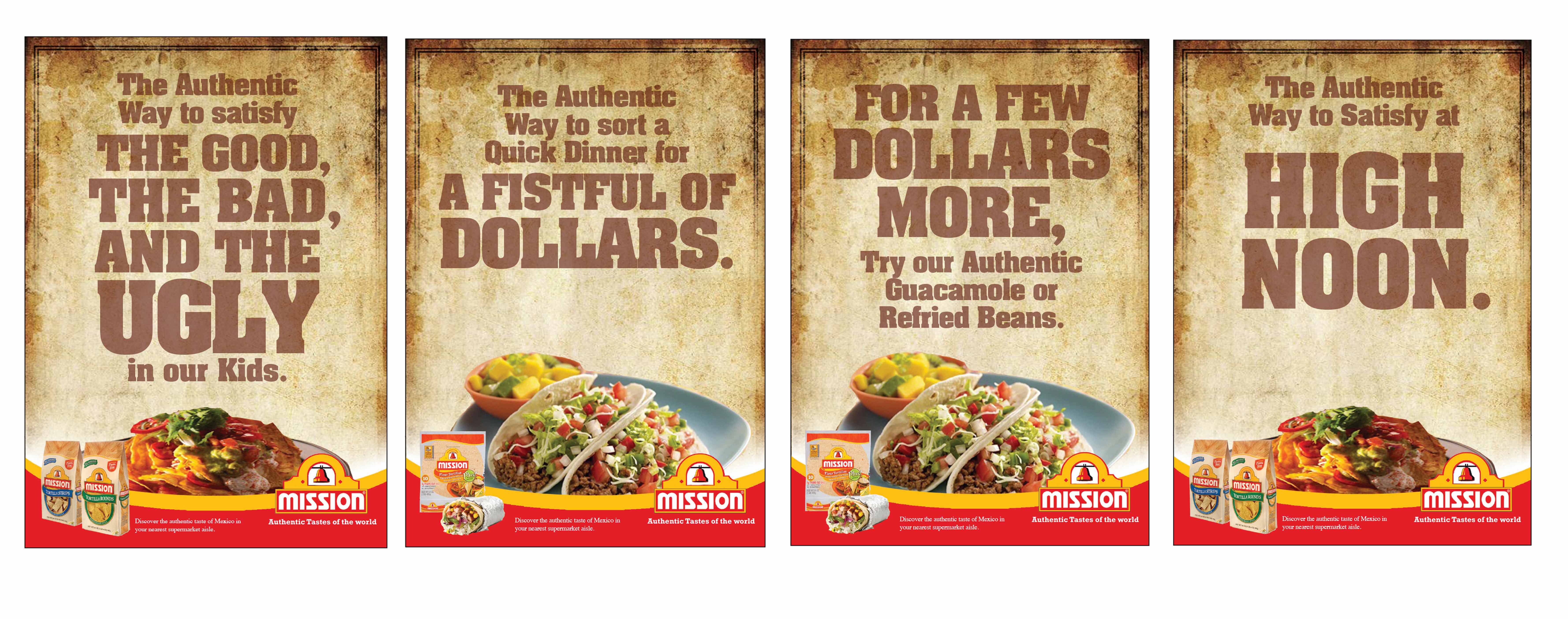
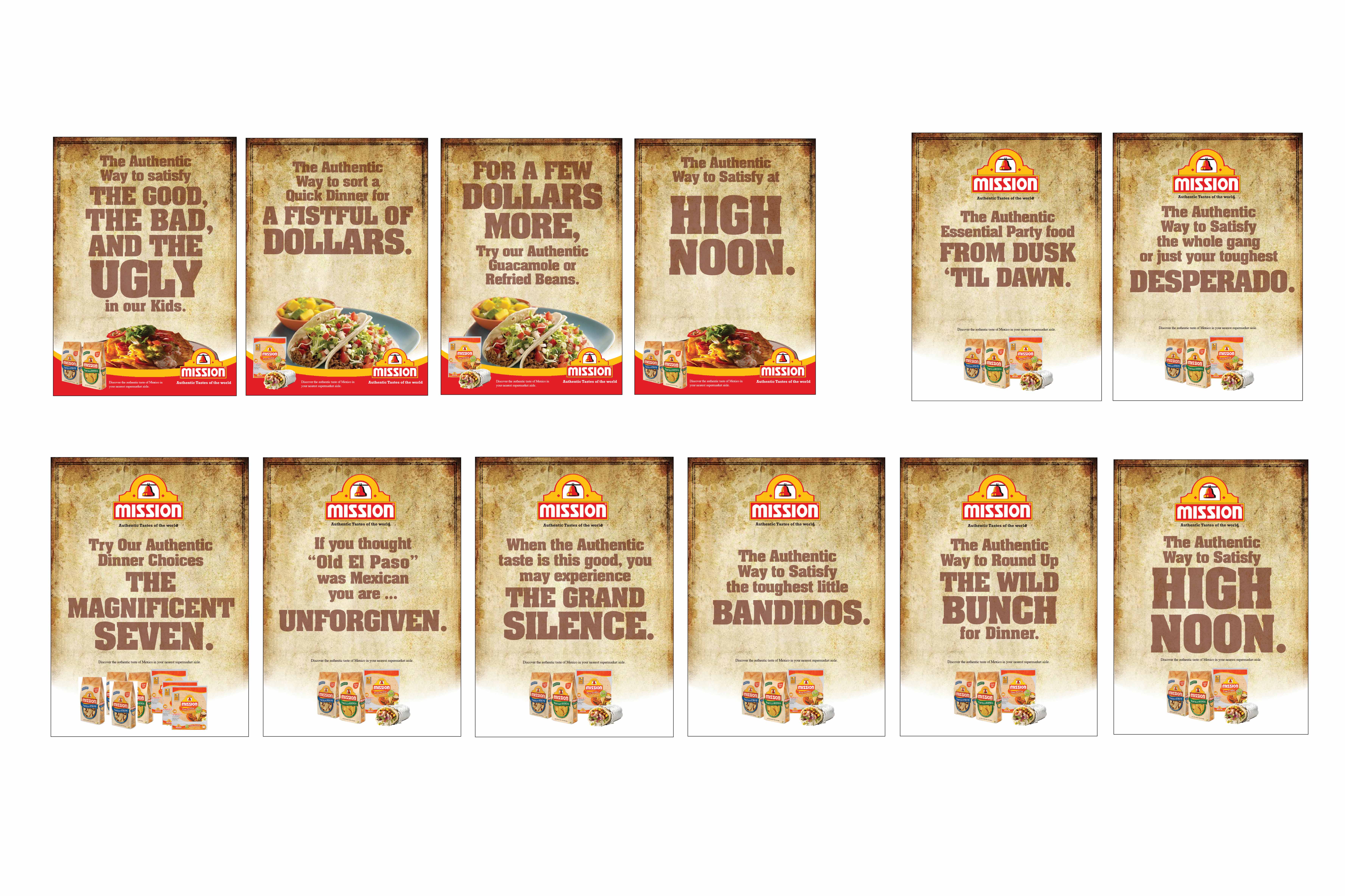
“Toying with the concept of the Authentic Mexican! Mexicans in American movies or “spaghetti westerns” were a particularly “wild bunch” or just plain bad guys. So we played with food that tames the wildest bunch [kids] through film title spoofs below and kids playing “Mexican” or “Cowboy and Indian” dress ups above.”
.
.
“Every parent knows the reality of siblings just before meal time. The behaviour change in hungry kids is intense. Infuse the real need to satisfy kids hunger with the wild west you have an idea. Having 5 kids himself, Myke knows when your little bandidos start killing each other before dinner is served. So the need to feed kids is an “authentic” and genuine need. The need to tame the wild west of the household hunger is one all parents can relate too.”
.
.
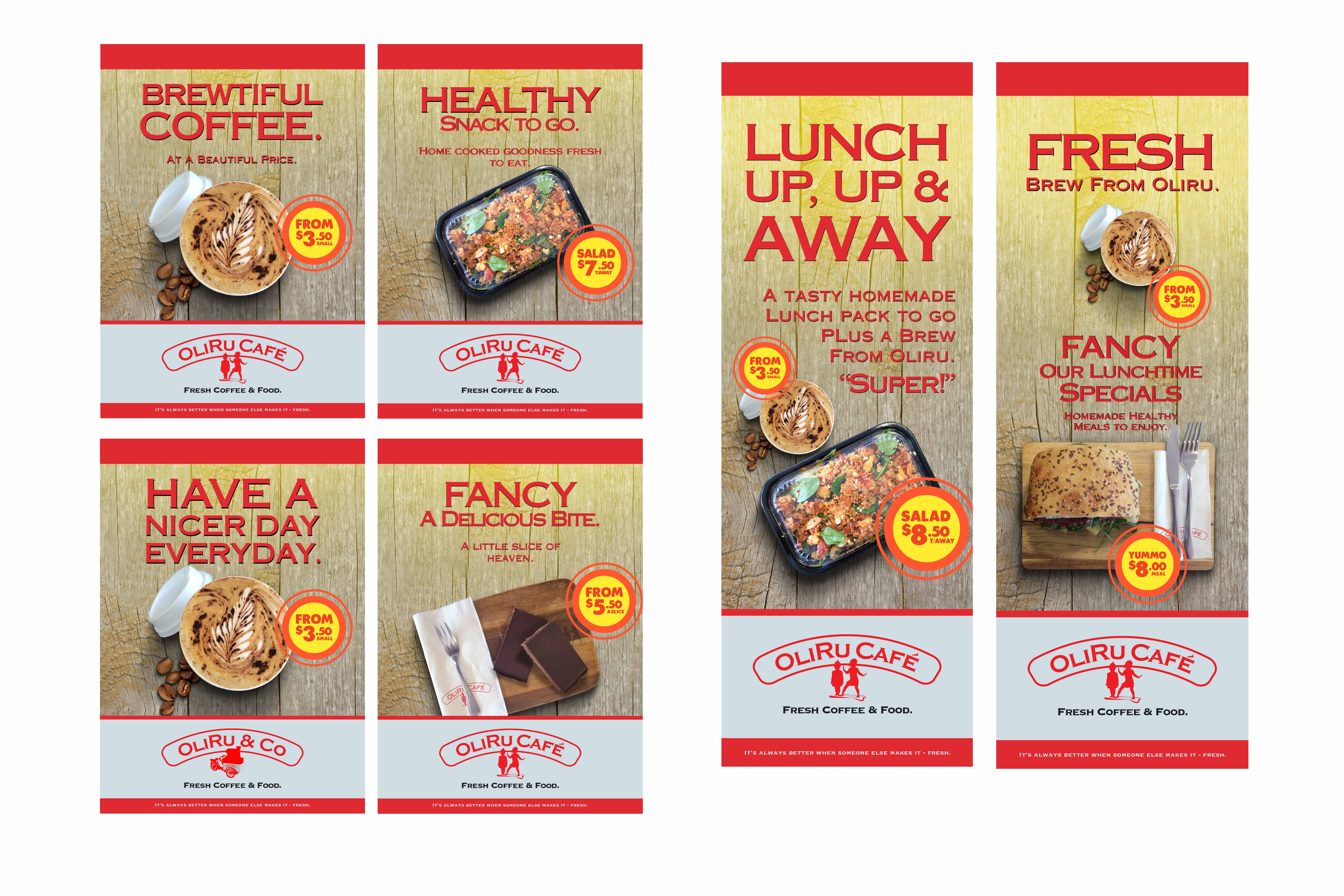
“Toying with the vernacular is always a great way to get some street credibility. It comes across confident and casual. People will always enjoy the relaxed … “roll of the tongue” style of copywriting if you can get it right.”
.
.
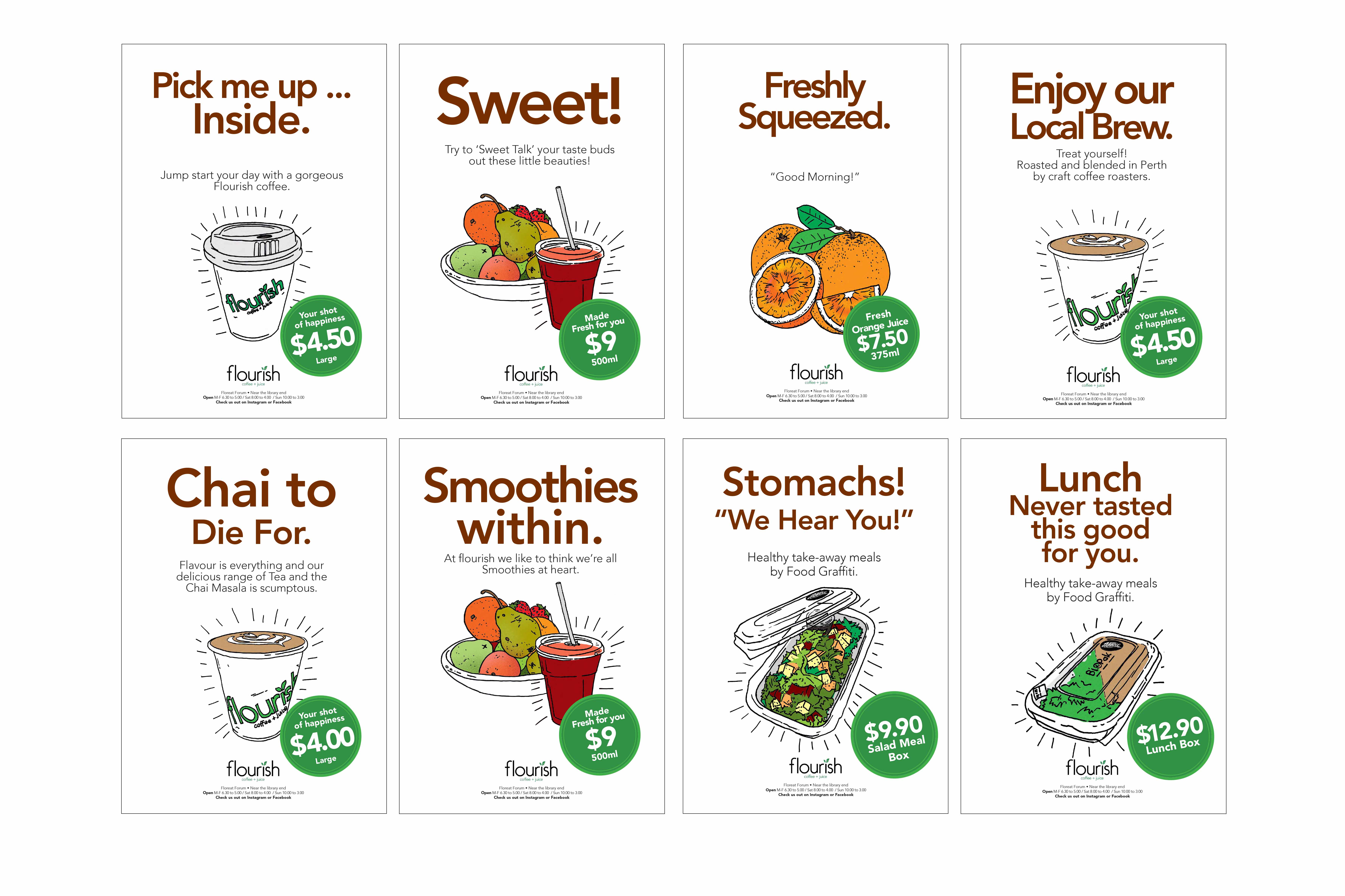
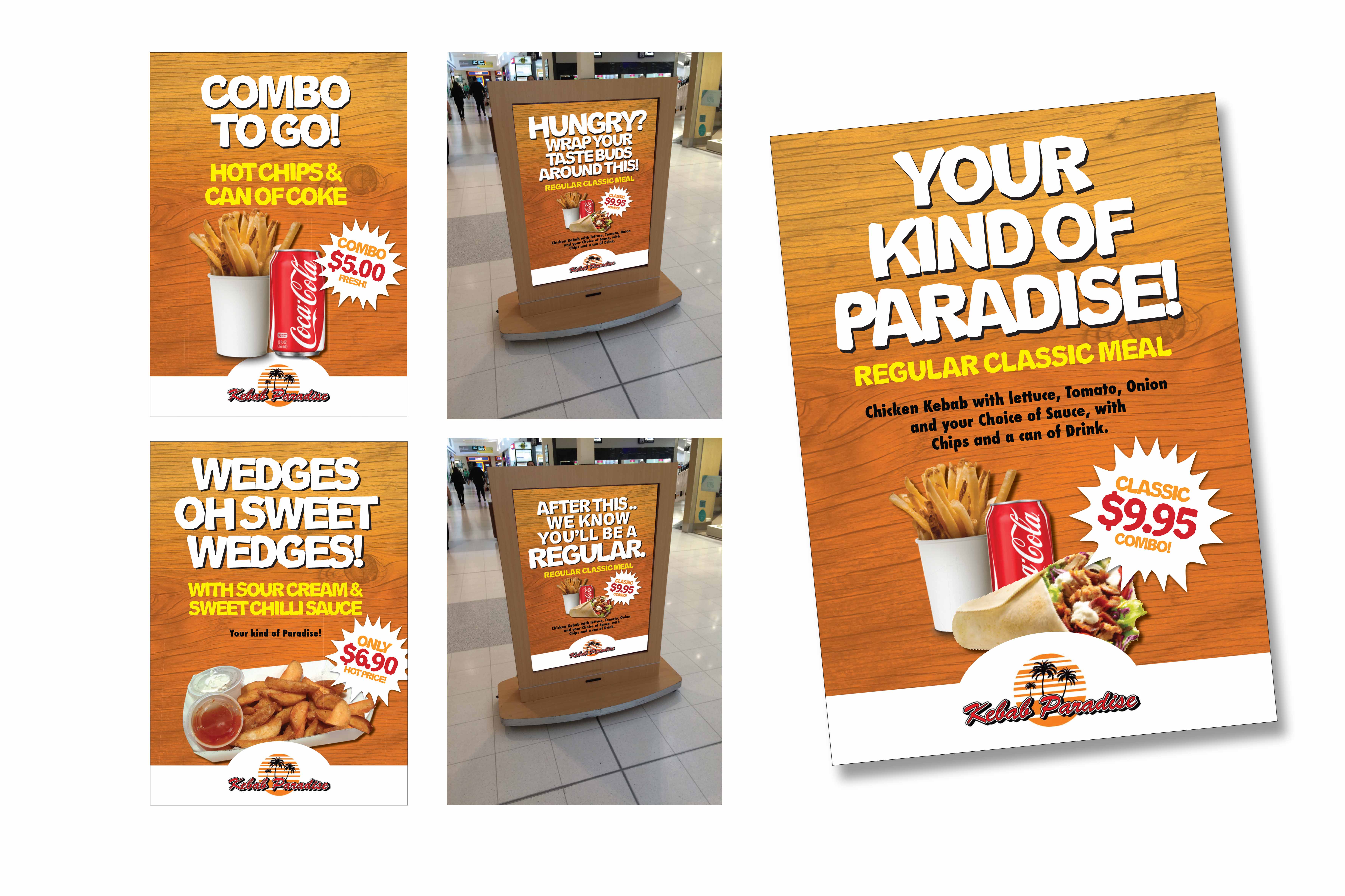
“Art directionally we used hand illustrated drawings to demonstrate how fresh the produce was. Then using clever puns and simple throw-away lines to entice walk in traffic and elevate the point of sale with clever in-store copy-lines.”
.
.
“Tapping into the name of a store like Kebab Paradise is one way to elevate the brand. Just like tapping into the menu with clever puns simple throw-away lines to entice walk in traffic.”
.
.
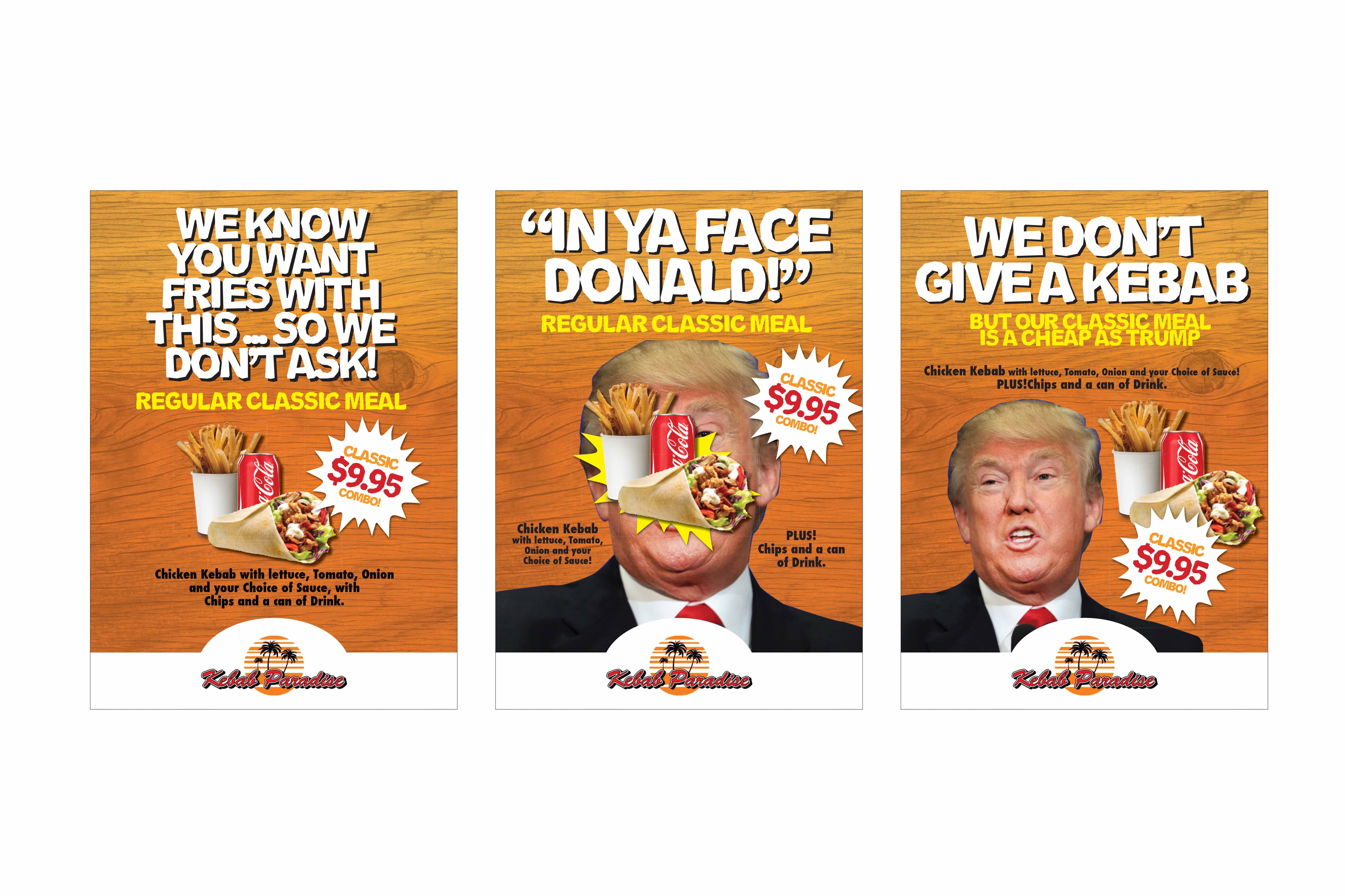
“A lot of ideas just come from reading the news. Comics use news headlines and often poke fun of politicians to get a laugh. Advertising can do the same to get into the mind of the consumer. These were just a couple that amused us.”
.
.
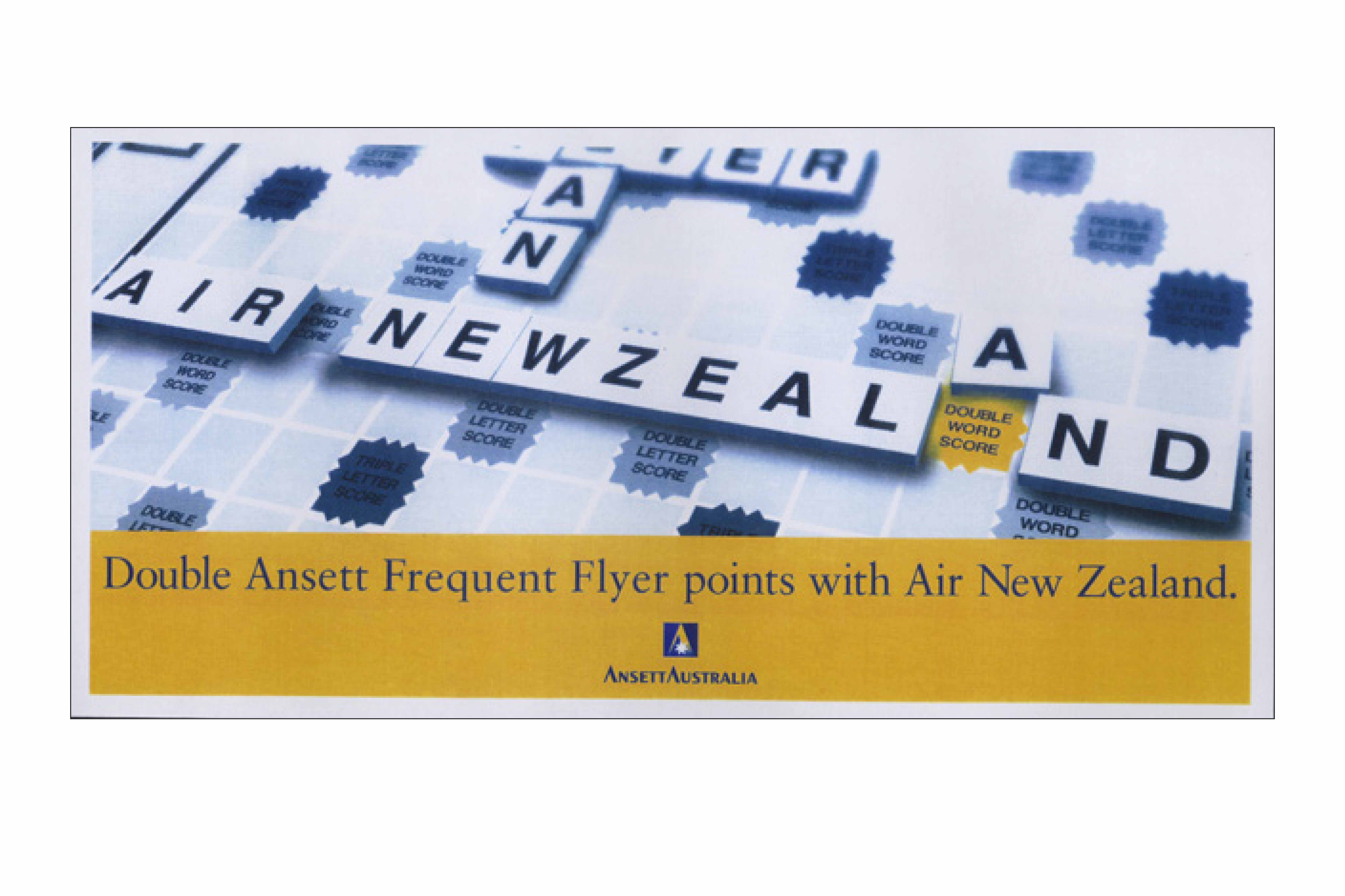
“Taking the simple game of Scrabble to illustrate “Double Frequent Flyer Points” takes you back doubly! Yes it was a long time ago that we flew ansett and when was the last time you played Scrabble with the kids?”
.
.
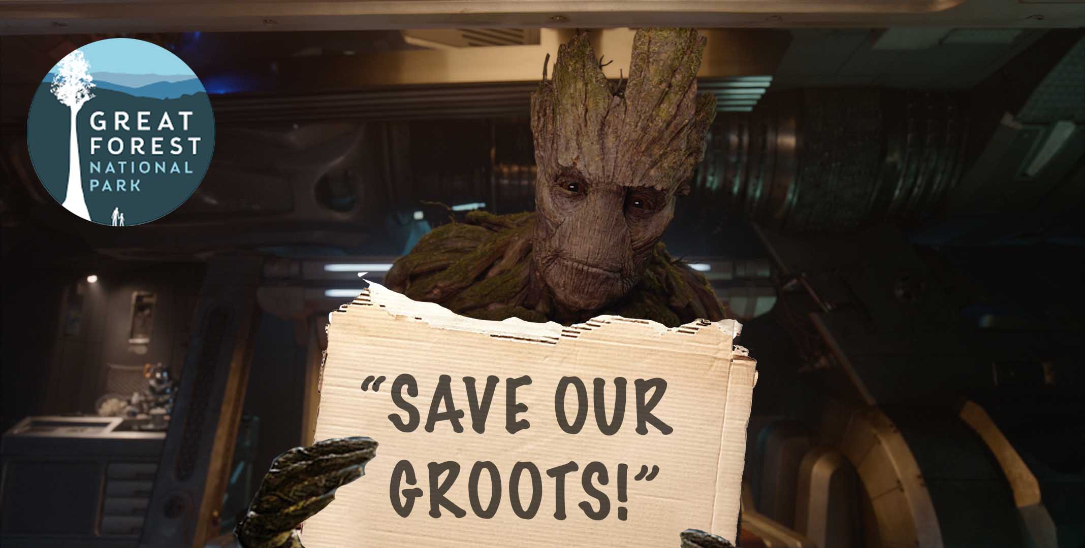
“A friend works for the GFNP. I enjoy messaging her my spoofs and inspiring environmental “memes” from time to time. It’s all in good fun and it would be nice if they could get Groot as an ambassador.”
.
Want to see more? Check out Wildfire’s Portfolio or Myke’s Skeleton Closet of past work.
.
Skeleton Closet.
Home Page Portfolio Back to top

